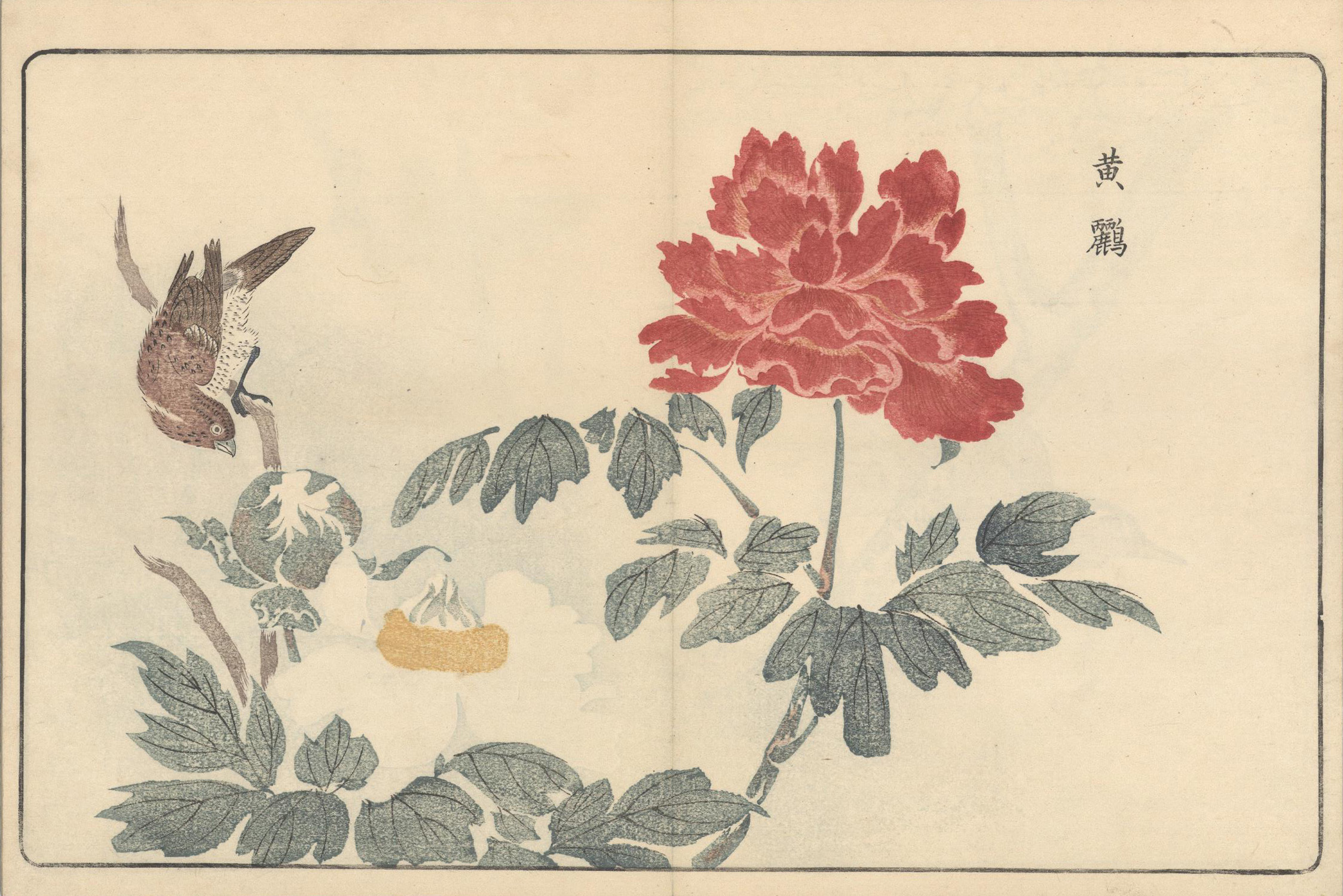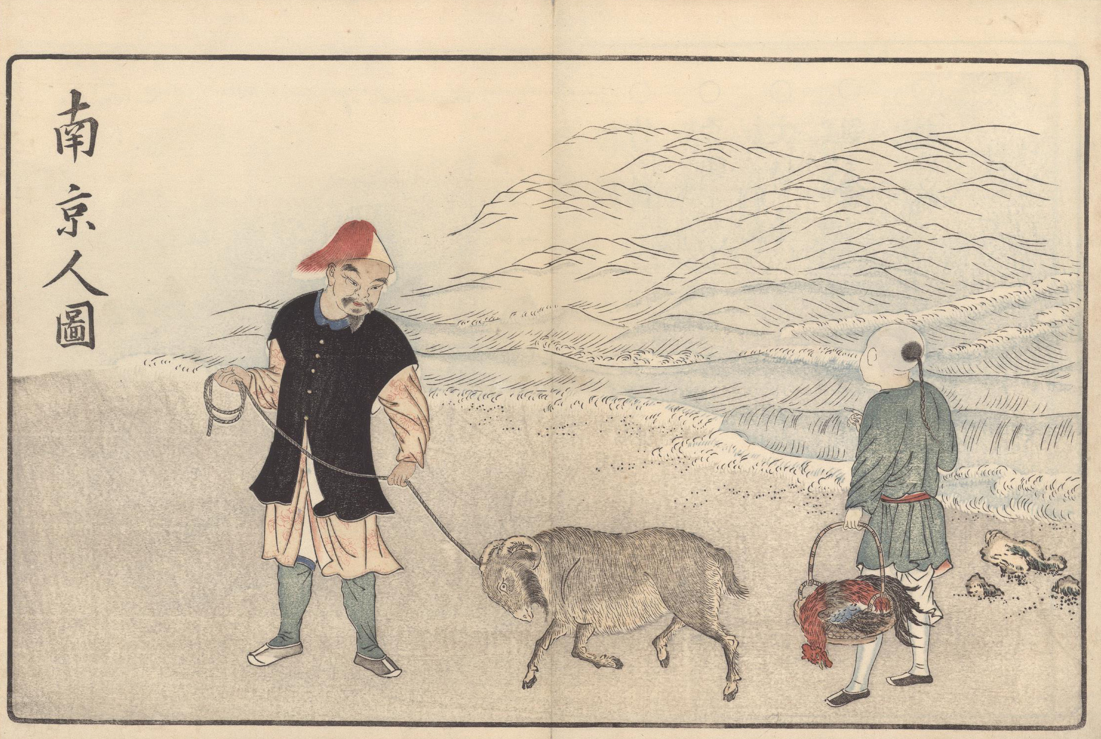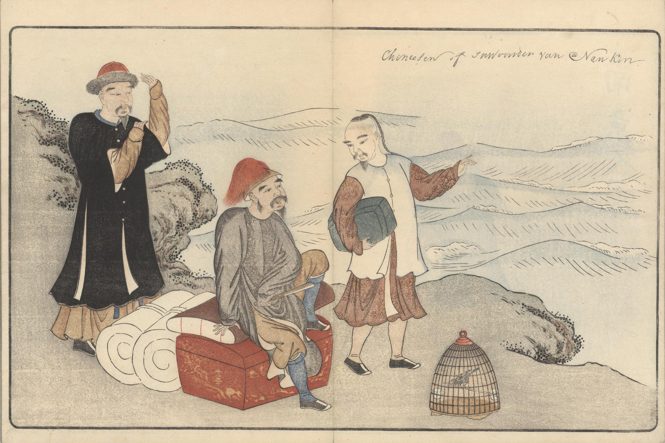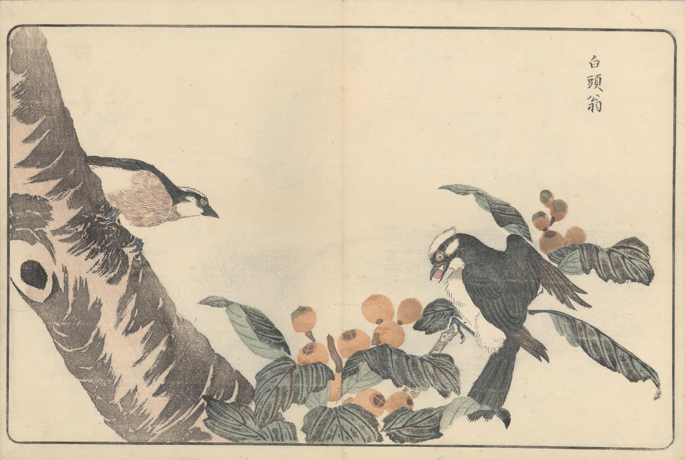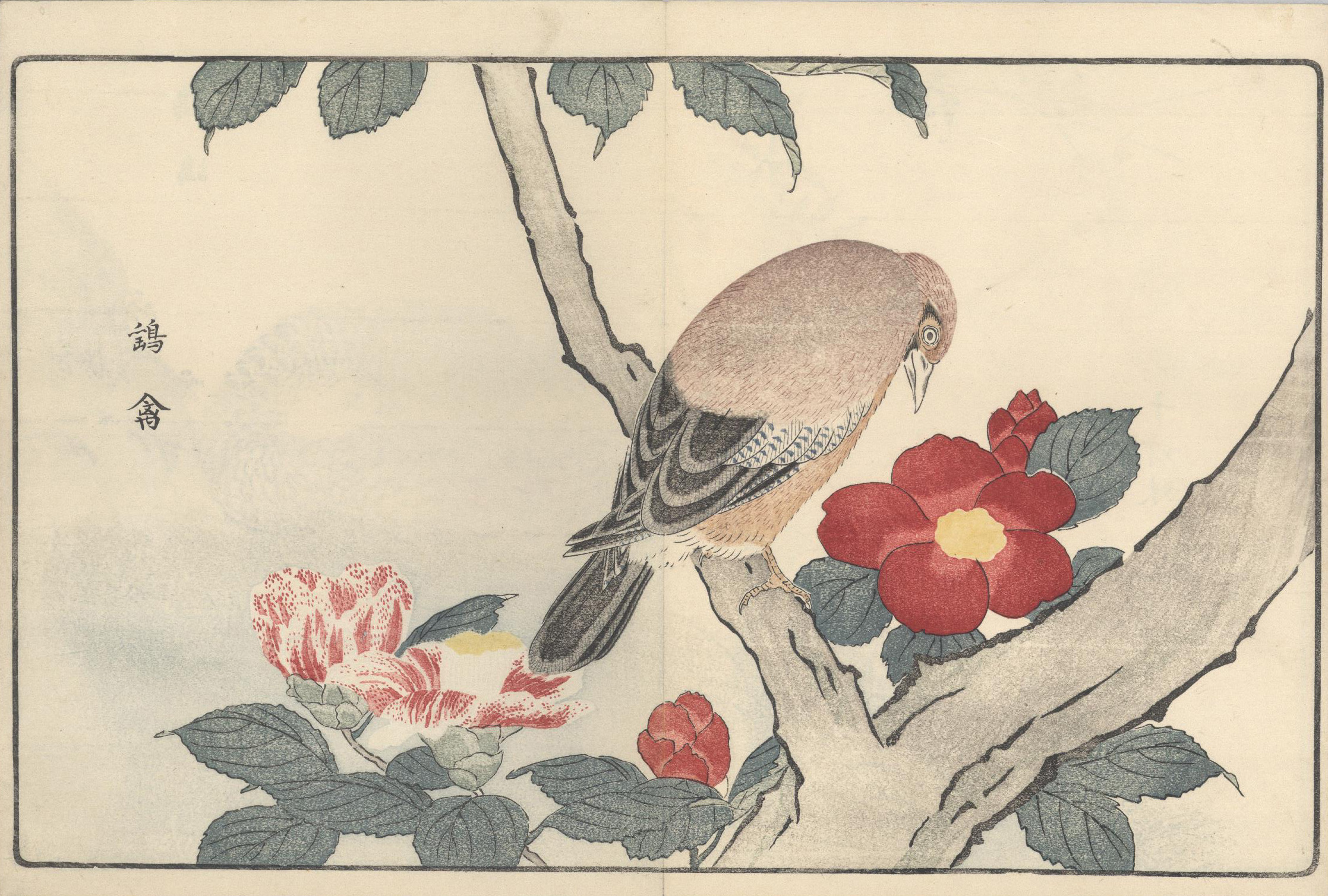
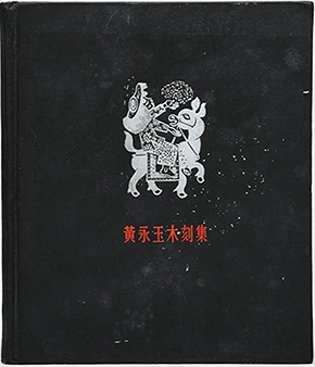
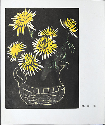
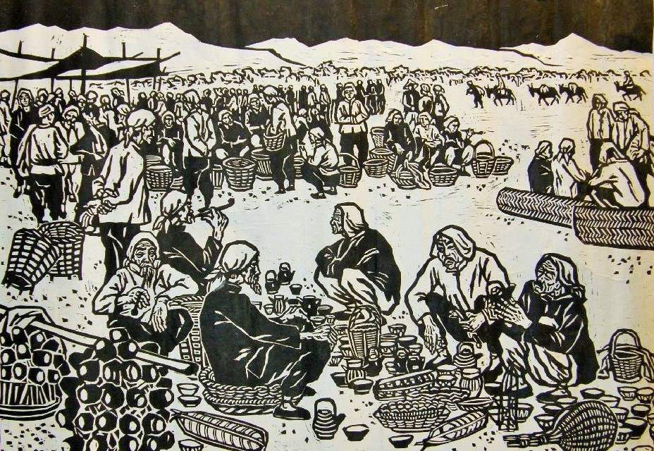
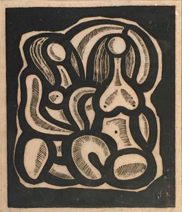
Marquand recently acquired an inscribed first edition copy of Huang Yongyu mu ke ji 黃永玉木刻集 , a survey of the best of Huang’s early printmaking work. Although Huang is perhaps best known internationally for later ink paintings of flora and fauna and especially for the controversy-stirring “Winking Owl” paintings of the 1970s, he focused early in his career (during the 1940s-50s) on woodblock printing. This collection showcases subjects typical of his oeuvre at the time: portraits, vignettes of village life, and animals, all influenced by the predominant socialist realism of the first decades of the PRC.

Huang Yongyu was born in 1924 in Changde, Hunan Province, but moved shortly thereafter with his parents to the scenic mountain area of Fenghuang County. Born with a rebellious temperament that he claimed came from his mother, an early member of the Chinese Communist Party, Huang was later sent to live with cousins in Xiamen. He still struggled with compulsory education, devoting himself instead to independent reading and wood carving. Something of a rabble-rouser, he soon left school altogether and set off for Dehua in Fujian Province to apprentice in a small porcelain workshop; in his early years he also worked as a painter in Quanzhou and sold portraits and paper cut images to make ends meet.
Anecdotes from his youth, spent eking out a living during the most turbulent years of the 1930s and 40s, attest to his lifelong tenacity, paired with wit and a wry sensibility. Like many Chinese artists who later worked in a variety of media, Huang cut his teeth on woodcuts during his early years; in the 1950s he ended up at the Chinese Academy of Fine Art (CAFA), serving as a faculty member in the School of Woodblock Art, studying with and teaching alongside the likes of Wu Zuoren 吴作人 (1908-1997) and Li Keran 李可染 (1907-1989).
After the founding of the People’s Republic of China in 1949, Czechoslovakia, as an eastern bloc country aligned with the USSR, was one of the first to recognize the PRC diplomatically. As a result, Czech students came to study in Beijing; Jaroslav Bejček (1926–1986), the recipient of the present volume, was one of these students. During his 5-year stay in Bejing, Bejček developed a close friendship with Huang, being close in age and interests. They were both part of the circle of prominent and rising artists that congregated in the Dayabao hutong in Bejing, a dormitory courtyard for CAFA staff and other art luminaries, including Lin Fengmian 林風眠 (1900-1991), Li Keran, and Qi Baishi 齊白石 (1864-1957).
In striking parallels to Huang, Bejček, grew up in a small scenic town, in Louka, Southern Moravia; his early training was at a state vocational school for ceramic arts. After working under Karel Svolinský, a prominent Czech painter, graphic artist, an illustrator at the Central Academy of Arts, Architecture, and Design in Prague, Bejček was sent to study graphics with Professor Li Chu from 1953 to 1957.
Bejček, who also met his wife, the Korean artist Ki Soon Lee, in Bejing during this period, achieved some acclaim while still in China; in 1957, his work was profiled in the paper Gongren Ribao 工人日報 (The Daily Worker), and he saw success in producing work inspired by the 1930s and its atmosphere of competing political ideologies, working in a wide array of 2- and 3-dimensional media.
He remained in close contact with the Chinese embassy, even with the cooling of Sino-Soviet relations from the late 1950s onward, and so fell somewhat from favor with official party circles back home. Exhibiting great versatility and energy throughout his life, Bejček continued to exhibit internationally, creating glass mosaics, bronze sculptures, paintings, ceramics, and illustrated books.
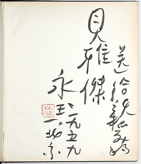
Inscribed “To my dear Bejček – Yongyu, Beijing, 1959,” Huang’s warm dedication represents a connection particularly interesting for researchers working on international artists’ collectives and informal societies, political alliances among artists, and international exchanges more generally, as well as those looking at Chinese artists transitioning from visual production with a strong ideological bent in the early years of the PRC to their more mature work.
To find this item in our catalog, click here.
Kim Wishart, Chinese Art Specialist