The work of Samuel Fosso, an acknowledged star of the contemporary art world, whose career spans five decades, was recently showcased in Samuel Fosso: Affirmative Acts, organized by the Princeton University Art Museum in collaboration with the Walther Collection and curated by Princeton University Professor Chika Okeke-Agulu with Silma Berrada, Lawrence Chamunorwa, Maia Julis, and Iheanyi Onwuegbucha.1 But the artist began his career as a photographer early, opening a portrait studio “Studio Photo Nationale” in Bangui, Central African Republic, at the age of just thirteen. Born in Cameroon in 1962, but raised in Nigeria, Fosso lost his mother early, and had been forced to flee his home in Afikpo for Central African Republic to escape the widespread violence of the Nigerian Civil War. Joining an uncle in Bangui, he began an apprenticeship with a local photographer but quickly branched out on his own.
Samuel Fosso, 70’s Lifestyle (1976-77), printed 2022, gelatin silver print Princeton University Art Museum purchase, Carl Otto von Kienbusch Jr Memorial Collection Fund
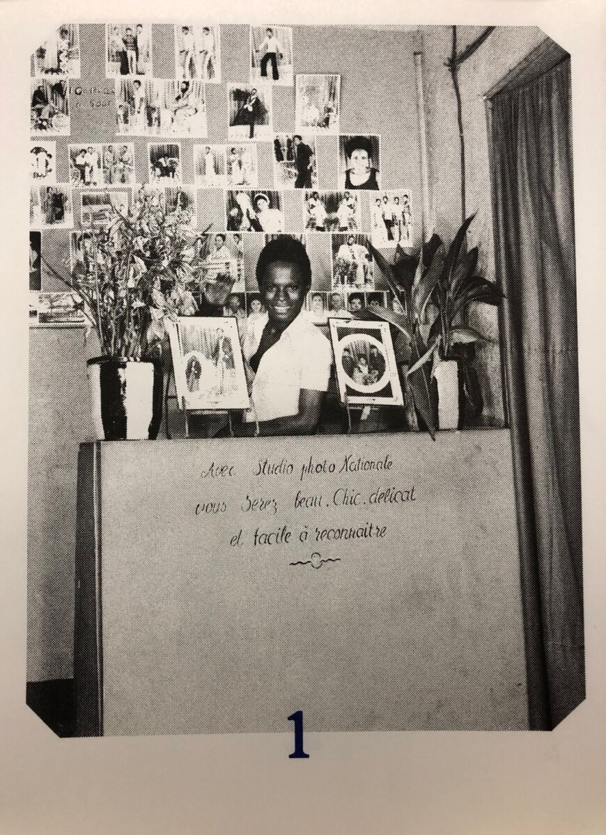
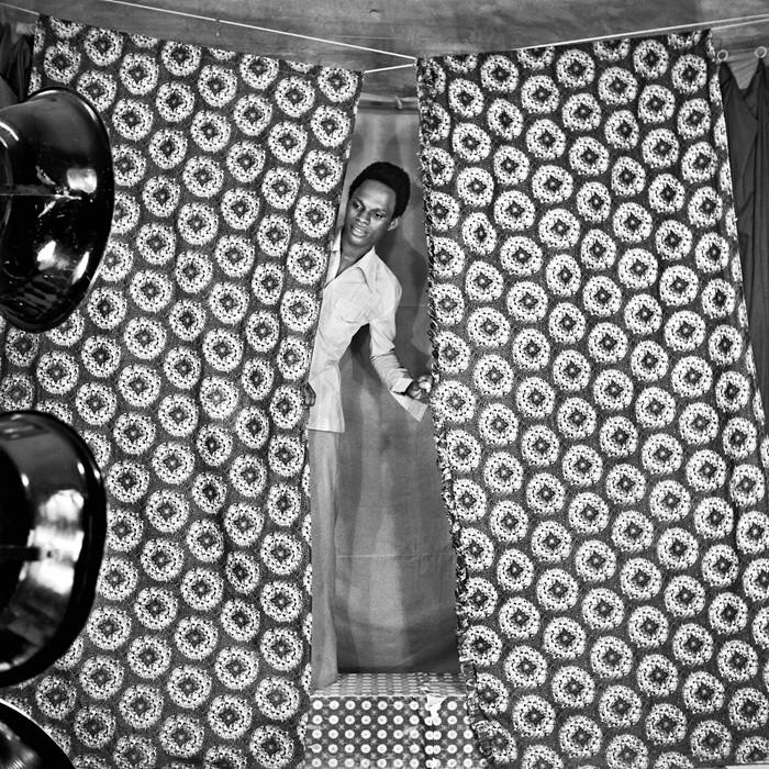
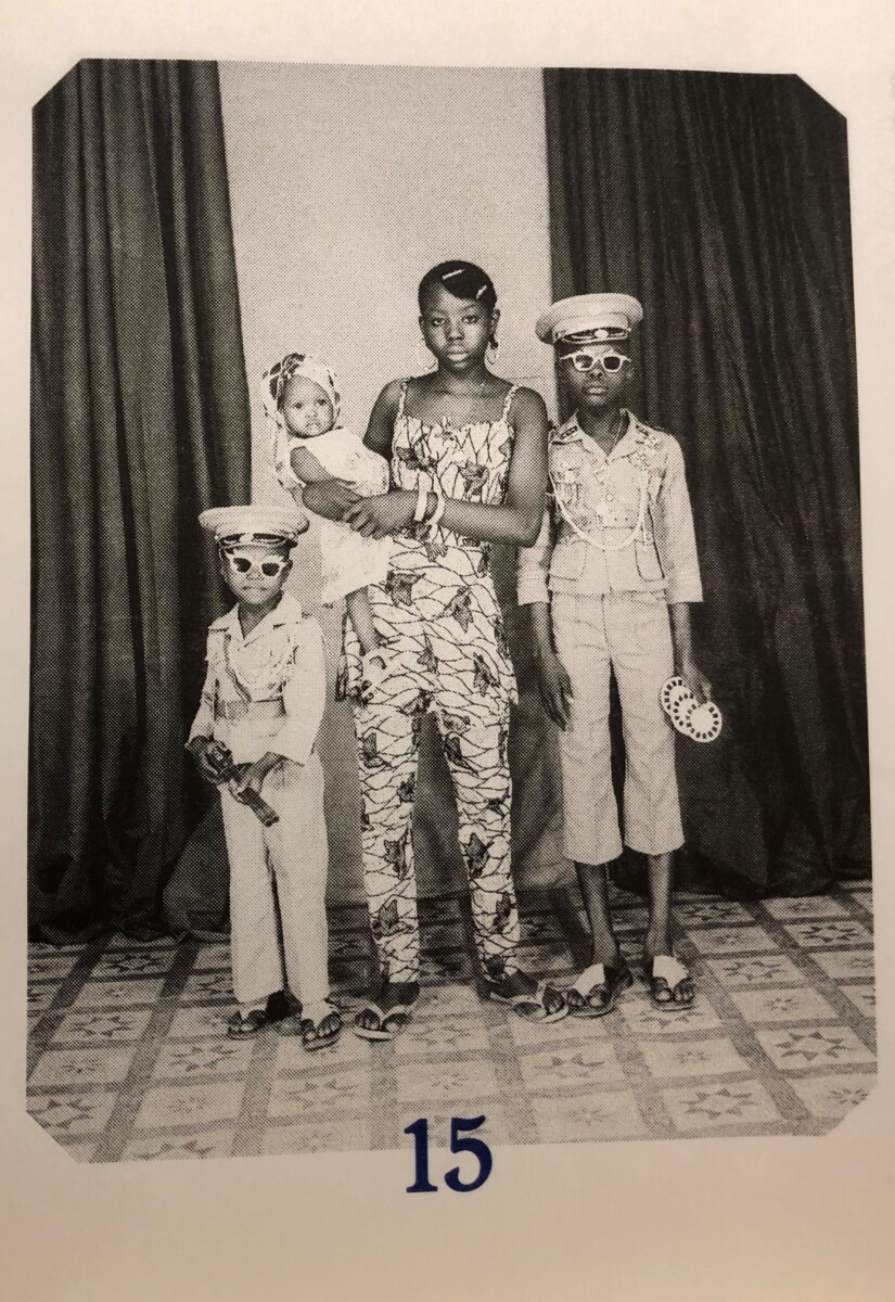
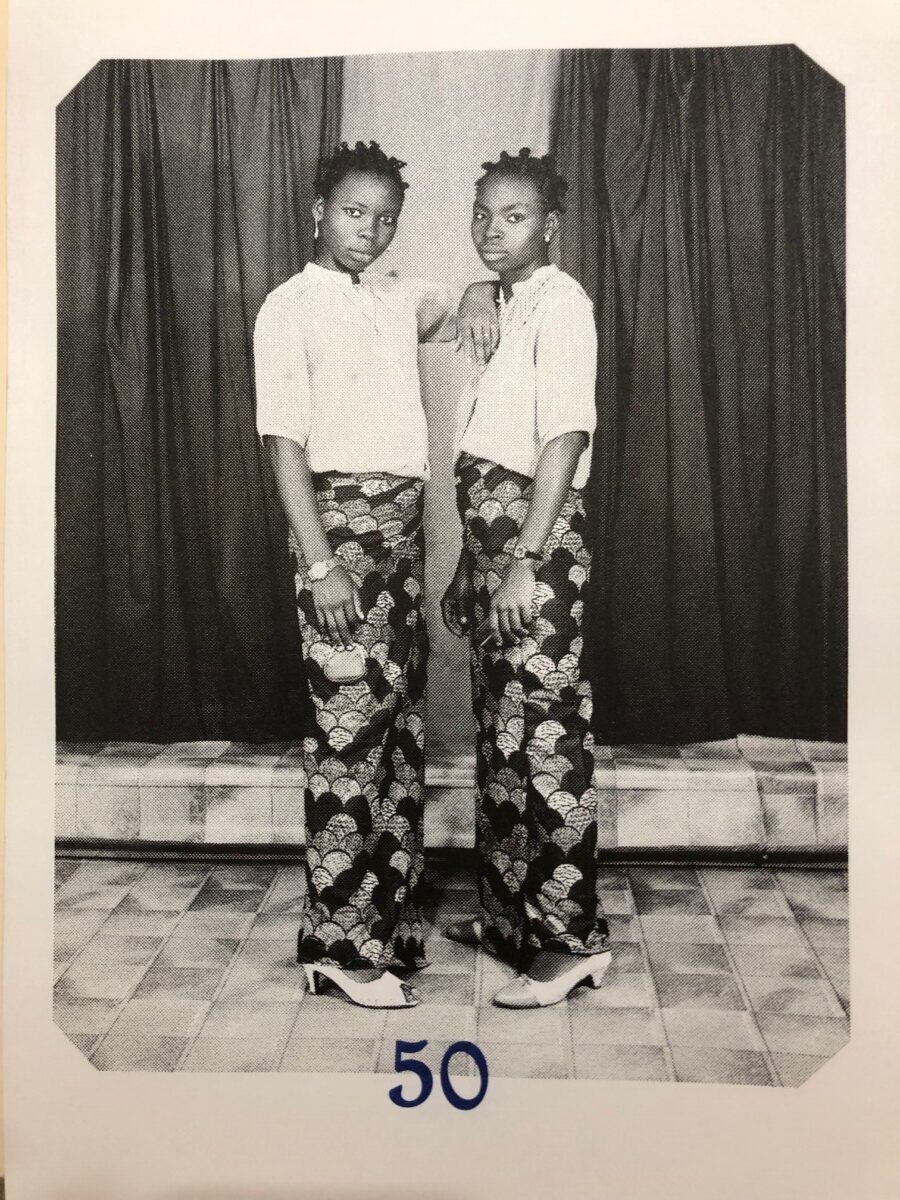
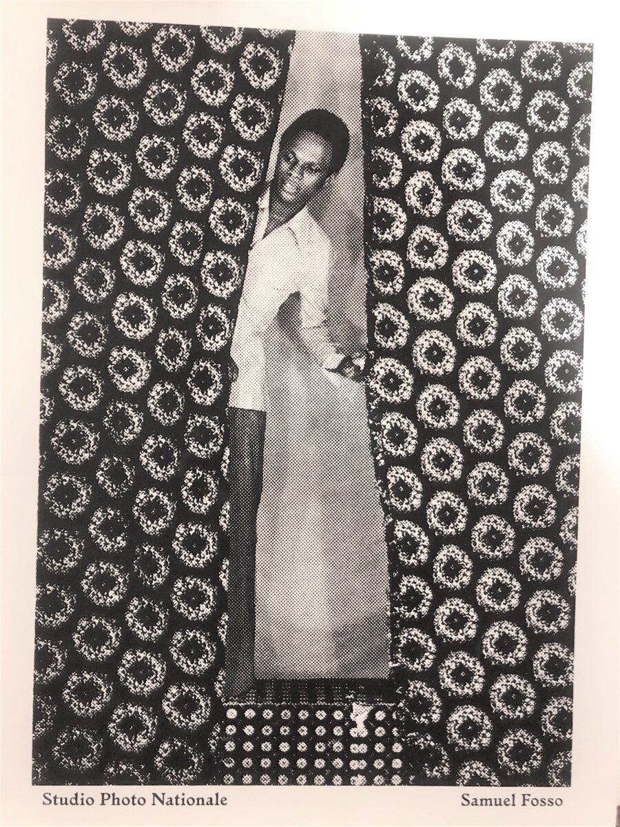
As the sign below the counter promised, in their Studio Photo Nationale portraits, Fosso’s clients would be “… beautiful. chic. refined and easy to recognize.” In between portrait sessions for clients, the teenager escaped the dangers and traumas of his life by creating his own world in the stylish and playful photographic self-portraits he made, dressed in the hipster fashions of the vibrant African music scene of the era, and posed against colorful patterned textiles and props in the photo studio. These photos were rendered even more striking in the black-and-white format that was the mainstay of his commercial business. In a photograph now in the collection of the PUAM, he reveals his process in the act of taking a self-portrait in the studio setup before editing out the lights and cropping the final composition. Fosso recounted that he sent some of these self-portraits to cheer up and reassure his grandmother, hundreds of miles away in Nigeria.
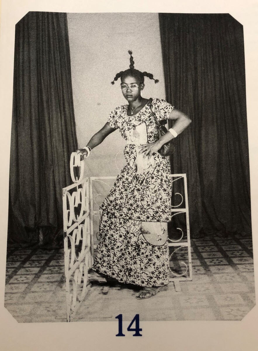
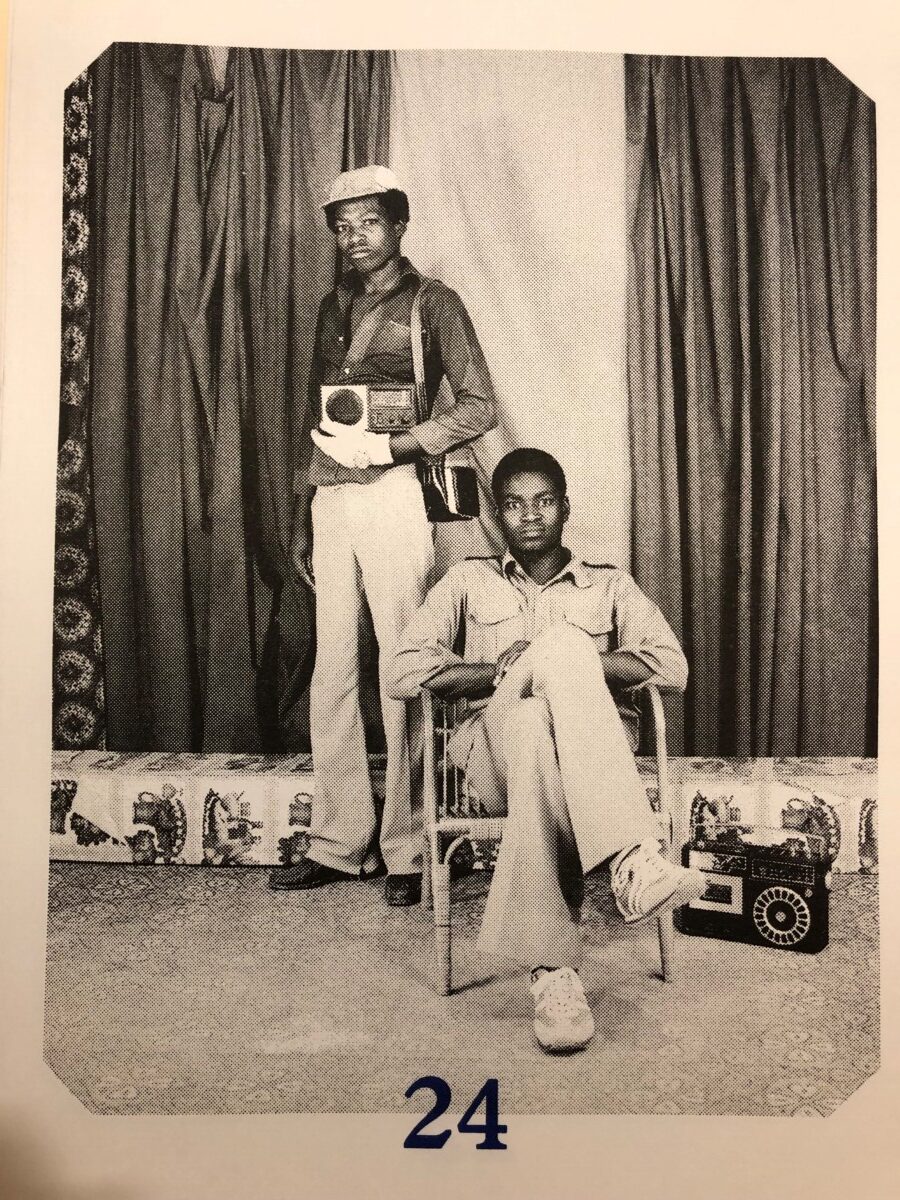
Samuel Fosso, Studio portrait photo, 1970s, Studio Photo Nationale (2021)
Samuel Fosso, Studio portrait photo, 1970s, Studio Photo Nationale (2021)
On his website, the artist notes that in this early period in Bangui, in addition to his admiration of the style of contemporary West African musicians, he was also “excited by the images of the African Americans and their sense of style” that he first saw in the magazines that young Peace Corps volunteers in Central African Republic brought with them.2 Thus began the evolution of Fosso’s ongoing series of inspired self-portraits, where the artist embraces the personas of others, both famous and fictive, to create narrative vignettes of his complex world view.
Samuel Fosso, Studio portrait photo, 1970s, Studio Photo Nationale (2021)
Samuel Fosso, Studio portrait photo, 1970s, Studio Photo Nationale (2021)
After almost twenty years of studio work, Fosso achieved international status as a participant in the first Rencontres de Bamako Photography in 1994 and has since led an increasingly cosmopolitan life, with studios in Nigeria and Paris and worldwide exhibitions of his work, which explores the intersection of photography, self portraiture, performance, and societal commentary.
Cover of Studio Photo Nationale (2021)
Studio Photo Nationale (2021), a recent purchase by Marquand Library, is already considered a “scarce” book — it is one of a run of only 500 copies. It celebrates the early portrait photographs produced in his Bangui studio, work that was almost completely lost. In 2014, Fosso’s home and studio there were attacked during a period of violent civil unrest in the region. Two photo journalists, Jerome Delay and Marcus Bleasdale, helped by Peter Bouckaert, Emergency Director of Human Rights Watch, managed to rescue Fosso’s archive of around 50,000 negatives and more than 150 prints from destruction and sent them to Fosso in Paris. The three steel trunks apparently remained closed until 2021, when Sébastien Girard edited a selection of them into the current format, a sampling of Fosso’s compelling early studio photographs from the 1970s-1980s.
Nicola Shilliam, Western Art History Bibliographer
Samuel Fosso: Affirmative Acts, on show at Art on Hulfish in Princeton, New Jersey from 19 November 2022-29 January 2023.
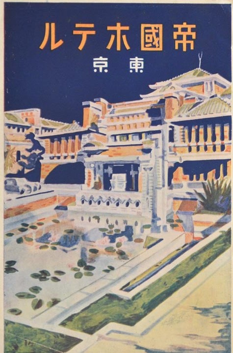
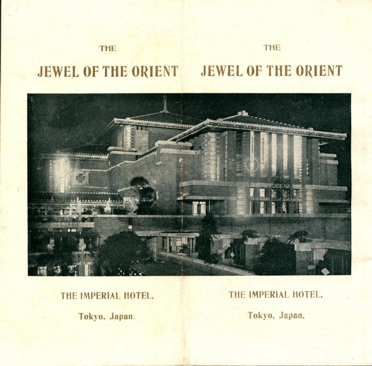
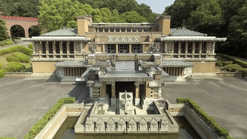
On September 1,1923, Frank Lloyd Wright’s legendary Imperial Hotel [Teikoku Hoteru] opened to the public for the first time. Located near the emperor’s palace in Tokyo, it was built by the Japanese government to house foreign visitors and guests of the imperial family. “The Jewel of the Orient,” as the hotel was billed, offered luxurious accommodations that were touted as being more suited to Western guests than its Japanese competitors.
The hotel achieved “legendary” status, not because of the reputation of its renowned architect, but for the circumstances surrounding its premiere. Just before noon of opening day, the Great Kanto Earthquake—at the time the most devastating natural disaster to have ever hit Japan—leveled the cities of Tokyo and Yokohama. Over 140,000 people were killed by the 7.9 magnitude quake and the resulting fires. The Imperial Hotel was damaged, but survived destruction—information that the Wright publicity machine quickly disseminated East and West. It led to the hotel achieving a kind of mythical status around the world.
Marquand Library’s comprehensive collection of works related to the famous architect Frank Lloyd Wright includes a number of extremely rare books dating from the early to mid-20th century that are associated with the construction, promotion and ultimate destruction of his Japanese hotel. Two of these publications are particularly significant in their documentation of the history of the building because they pre-date the fabled opening. They offer the modern scholar an historical context and contemporary perception of the hotel that no longer existed once attention was refocused on the innovative construction techniques that allowed the hotel to survive the earthquake.
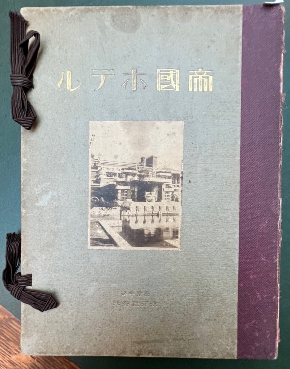
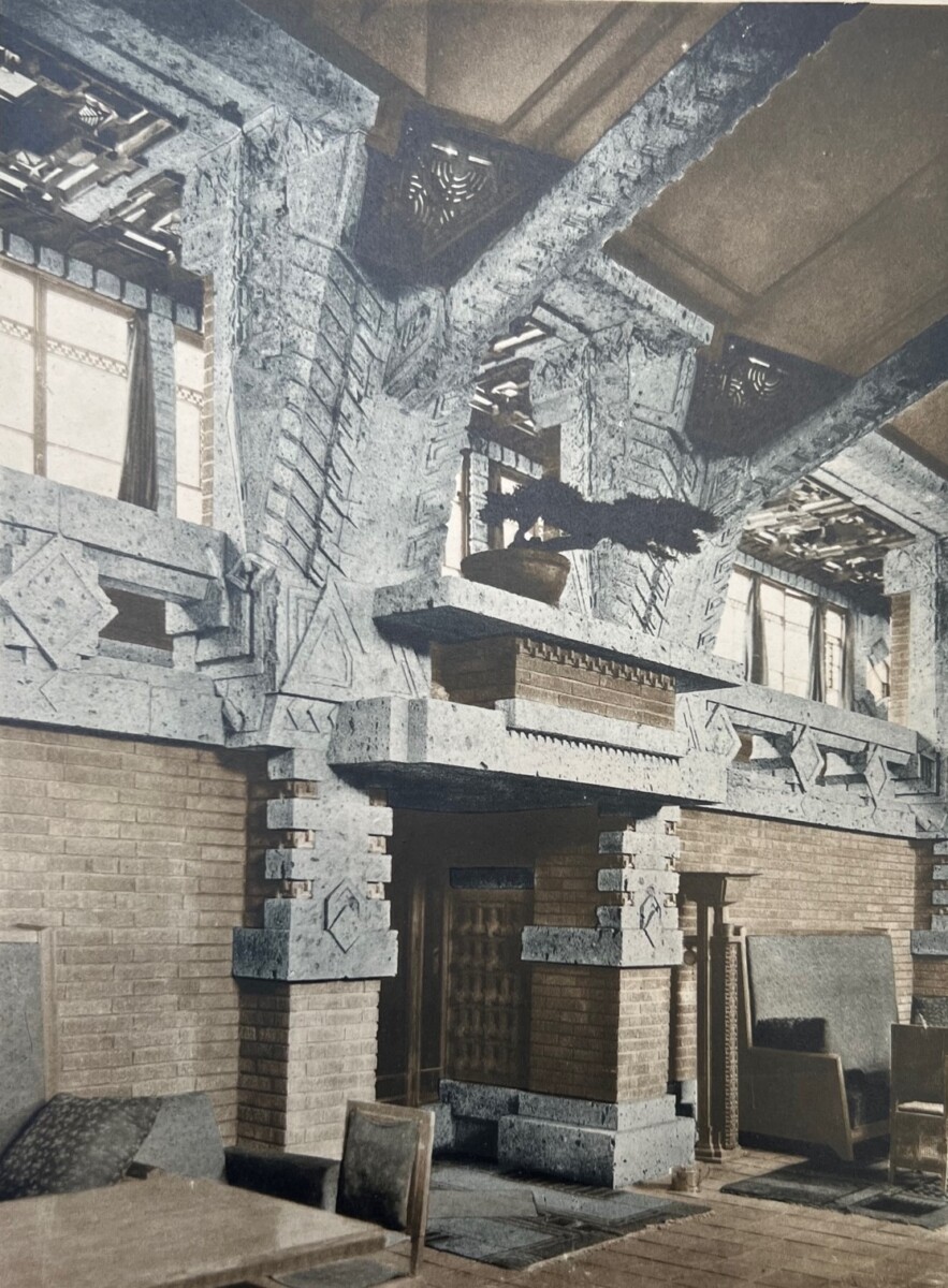
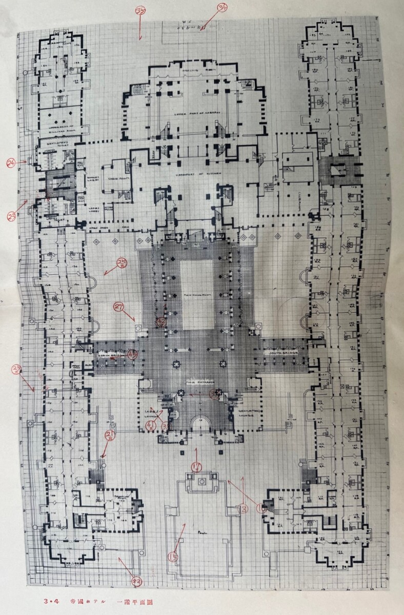
The first of these rare publications in the Marquand Collection is Teikoku Hoteru [The Imperial Hotel], published in August 1923, a month before the September opening. It is an expensively produced, comprehensive view of the hotel’s interior and exterior, featuring high quality photographs—some colorized—and detailed floor plans for each level of the building.
The floor plans include notations printed in red (but appearing to be hand-inscribed) that indicate the locations where each of the photos in the book was taken. This allowed/allows the viewer a true sense of the completed hotel. In his catalog essay on Wright’s own copy of this slender volume, which appeared in the 2017 Museum of Modern Art exhibition, Frank Lloyd Wright at 150: Unpacking the Archive, Ken Tadashi Oshima speculates that it was through this book that Wright (who had left Japan a year before the building was completed) was able to experience the fully realized Imperial Hotel. (61)
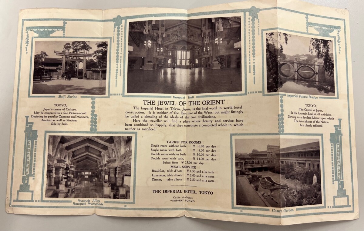
Front and Back Covers of the prospectus/brochure for the Imperial Hotel, which had to be unfolded like thisto be opened and read. (Tokyo: Tokyo Printing Company, 1923)
Also published in August 1923 was an English-language prospectus in booklet form, The Jewel of the Orient: The Imperial Hotel, Tokyo, which highlighted the grandeur and modern guest-related features of Japan’s new tourist destination. Today the ‘cutting edge’ amenities described seem quaint, but today, give us a real sense of period. In its 28 illustrated pages, for example, the brochure describes the luxuriously appointed public and private rooms, the arcade full of shops, the modern laundry, the ice-making plant, the roof garden, the aquarium for shellfish in the kitchen and, of course, the hotel’s ice cream-making machine! The Imperial Hotel also had its own orchestra, a theatre that sat 775 people, and an 8,000 square foot kitchen that was able to serve ‘the finest’ meals to 3,600 guests at a time. There was also a water distillation plant so that, as the brochure promises, “not a single drop of drinking water” would be served that had “not been distilled, thus ensuring its purity and immunity from disease bearing bacilli.”(23) In addition, they employed twelve men to man the four large automatic burnishing machines for the hotel silver and had a dishwashing machine so large that it could wash and dry 5,600 dishes an hour.
Dishwasher at the Imperial Hotel
The “sales pitch” begins in the first opening of the brochure (see below), where the Imperial Hotel is advertised as setting architectural precedent in terms of form and function; it was a “blending of the ideas of the two civilizations”—a “symphony in brick and stone.” It continues with an almost comedic turn, advertising the hotel’s luxuriousness by bemoaning the unabandoned extravagance with which it was constructed:
Much has been written and much has been said about the new Imperial Hotel in Tokyo, Japan. Hard-headed businessmen who estimate all things in dollars and cents look upon it as a folly…The costly rugs scattered everywhere throughout the hotel for the thousands to tramp over daily are described as wanton extravagance. The apparent indifference of the management to the cost of hammered copper, glass, gorgeous upholsteringsand the like, all bring down the wrath of the dividend seeker on the heads ofthe directors who approved of the structure, the architect who conceived anddesigned it and the builders who dared to construct it. To them the ImperialHotel is a masterpiece of folly, a source of never ending expense and a casewhere pride took the bridle in its teeth and ran away with judgement andcommon sense.
Later in the booklet, Wright, himself, provides historical pedigree, boasting that the hotel is the “first important protest against the Gargantuan waste adopted by Japan from old German precedents.” It is, he continued, “a conservation of space, energy, and time…”
ca. 1935 Brochure
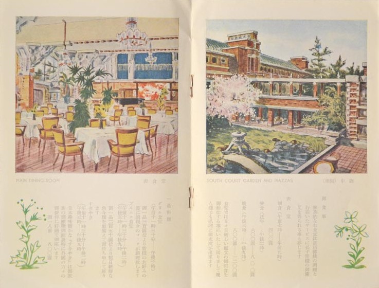
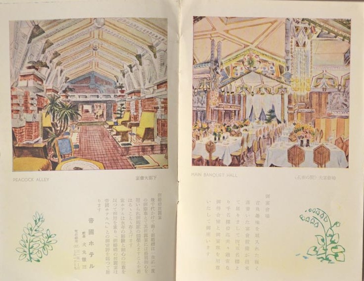
Recently, Marquand acquired two additional Imperial Hotel brochures that offer a view of the hotel’s “packaging” across the span of its lifetime. The first, dated ca. 1935, is written in Japanese with English captions. The beautiful printed illustrations appear to have had their origins in original paintings of the hotel.
Pages from the 1935 brochure, featuring the “Main Dining Hall,” the “South Court Garden,” “Peacock Alley,” and the “Main Banquet Hall.”
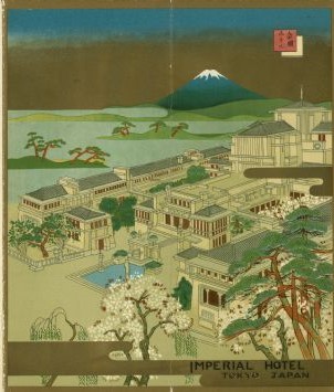
The second brochure, dating from ca. 1957 (34 years after the hotel’s opening and ten years before its demise) continues to advertise the grandeur of the setting, now incorporating a view of the famous Mt. Fuji on the horizon:
ca. 1957 Brochure
It is the acquisition of ephemeral publications like Jewel of the Orient and the later Imperial Hotel brochures that allow Marquand Library to provide the modern scholar with unique insights into the historical context of a significant architectural monument and the period in which it was built.
In studying the context of Wright’s Imperial Hotel, it is enlightening to compare its promotional material with that of its predecessor, the first Imperial Hotel, which opened to foreign businessmen and tourists on the same site thirty-three years earlier. An advertisement, featuring a drawing of the original—a neo-Baroque, French Second Empire-style structure—appears in an 1890 publication in the Marquand Collection entitled, Imperial Hotel: Guidebook and Map (published by the “Box of Curious” Printing Office, Tokyo). The 1890 structure was actually the first Western-style hotel built in Japan and, like its successor, offered luxurious lodging and the amenities that foreign visitors would expect. By 1911, however, the hotel could no longer accommodate the growing influx of Western guests, so plans were made to build a larger, more modern structure. Frank Lloyd Wright was tapped for the job, but it would be twelve years (more than four years behind schedule and over two million dollars over budget) before his new Imperial Hotel would be completed.
Advertisement for the original Imperial Hotel from an 1890 Tokyo guidebook.
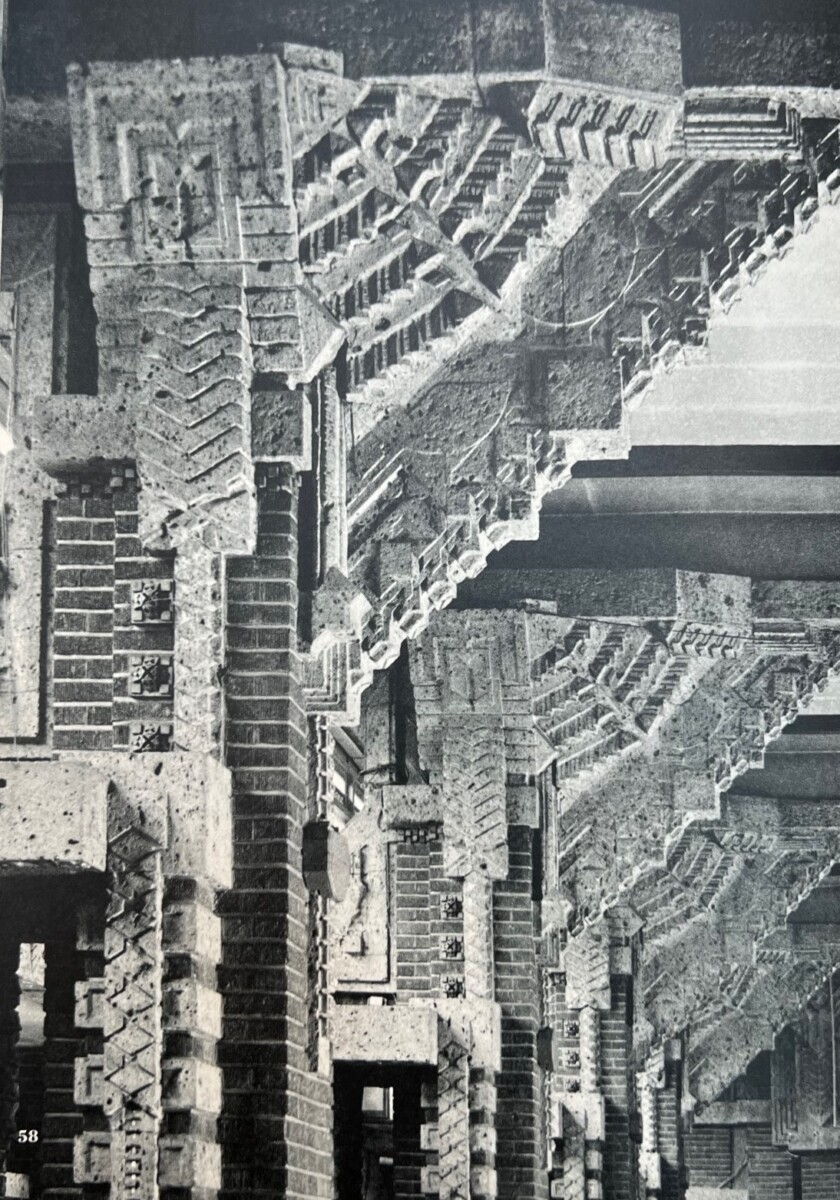
Frank Lloyd Wright’s Imperial Hotel was architecturally striking, faced with golden brick and local Ōya stone, an igneous rock that was easily carved and perfect for the building’s decorative elements. Although the building style, at the time, was deemed “Mayan Revival,” because of its “Mexican and Central American” decorative elements (seen here), Japanese art and architecture were clearly the inspiration for Wright’s design for the new Imperial Hotel.
Actually, Wright was already deeply immersed in the art of Japan when he received the commission. Though not well known, over his lifetime, Frank Lloyd Wright made more money as a Japanese woodblock print dealer than as an architect. He himself had a staggering collection of Japanese prints, paintings, ceramics and textiles. It would therefore not be surprising that these works would have been a source of inspiration for the architect. However, controversy about the influence that Japanese art and architecture had on Wright has always existed. The dispute lies in the fact that, despite clear evidence to the contrary, Wright often rejected the idea. He addressed the issue on several occasions throughout his career. Examples include:
Do not accuse me of trying to adapt Japanese forms…THAT IS A FALSE ACCUSATION AND AGAINST MY VERY RELIGION.
[1911 letter to Charles Ashbee]
…I found in Japan, not the inspiration everyone thinks I found…Whathappened to me was a great confirmation of the feeling I had and workthat I had myself done before I got there.
[1956 recording of a lecture by Wright]
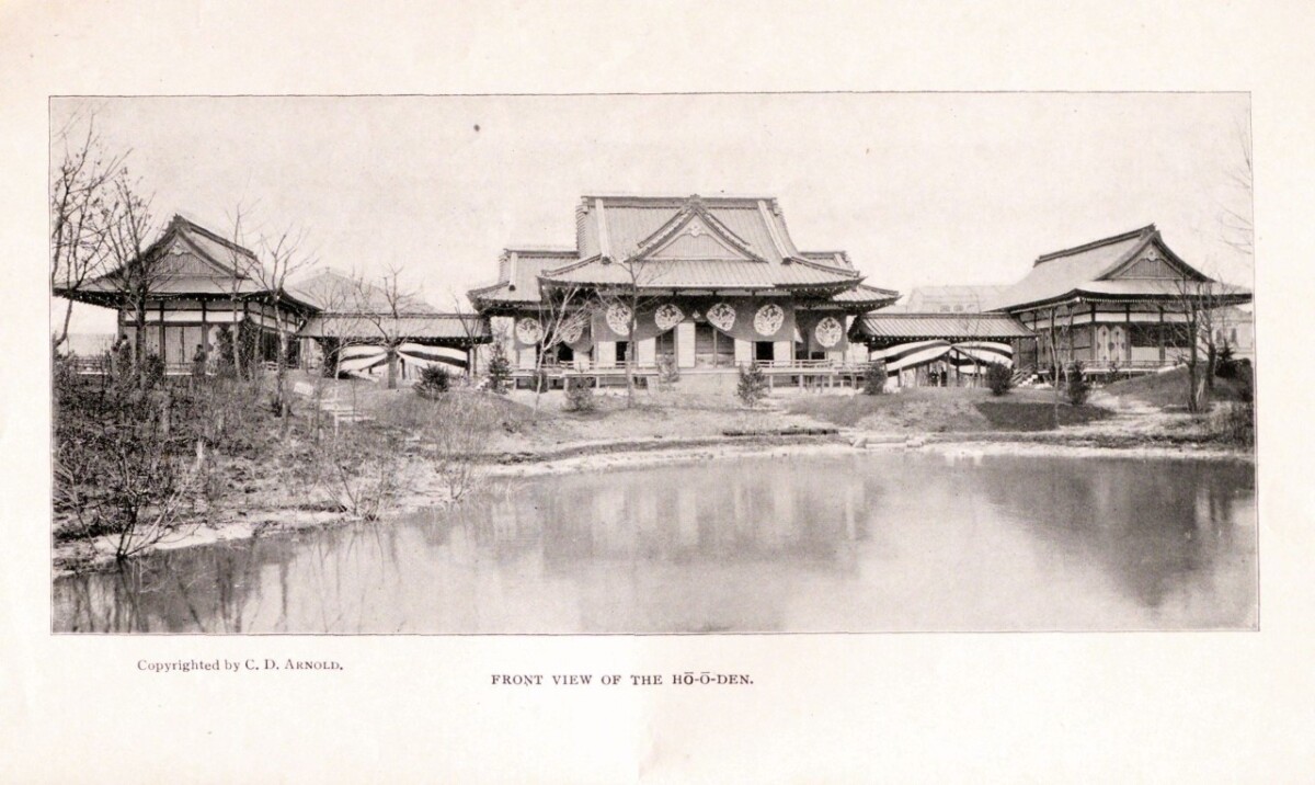
Despite Wright’s protestations, the Imperial Hotel was unquestionably inspired by Japanese architecture, or, to put it more bluntly: its structure and design are clearly derived from the Japanese Exhibition Hall at the center of the World’s Columbian Exposition that took place in Chicago (where Wright lived and worked) in 1893. It was a building with which Wright was very familiar:
Japanese Exhibition Hall at the 1893 Chicago Exposition [From, Okakura Kakudzo, The Hō-ō-den:Phoenix Hall (Tokyo: K. Ogawa, 1893)]
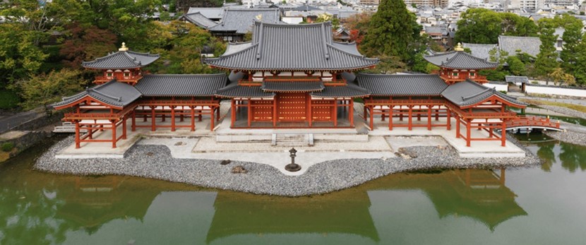
The exhibition hall itself was a modern interpretation of what is still considered one of the hallmarks of Japanese architecture, the 11th-century Phoenix Hall of the Byōdōin Temple.
Phoenix Hall of the Byōdōin Temple, Japan
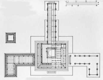
Plan (aerial view) of the Phoenix Hall, Japan
Built in 1052, the Phoenix Hall near Kyoto, Japan was a physical manifestation of the palace depicted in Buddhist paintings of paradise. There is a central square two-story edifice with identical wings of two-story-high colonnades, that stretch out from either side and then come forward at right angles. A corridor or “tail” is attached to the back of the hall, creating the overall aerial appearance of a phoenix in flight. There is a lotus pond in front of the building, which is integral to its design and purpose as a place to worship the Amitabha Buddha.
The Japanese pavilion at the 1893 exposition, designed by Japanese architect Masamichi Kuru, was modeled after the Phoenix Hall, one of his country’s most significant architectural treasures. He recreated the same central square structure with wings of the 11th century building, although the purely decorative colonnaded wings of the original now became functional interior space to house the Japanese treasures on display at the exposition. In homage, Masamichi also called his building “Phoenix Hall” or “Ho-o-den.”
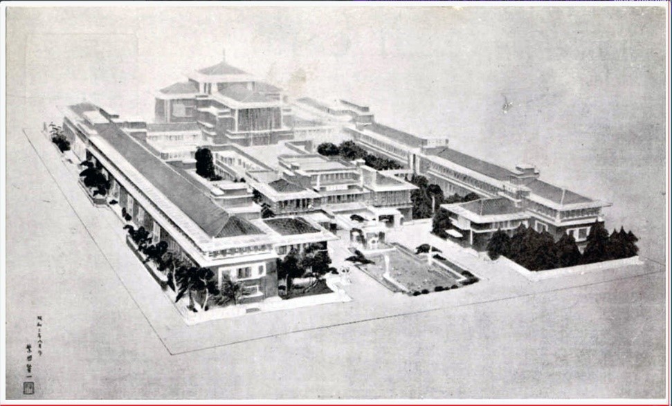
Imperial Hotel [Final drawing by F. Lloyd Wright] (ca. 1915), showing a greatly exaggerated central structure and elongated wing extensions.
As can be seen in the photo of Wright’s final drawing of the building, the Imperial Hotel is based on this same model. It is no secret that Wright had intimate knowledge of the Chicago Phoenix Hall. He had been hired to work on the Exposition’s Transportation Building and is known to have visited the construction site daily to view the Japanese craftsmen constructing the hall from the ground up. In addition, the pre-Exposition hype included a feature in the Chicago journal, Inland Architect (December 1892), which included complete and detailed architectural drawings of the Masamichi’s Japanese pavilion. The article created such a buzz in Chicago that over 10,000 people a day were visiting the construction site to see the creation of this wonderful gift from the Meiji Emperor. It is therefore unlikely that Wright did not know about or have access to these detailed plans. The access and drawings provided Frank Lloyd Wright with both a model for the Imperial Hotel and, more importantly, with his overall approach to architectural design. His hotel, however, needed to be much larger than either a small Buddhist hall or exposition pavilion. Wright therefore enlarged the cruciform plan of the earlier structures by adding a second central building attached by a “tail” corridor (like the one seen in the original Phoenix Hall). The wing extensions were also expanded and are attached to both central buildings. To reproduce the landscaping of the original Phoenix Hall, which Wright visited during the years he lived in Japan, the architect located a lotus pond at the entrance to the hotel.
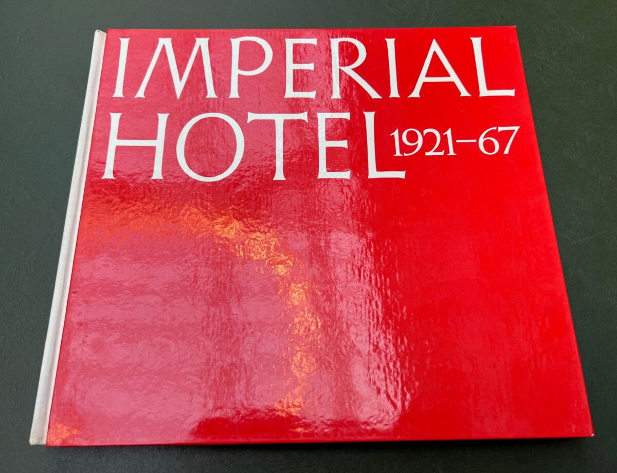
Watanabe Yoshi,The Imperial Hotel 1921-1967. Tokyo: Kajima Kenkyūsho Shuppankai, 1968
In 1967, the Imperial Hotel was torn down. Damage done by the earthquake forty-five years earlier had caused the building to sink and become unstable over time. A collection of photographs taken just before and during the building’s destruction is to be found in another book in Marquand’s collection: The Imperial Hotel 1921-1967, by Watanabe Yoshi (1968). It is a visual record of the architectural details of the carcass of Frank Lloyd Wright’s once imposing structure. Because of the historic significance of Wright’s Imperial Hotel, however, the entrance, lobby and lotus pond were rescued and moved to the Meiji-Mura Museum in Aichi prefecture—a park opened in 1965 to preserve important Japanese buildings from the late 19th and early 20th centuries.
(Today) Entrance and lobby of the Imperial Hotel at the Meiji-Mura Museum
[1] Since publishing, lori Hamada from Hotel Operations Management, Public Relations at the Imperial Hotel informed me that “the suite was actually opened in 2005 and was mostly only available to heads of state. Since we wanted guests to experience the Wright’s legacy we decided to open the doors to the general public this year only since it is the 100th anniversary.”
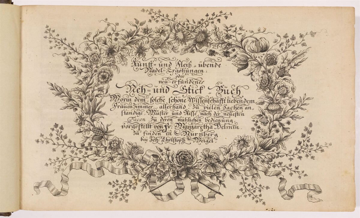
Kunst- und Fleiss-übende Nadel-Ergötzungen: oder neu-erfundenes Neh- und Stick-Buch [The Delights of the Art and Industry of the Practising Needle or the Newly-Invented Sewing and Embroidery Book], an early eighteenth-century German pattern book, was recently acquired by Marquand Library with generous support from other areas in PUL, including Rare Books, Graphic Arts, Gender & Sexuality Studies, and History. This collaborative acquisition reflects the insights into many areas of common interest that this publication provides. One of just a handful of surviving copies, this book is the work of Margaretha Helmin (Helm) (1659-1742). Born Margaretha Mainberger, she was a professional embroiderer, teacher, and copper plate engraver working in Nuremberg. Princeton’s copy, consisting of 3 parts with separate title pages, here bound together, probably dates to between 1742-1746.1
Title page of first part of Margaretha Helmin, Kunst- und Fleiss-übende Nadel-Ergötzungen; oder, neuerfundenes Neh- und Stick-Buch…. Nuremberg: Johann Christoph Weigel [nd, ca. 1720s?-1746?]
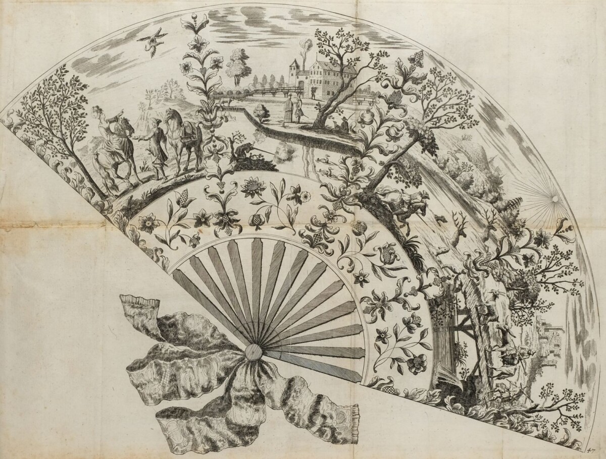
Printed pattern books and individual sheets of printed designs for embroidery, needlework, and lace, published in Europe since the sixteenth century, were used by both amateur embroiderers and profession workers, whose ranks included many men in the earlier period. The patterns could be used in various way — the outlines of designs could be pricked to create tiny holes through which charcoal dust was blown to transfer marks directly onto the fabric, or translucent (oiled) paper could be laid on top of the print for tracing from the original, or the prints could be copied by hand by those skilled at drawing. Many of these books and sheets were gradually destroyed by repeated use or were superseded by new designs. But embroidery patterns often survived the changes in fashion by being modified and reprinted for decades, as is the case with Margaretha Helmin’s designs. Some were her own invention but others derived from earlier publications.
Margaretha Helmin: Title page of Part 2: “Forgesetzter Kunst- und fleiss-übende Nadel- auch Laden-Gewirck-Ergötzungen…[Further Delights of the Art and Industry of the Practising Needle and Loom…]
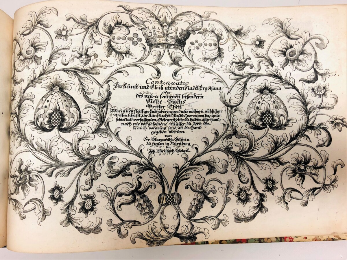
Margaretha Helmin: Title page of Part 3: “Continuatio der Kunst- und Fleiss-übende Nadel-Ergötzungen; und….[Continuation of the Delights…]
Although this type of pattern book was often addressed to female readers, only a handful have been credited to female designers/authors, most notably Isabella Catanea Parasole’s Specchio delle virtuose donne (Rome, 1595). By the eighteenth century, the number of such books increased greatly, but women authors were still underrepresented. A published record of more than 300 notable artists and craftspeople working in Nuremberg in 1730 noted only 12 women, including Magdalena Fürst(in) “drawer and painter” and Amalia Pachelblin (1688-1723), a pattern drawer, flower painter, copperplate engraver, and embroiderer. Rosina Helena Fürst (1642-1709), the sister of Magdalena, also published a needlework pattern book in Nuremberg: Das Neue Modelbuch… (ca. 1660), republished in 1728 by Johann Christoph Weigel’s widow. In G.A. Will’s 1758 dictionary of notable men and women in Nuremberg, Helmin was finally mentioned as a teacher and publisher of embroidery designs, though she was probably active in this field since possibly the 1680s, when she would have been in her early twenties.2 The standing of all three women in their professions was sufficient to merit being included in records made after their deaths. Nuremberg, a thriving commercial city, famous for its printmaking and publishing, at least offered a network of contacts for such endeavors.
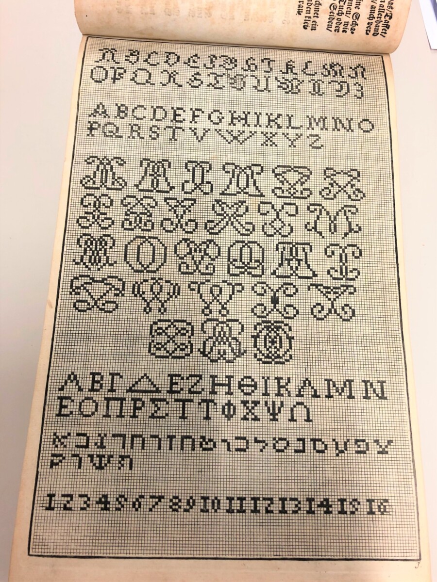
Margaretha Helmin: Design for embroidered alphabets and numbers
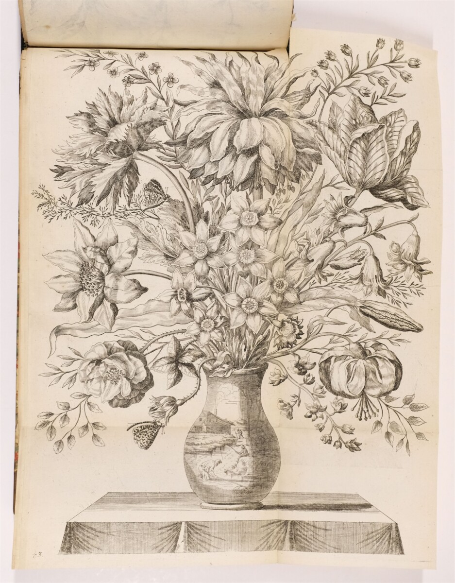
Margaretha Helmin: Embroidery design for a vase of flowers
Helmin’s book, with 154 plates, some double-paged, many with multiple designs on each page, provided a wide variety of patterns that would have been used by both amateur and professionals. A page of alphabets would have been useful for young women to learn basic marking/initialing of their household linens for inventories and laundry, or for making samplers to practice their stitches, if they had more leisure time. But most of the designs, such as the intricate vase of flowers and embroidered pictorial fan illustrated here, were much more advanced and required a higher level of skill with the needle. Other plates offered sections of ornament that could be repeated to decorate a variety of interior furnishing, including covers and cushions. The second part also included designs that were also suitable for weaving patterns.
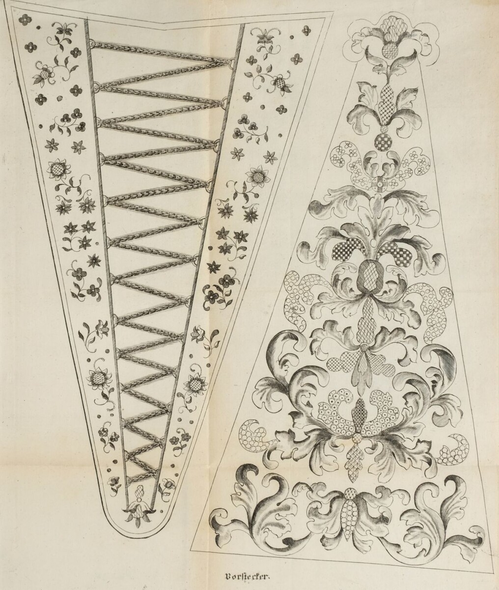
Margaretha Helmin: Designs for embroidered stomachers
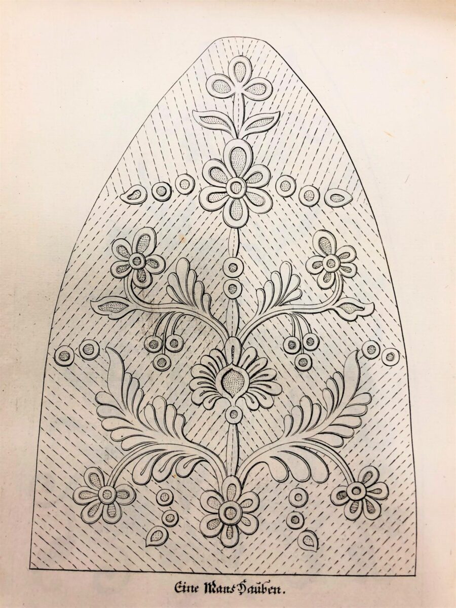
Margaretha Helmin: Design for a man’s whitework cap (one panel)
Examples of surviving textiles, sometimes including embroidered dates, and surviving garments with similar designs in museum collections help to provide closer dating for some of Helmin’s patterns. Items of clothing, such as jackets, and costume accessories, such as stomachers, caps, gloves, fans tended to survive as keepsakes, and some examples compare closely with the prints.
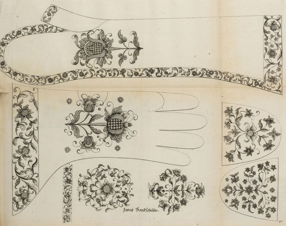
Margaretha Helmin. Embroidery pattern for gloves
The pattern above shows designs for a gloves for both women and men. Luxurious gloves were popular New Year’s gifts in the early modern period. Queen Elizabeth I of England received and gave many gifts of elaborately ornamented and perfumed gloves (sometimes containing gold coins) during these celebrations. If you managed to read to the end of this post, all in Marquand Library wish you ReMarquable holidays and a happy and healthy New Year!
Nicola Shilliam, Western Art History Bibliographer
In the forward to part 2 of Princeton’s copy, there is a reference to Adam Helm, Helmin’s husband, as cantor of St. Egidien in Nuremberg, a position he only held from 1742 until his death in 1746. Johan Christoph Weigel the Younger may have reprinted or republished older stock of parts of Margaretha Helmin’s work, possibly published by his father Johann Christoph Weigel the Elder, who died in 1725. The parts were published as needed, which may account for the lack of assigned dates.
For much more on this topic, please see: Moira Thunder, “Deserving Attention: Margaretha Helm’s Designs for Embroidery in the Eighteenth Century,” Journal for Design History (2010) vol. 23, no. 4: 409-427.
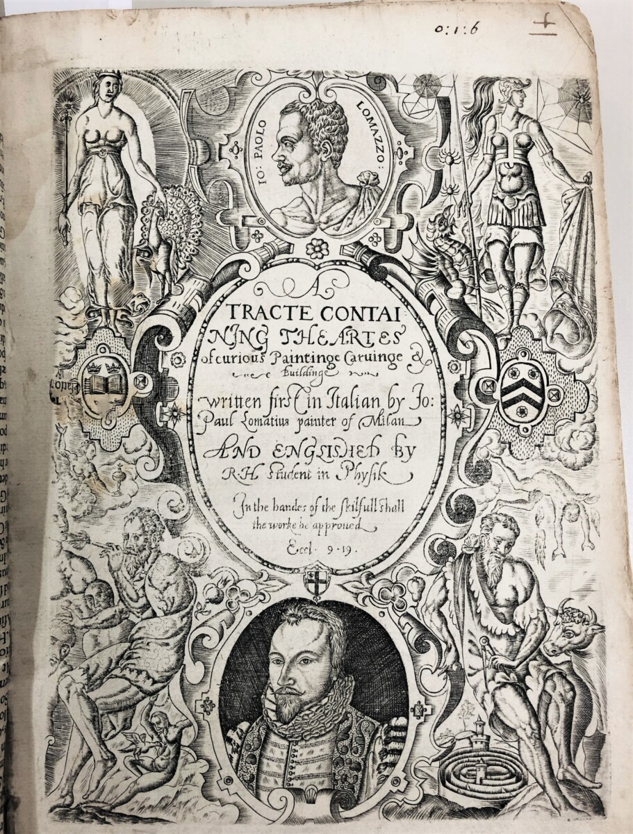
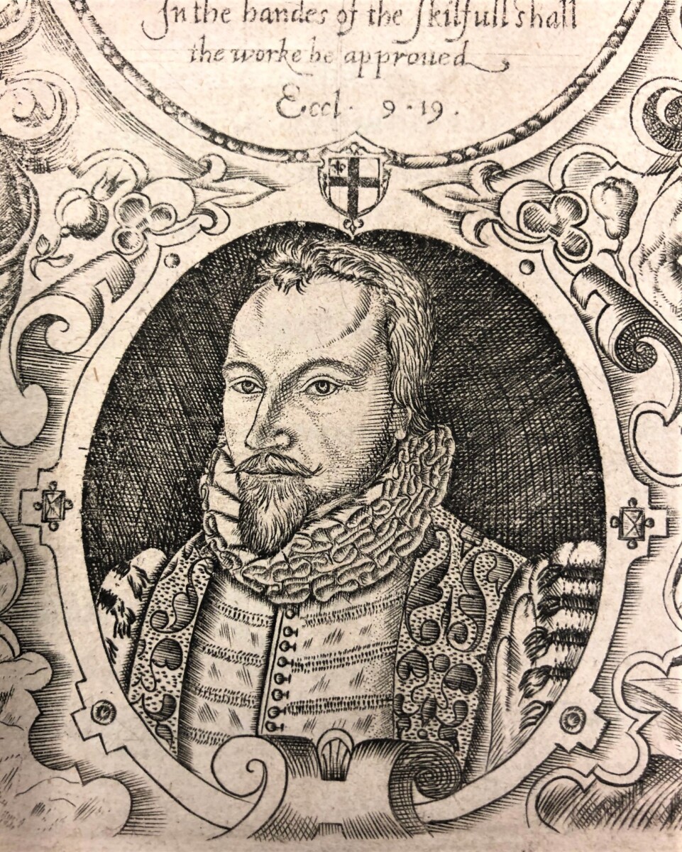
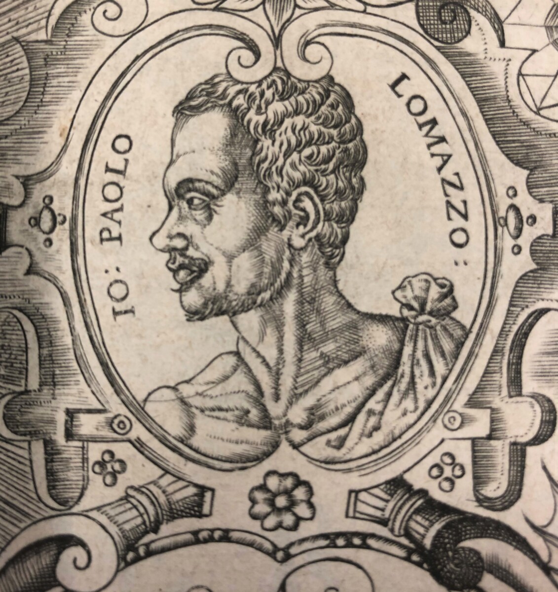
When Richard Haydocke’s translation of Giovanni Paolo Lomazzo’s Trattato dell’arte della pittura… was published in 1598, England was regarded as a backwater of the European art world. Though the Tudor monarchs had begun to develop their patronage of artists to bolster the prestige of the English crown as it played a greater role in European politics and the wider world, there were few publications in English to support the training of artists or cultivate the taste of their patrons.
Richard Haydocke: engraved self portrait (ca. 1598)
Richard Haydocke: engraved portrait of Giovanni Paolo Lomazzo (ca. 1598)
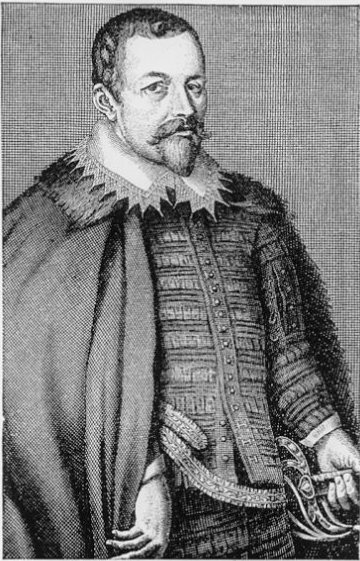
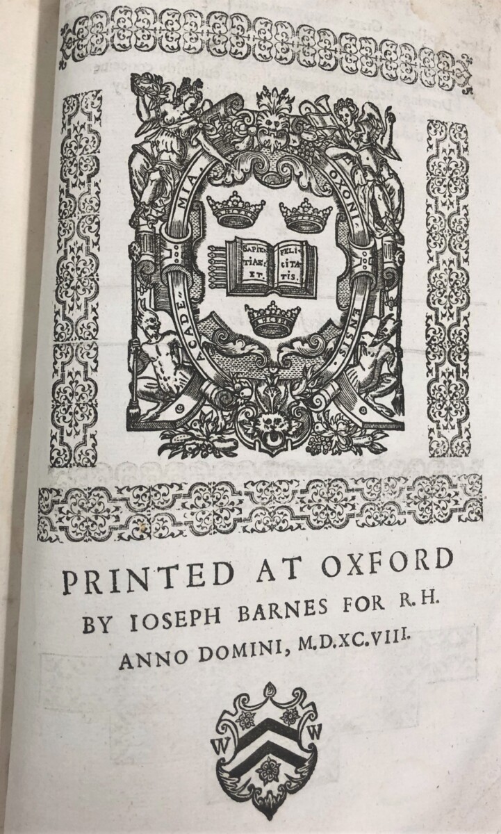
Richard Haydocke (ca. 1569-ca. 1642), a Fellow of New Colllege, Oxford, and known chiefly as a physician and sometime preacher, who spent his “spare howers of recreation” as an amateur artist, was well placed at the center of the bookish world of Oxford to pursue his interest in bringing the latest Italian theorizing on art to England. It is likely that he travelled in Italy in the 1590s, where he would have seen works of art in the new Mannerist style. In his preface, he relates that he originally only had access to “a poor copy” of Lomazzo’s Trattato, first published in Milan in 1584, provided by his friend Thomas Allen, an Oxford mathematician, astrologer and collector of manuscripts, before another friend, who preferred to remain anonymous, supplied him with a better copy (probably the 1585 edition). His book was dedicated to Sir Thomas Bodley, whose great project of establishing a collection of books for the University library, now known as the Bodleian Library, was already in process. And Haydocke’s translation of Lomazzo was handsomely produced by Joseph Barnes, the original printer of the University of Oxford press.
Unknown artist: engraved portrait of Sir Thomas Bodley
Colophon of Joseph Barnes in Haydocke’s Tracte…
Described by later writers as the “bible” of Mannerism, the original Italian edition of Lomazzo’s Trattato... consisted of seven books but did not include illustrations, probably because the painter and theorist had gone blind by the age of thirty-three. Haydocke informs the reader that he wished to give Lomazzo greater credit for his role in the history of art than he had received from some of his contemporaries, including Giovanni Paolo Gallucci, whom Haydocke accused of plagiarizing a whole section of Lomazzo’s second book in his work on Albrecht Dürer, Di Alberto Durero pittore e geometra… (1591), and Antonio Possevino, who had completely omitted Lomazzo from his Bibliotheca selecta (1593) of noteworthy writers on the art of painting.
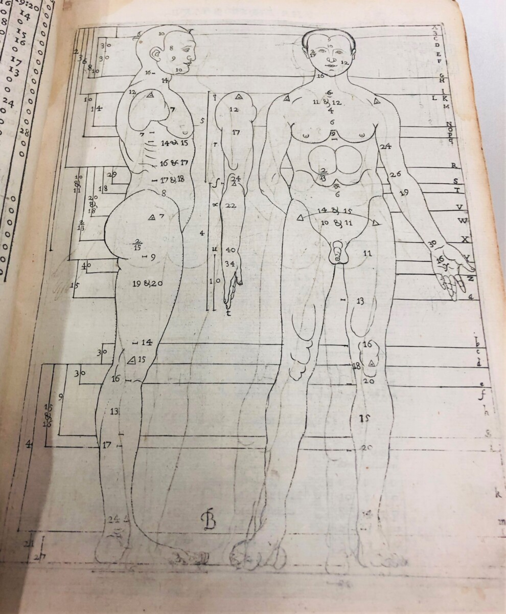
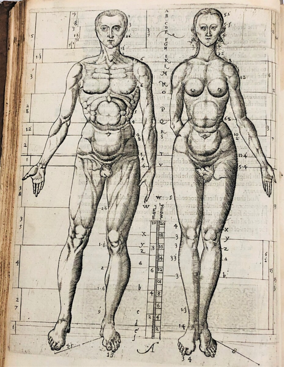
Richard Haydocke: illustration of male proportion
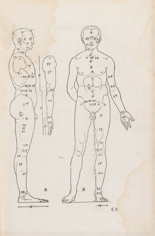
Albrecht Dürer: Illustration of human proportion from De symmetria… (1532)
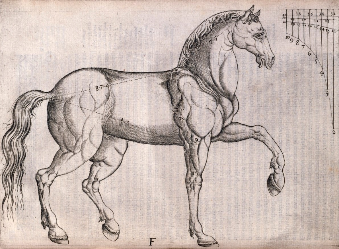
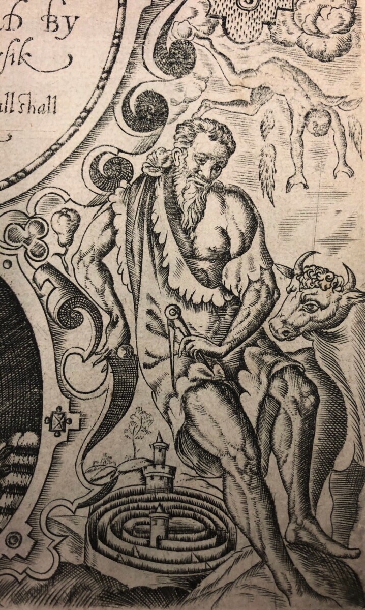
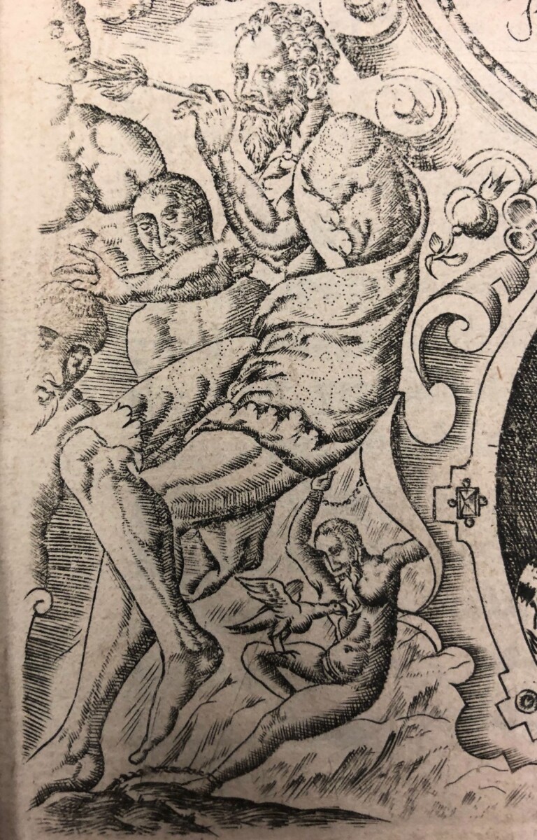
Haydocke actually translated only five of Lomazzo’s seven books and added a “briefe Censure of the booke of Colours….” But in addition to translating the text into English, he describes how he made multitudinous corrections, attributing the errors– “so many flies of presse-errours”–in the original Italian that Lomazzo must have “swallowed” as a result of his blindness. Major additions to his translation were the frontispiece with its fine portrait likenesses of Lomazzo and himself and thirteen “pictures” that Haydocke himself executed, with apologies for his clumsiness, to illustrate the treatise. Though some derived from Durer’s De symmetria partium…humanorum corporum (1532) or Gallucci’s later adaptations of them, others were Haydocke’s own inventions and showed his interest in Mannerist art, as is evident in the attentuated figures of the nude couple in the section on human proportion, and the elegant study of the horse, both of which reveal his study of anatomy for his work as a physician. The unusual allegorical figures of the visual arts in the four corners of the frontispiece, and the scrolling cartouches and other ornaments are also in the Mannerist style.
Richard Haydocke: human proportion
Richard Haydocke: Proportions of the horse
Richard Haydocke: Allegory of Architecture
Richard Haydocke: Allegory of Sculpture
A recent acquisition for Marquand Library, Haydocke’s book, packed with allusions to scholarly writing and aesthetic debates, and illustrated in a style that showed recent developments in avant-garde European art, is one of the first illustrated publications in English on art theory, preceding by many centuries the publication of Nicholas Hilliard’s contemporaneous Treatise concerning ‘The Art of Limning,’ (not published until 1912), to which Haydocke alludes to in his preface.
Nicola Shilliam, Western Art History Bibliographer
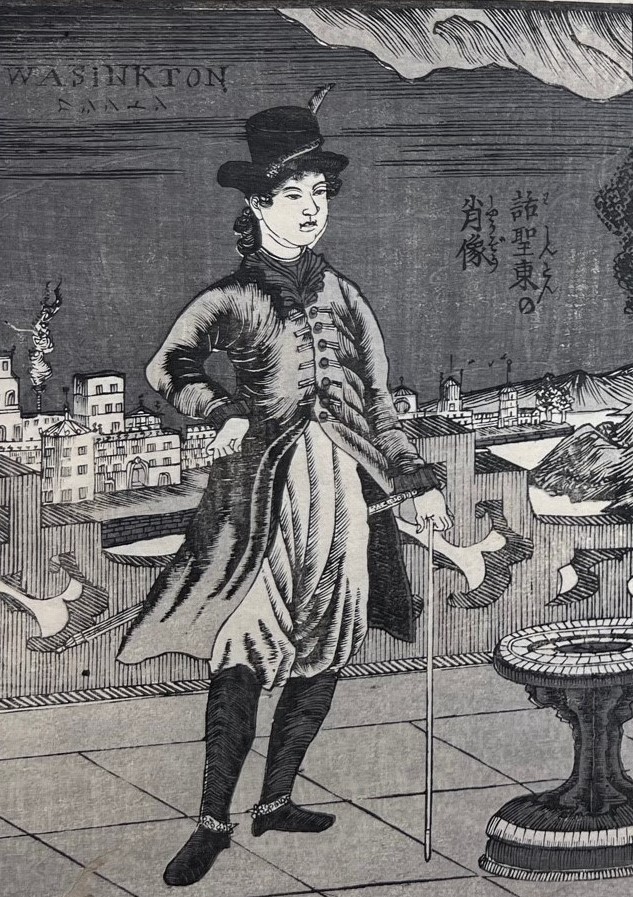
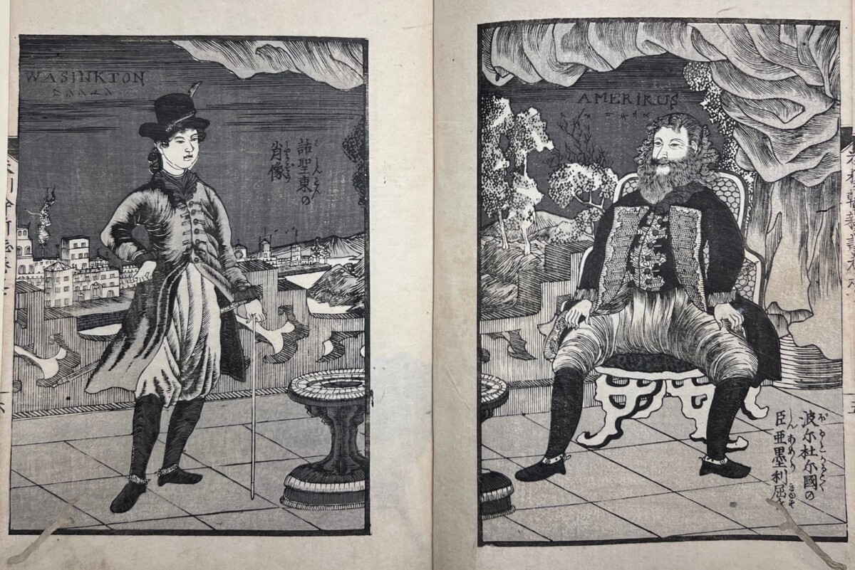
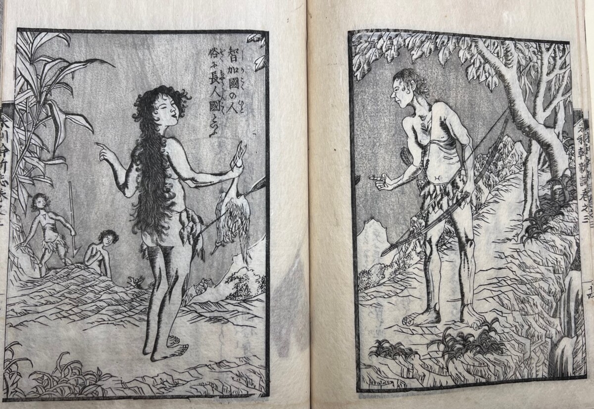
We all remember that classic tale of George Washington as a young boy—no, not the one about him chopping down the cherry tree—the one where he met with the Italian explorer, Amerigo Vespucci (1451-1512) on a balcony overlooking a random city? This literally legendary meeting is one of the first illustrations in the 5-volume Japanese history of America, New Account of America [Merika shinshi]1, written between 1853 and 1855.2
GeorgeWashington, as a boy, meeting Amerigo (Amerikus) Vespucci.
While scenes like this have been called ‘garbled’ or ‘misunderstood’ history,3 I would suggest instead that this might be an illustration of the young man who would become the first president of America symbolically paying tribute to the long dead explorer whose first name, here designated as “Amerikus,” would be used by cartographers to label the continents of the New World and ultimately give George’s nascent country its name.
The date of this 5-volume set, which claims to give a full account of America, is significant. In 1853, after Japan’s two hundred years of self-imposed isolation, Americans, under the command of Commodore Matthew Perry, arrived in Japan and demanded that the Japanese “open their ports” and sign trade agreements with the United States. A year later, in 1854, when Perry returned with an even larger fleet, the Japanese relented and began a trading relationship with the United States. New Account of America was written and illustrated during this transitional period, when there was intense curiosity about Americans and the Americas among the Japanese. It is believed to be the first book on the subject. The information here, however, is probably not from American sources, but from books that filtered into Japan through the Dutch, Japan’s only Western trading partner during its long period of isolation.
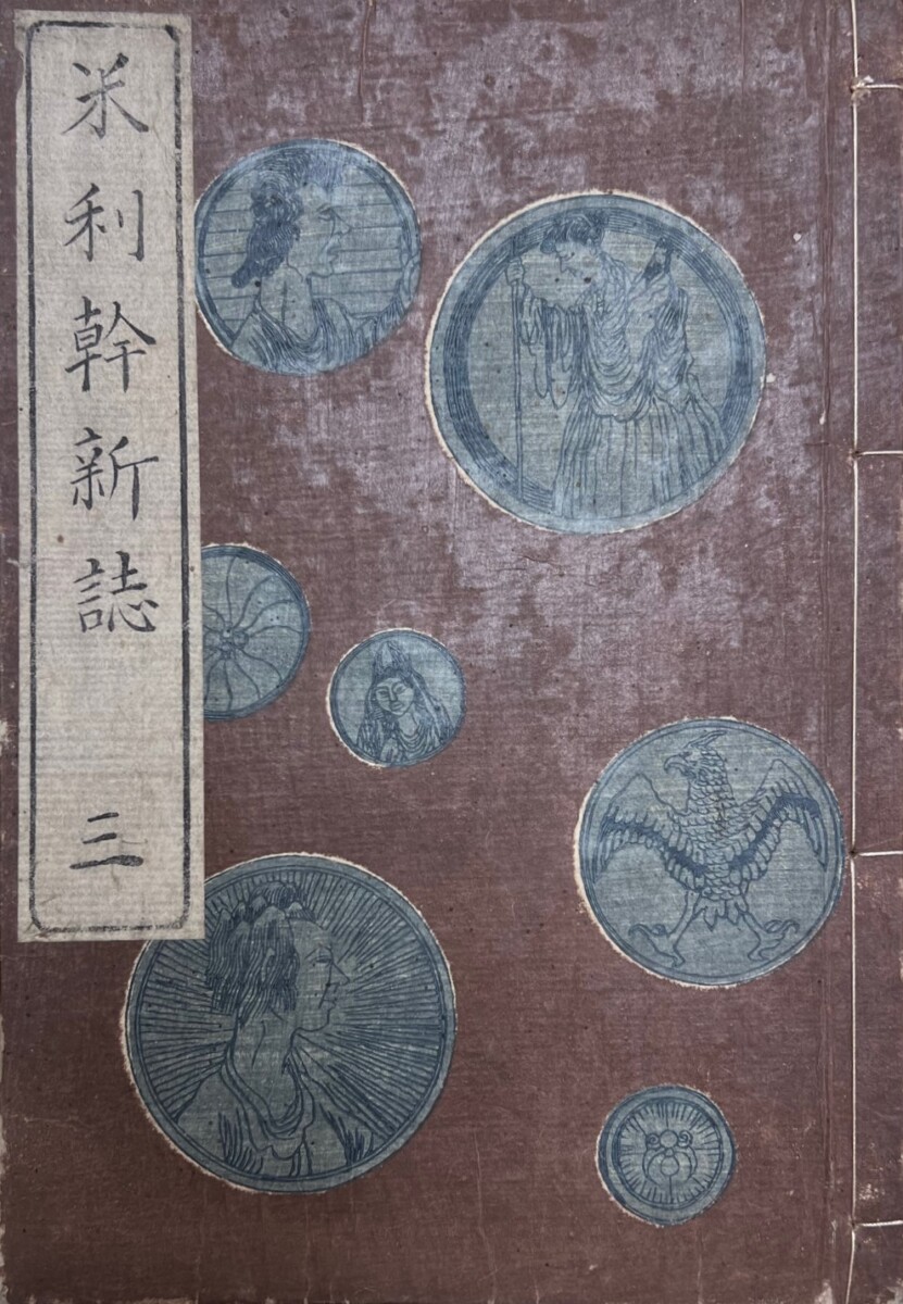
It appears that there was an attempt on the part of the publisher, Kasugarō, to add a touch of Western authenticity to the publication by giving it the appearance of Dutch books known to the Japanese in the 19th century. The cover, though paper, is the reddish brown of fine leather. The thickness of the paper adds to the sensory tactile illusion. Each cover is identically decorated with round medallions that bear designs, images and busts of Europeans, and what some have called the “American eagle” on them. They are all printed in blue ink and may represent the coins of North and South America.
New Account of America was written by the scholar, Tsurumine Shigenobu (1786-1859) and is believed to have been illustrated by Utagawa Sadahide (1807-1873),4 who became famous for his woodblock print depictions of foreigners at the port of Yokohama a few years after this book was published. Sadahide, a pupil of Kunisada (whose work was highlighted in a previous blog),was so admired that he was one of the ten artists chosen by the Tokugawa government to represent Japan at the 1867 Exposition Universellede Paris, which introduced the Japanese print to Europe for the first time. He was awarded the Légion d’Honneur for his woodblock prints.
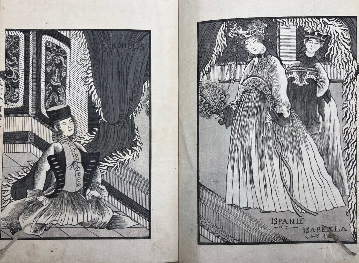
Much of New Account of America is devoted to George Washington and to Christopher Columbus, with two double-page illustrations of his begging Queen Isabella for the funding for his trip to India, which then led to the supposed “discovery” of the Americas. There is also quite a bit of statistical information on the individual states at that time, a description of the capital, and a discussion of the workings of the American government. Descriptions of battleships get more ink than Canada, which is only briefly mentioned, and the information on South America is, as will be seen below, spotty.
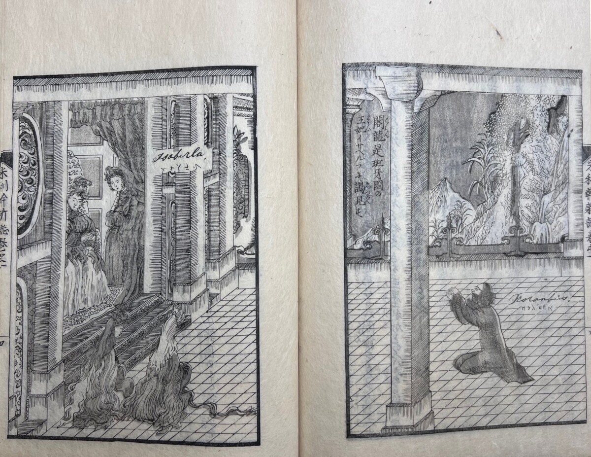
Columbus and Queen Isabella of Spain (Ispanie)
A second image of Columbus (Koronbus) and Queen Isabella (Isaberla), which was probably influenced by different source material.
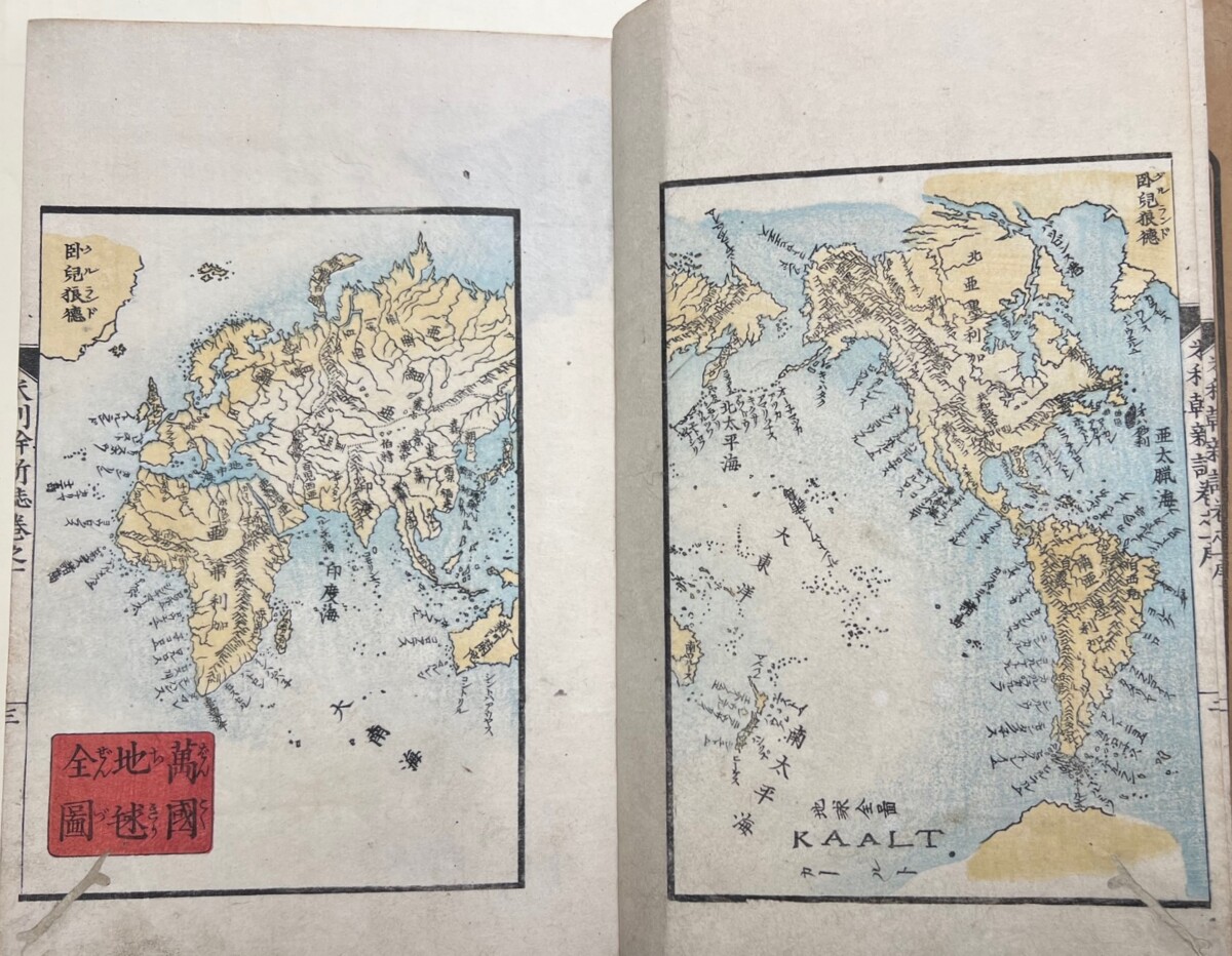
Volume 1 is largely devoted to the discovery of America and, in addition to the illustrations of Columbus, above, it includes maps of the world as it was known in the mid-19th century.
World Map
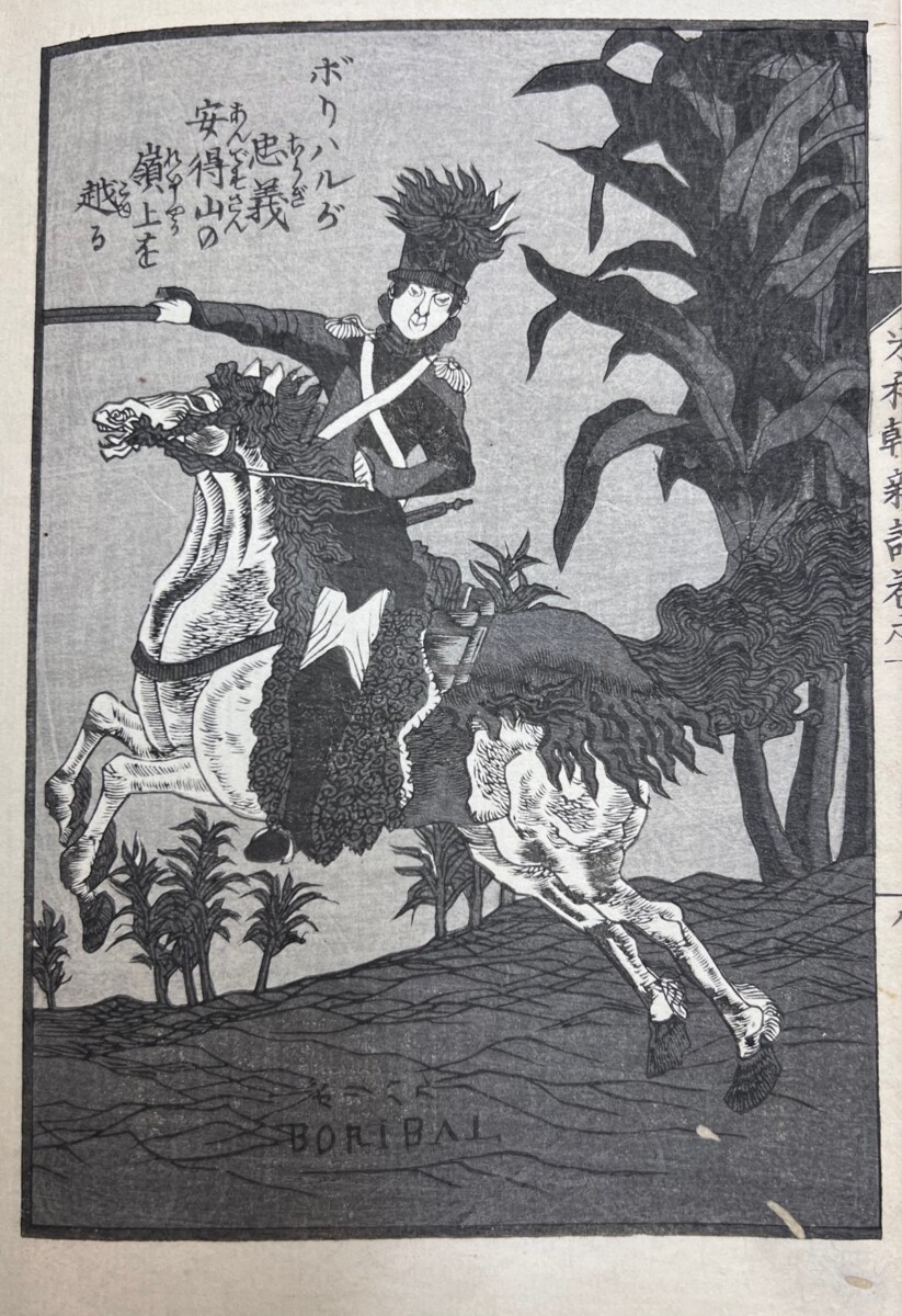
This volume also includes the Washington/Vespucci image and what may have been perceived as its counterpart: a dynamic portrait of Simón Bolivar, “The Liberator,” who led much of South America to independence from the Spanish empire.
Simón Bolivar(Boribal)
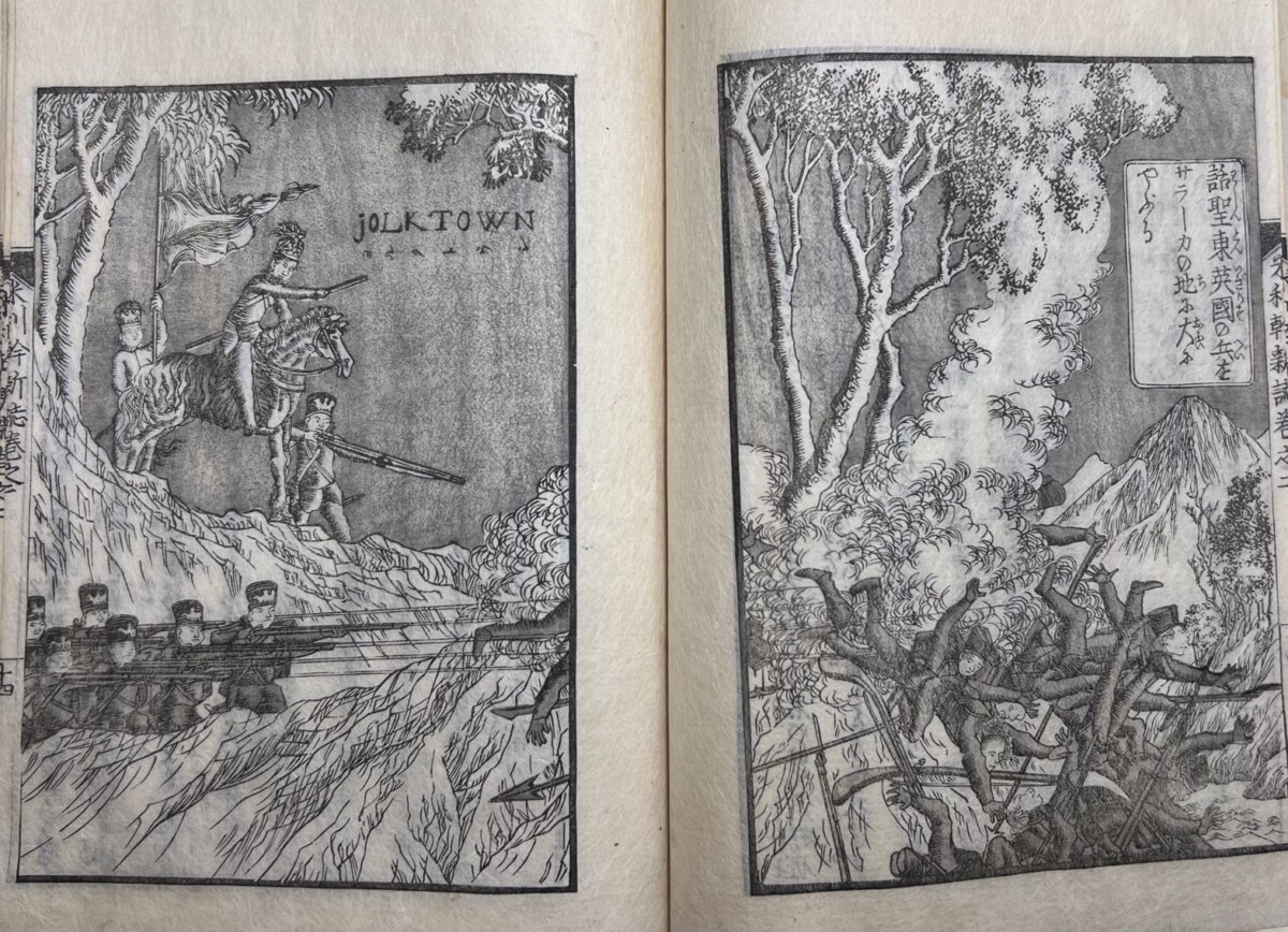
Volume 2 focuses on the Revolutionary War and its illustrations are heroic battle scenes filled with sprawling bodies like that of the Battle of Yorktown (Jolktown) below.
Americans winning the Revolutionary War Battle of Yorktown (Jolktown), which led to the surrender of British forces and the Treaty of Paris in 1783.
Volume 3 returns to the subject of Bolivar’s fight for independence and to South America in general, with images like the one of Chile and its inhabitants below.
The people of Chile.
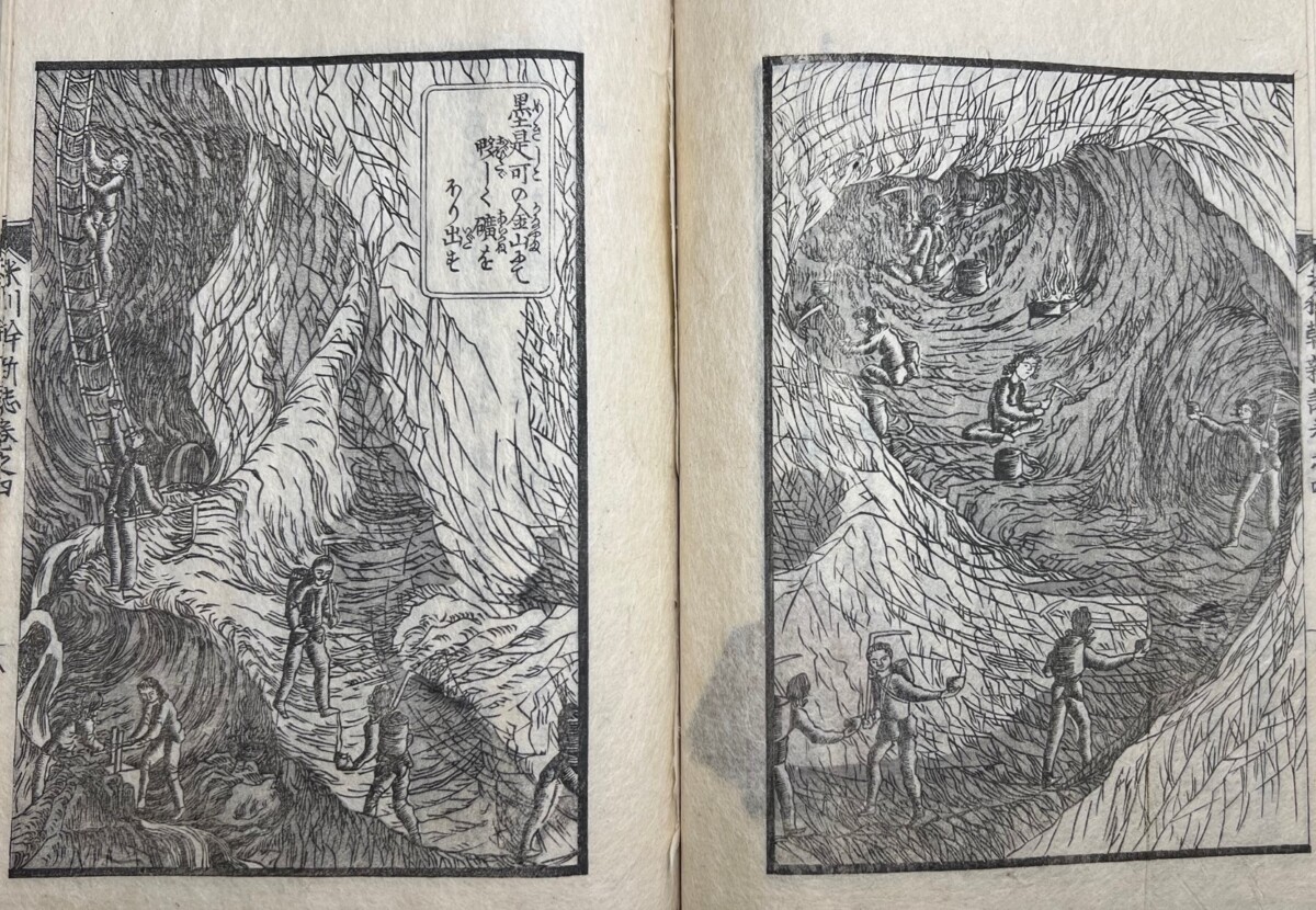
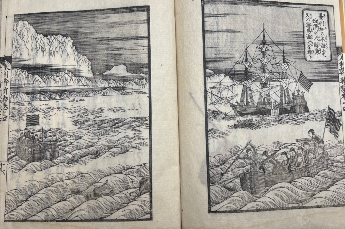
Volume 4 moves to the industry of the Americas and includes illustrations of a Mexican silver mine and whaling—where the whalers appear to encounter “seahorses,” which have been depicted as tiny horses among the waves.
Mexican mining operation.
American whaling boats encountering “sea horses” among the waves.
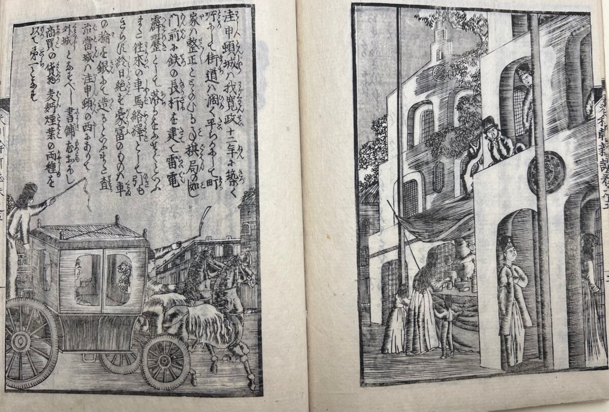
There are more battles depicted in Volume 5, followed by a picture of the city of Washington, where it notes that the streets are filled with carriages, there are many bookstores in Georgetown, and bread and tobacco are sold in large quantities.5
City of Washington
While the images like the ones in New Account of America can appear quite charming to us today, there is dark side to Japanese adoption of the conventions for illustrating peoples of other nations from models created by White colonizers. The images of the Chilean “savages” in this book give us some sense of how racist views about a culture or a people can be promoted and then fixed in the minds of others. For more information on Japan’s adaptation of racist images from the West see my article, “From the Wild West to the Far East: The Imagining of America in a Japanese Woodblock Print,”The Record, Princeton University Art Museum. Volume 68, 2009: 16-37 and my chapter, “Images of American Racial Stereotypes in Nineteenth-Century Japan,” in Cynthia Mills, et. al., East-West Interchanges in American Art: A Long and Tumultuous Relationship. (Washington D.C.: Smithsonian Institution Scholarly Press, 2012.), p. 80-94.
Marquand Library is fortunate to have other important works by Utagawa Sadahide, including a “draft book” with drawings of an as yet unidentified historical story about heroes of Japan, with characters resembling the great generals Oda Nobunaga, Toyotomi Hideyoshi and Tokugawa Ieyasu (ca. 1848-1868). Also in the collection, is one of Sadahide’s most famous books, Things Seen and Heard at the Yokohama Open Port [Yokohama kaikō kenbunshi] (1862-1865) and a large fold-out map of Yokohama [Gokaikō Yokohama no zenzu] (1859).
Nicole Fabricand-Person, Japanese Art Specialist
米利幹新誌. This title has alternatively been Romanized as Merikan shinshi and Meriken shinshi.
The date of the preface in the first volume is 1853. The postscript at the end of Volume 5 is dated 1855. Although, some scholars have suggested that the book must have been completed by 1853 (and the postscript added later), because the maps do not show the Gadsden Purchase of that year, it is likely the news of the change in the shape of the borderline with Mexico may not have reached Japan within a few months’ time. The inclusion of borderline of California on the North American map, however, does mean that New Account of America’s earliest date of publication could have been 1948 when the state was acquired.
Jack Hillier, The Art of the Japanese Book. (New York: Harper & Row, Publishers, 1987), p. 926-7.
Also known as Gountei Sadahide and Gyokuransai Sadahide.
Jack Hillier, The Art of the Japanese Book. (New York: Harper & Row, Publishers, 1987), p. 928-9.
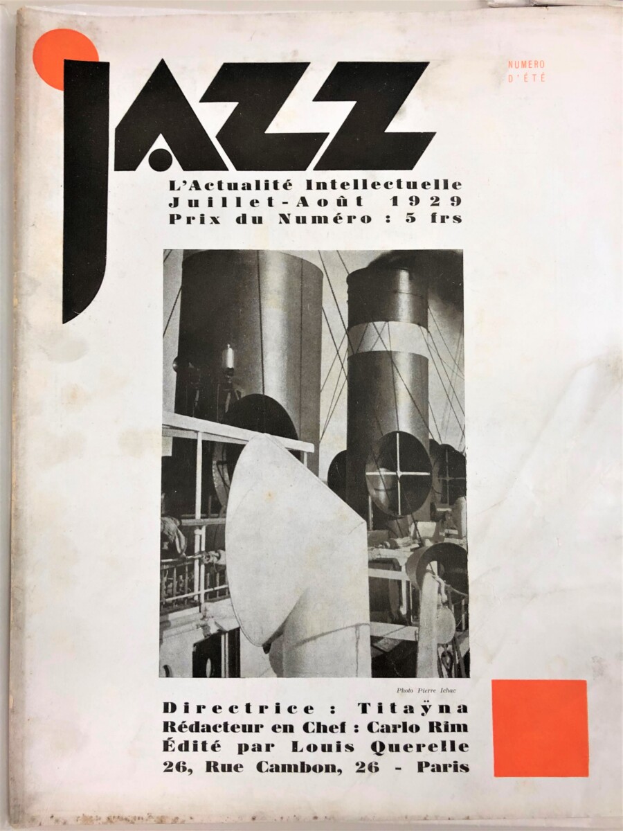
Jazz (issue for July-August 1929); cover photo by Pierre Ichac
Jazz: L’Actualité intellectuelle (1928-1930?) was one of the new French photo journals (including Vu, Lu, and Voilà) of the Art Deco period that employed a multitude of avant-garde writers, illustrators, and photographers to attract artistic-minded and fashionable readers. These publications popularized the picture essay format, and the stunning photographs of great modern photographers, including Man Ray, Berenice Abbott, Germaine Krull, and Moholy Nagy, appeared frequently on the covers and in the pages of Jazz, a recent acquisition for Marquand Library.
Jazz, edited by Carlo Rim and Louis Querelle, with Titaÿna (Élisabeth Sauvy) as “Directrice” of the early issues, was a short-lived but ambitious monthly, running to only fifteen issues and two special numbers on themes entitled “Exotique” and “Nudisme” in 1931. Jean Cocteau, Rene Clair, Ivan Goll, George Grosz, Max Jacob, Pierre Mac Orlan, Marcel Pagnol, André Salmon, and many others contributed articles about artists and exhibitions, literature, the cinema, architecture and music, including jazz, which had taken Paris by storm during World War I and prompted the magazine’s title. With its modernist layout, illustrations by contemporary artists, and photographs created with sophisticated pre- and post-production manipulation of images, such as photomontage, all informed by Dadaist and Surrealist art, Jazz was meant to epitomize all things cool.
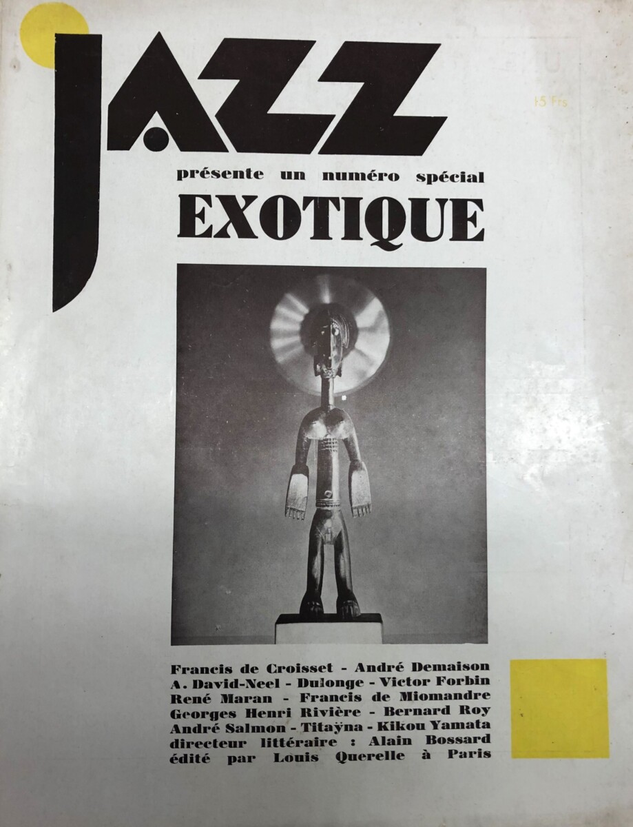
Cover of Jazz Special no. “Exotique” (1931) Gilbert Boisgontier, Untitled (Bamana figure, jonyeleni, Central Mali)
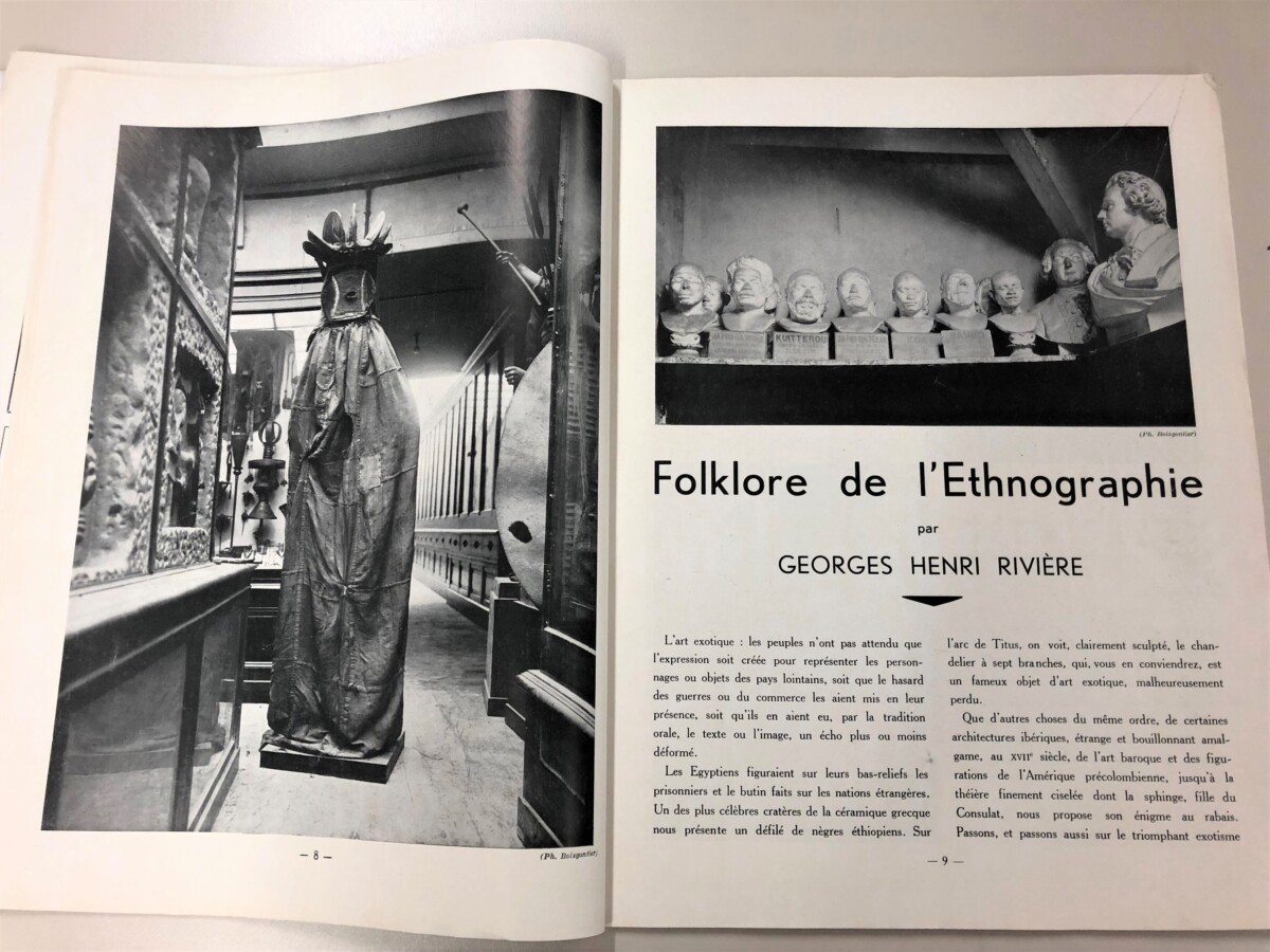
In spite of the magazine’s cosmopolitanism, the special number “Exotique” (1931) presents a complex and often shocking reflection of a bourgeois version of French avant-garde culture. The views expressed and the images used veer from adoration of the beauty and chic of “the other” — with articles on ethnographic art, Japanese Kabuki actors, and Tibetan sculpture, by knowledgeable authors — to the casual racism (both conscious and unconscious) that “exoticized” non-Caucasian and indigenous peoples and their art, and was clearly evident at the Colonial Exposition, taking place that year.
The extraordinary image on the cover, created by the ethnographic photographer Gilbert Boisgontier, juxtaposes a Bamana female jonyeleni sculpture (central Mali) with an image of a spinning cymbal, associated here with jazz music, placed behind the statue’s head to create a halo effect, which, in the words of Wendy A. Grossman “conflates a romanticized representation of an African sculpture with this African-African musical form.”1
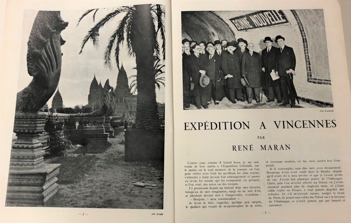
Photograph by Germaine Krull of the replica of the Temple of Angkor Wat (left) and visitors traveling to the Colonial Exposition at Vincennes (1931) (right)
“Exotique” began with an account of a visit to the controversial Colonial Exposition at the Bois de Vincennes, outside Paris, where the organizers created a massive spectacle, intended to promote the “civilizing” and unifying benefits of colonialism. Other countries, including the Netherlands, Belgium, and the United States, with its recreation of George Washington’s Mount Vernon residence, built pavilions or contributed to exhibits, but the main focus was on the French colonies. From May-November, 1931, visitors could roam the spacious site, marveling at such wonders as the replica (by French architects) of the Angkor Wat temple, and view daily life in “authentic” African villages, while sampling ethnic foods and musical performances by workers from the colonial territories. There were also displays of art at the Musée Permanent des Colonies at Vincennes, as well as the “Exposition Ethnographique des Colonies Françaises” at the Musée Trocadéro. Though the Exposition was a financial success, with an estimated 8-9 million visitors2, by the 1930s, many were aware that all was not well with French colonialism.3 News of recent uprisings in Vietnam and of the huge death toll of forced laborers during the construction of the Congo-Ocean railroad featured heavily in left-wing press and propaganda, and anti-Imperialist groups railed against the Exposition and its attempts to glorify and justify colonial exploitation.
The LDNR (Ligue de Défense de la Race Nègre) organized a counter exposition at the Palais des Soviets (September 1931-February 1932). “La Vérité sur les Colonies” [The Truth about the Colonies] included its own display of art, including African and Oceanic pieces lent by André Breton, Paul Éluard, Tristan Tzara and other artists.3 The Surrealists, primed by the recent arrests of Tiemoko Garan Kouyaté, the French Sudanese leader of LDRN, and other left-wing dissidents, issued “Ne visitez pas l’Exposition Coloniale,” a tract urging people not to visit the Colonial Exposition. Yet the alternative exposition was also criticized, especially since it was based on the concept borrowed from the Colonial Exposition itself. And the sale of Breton and Eluard’s collection of African, Indigenous America and African art in Paris in July 1931 must surely have benefitted from the attendant publicity from both sides of the bitter controversy. Jazz ceased publication that year, and this was the last colonial exposition in France.
1Wendy A. Grossman, “Fashioning a Popular Reception,” in Man Ray, African Art and the Modernist Lens (2009), ch. 7, p. 129.
2Though some sources state that more than 33 million paid admissions occurred, many of these may have been repeat visitors.
3 See Jody Blake, “The Truth about the Colonies, 1931: Art indigène in Service of the Revolution. Oxford Art Journal 25.1 (2002), pp. 35-58.
Nicola Shilliam, Western Art History Bibliographer
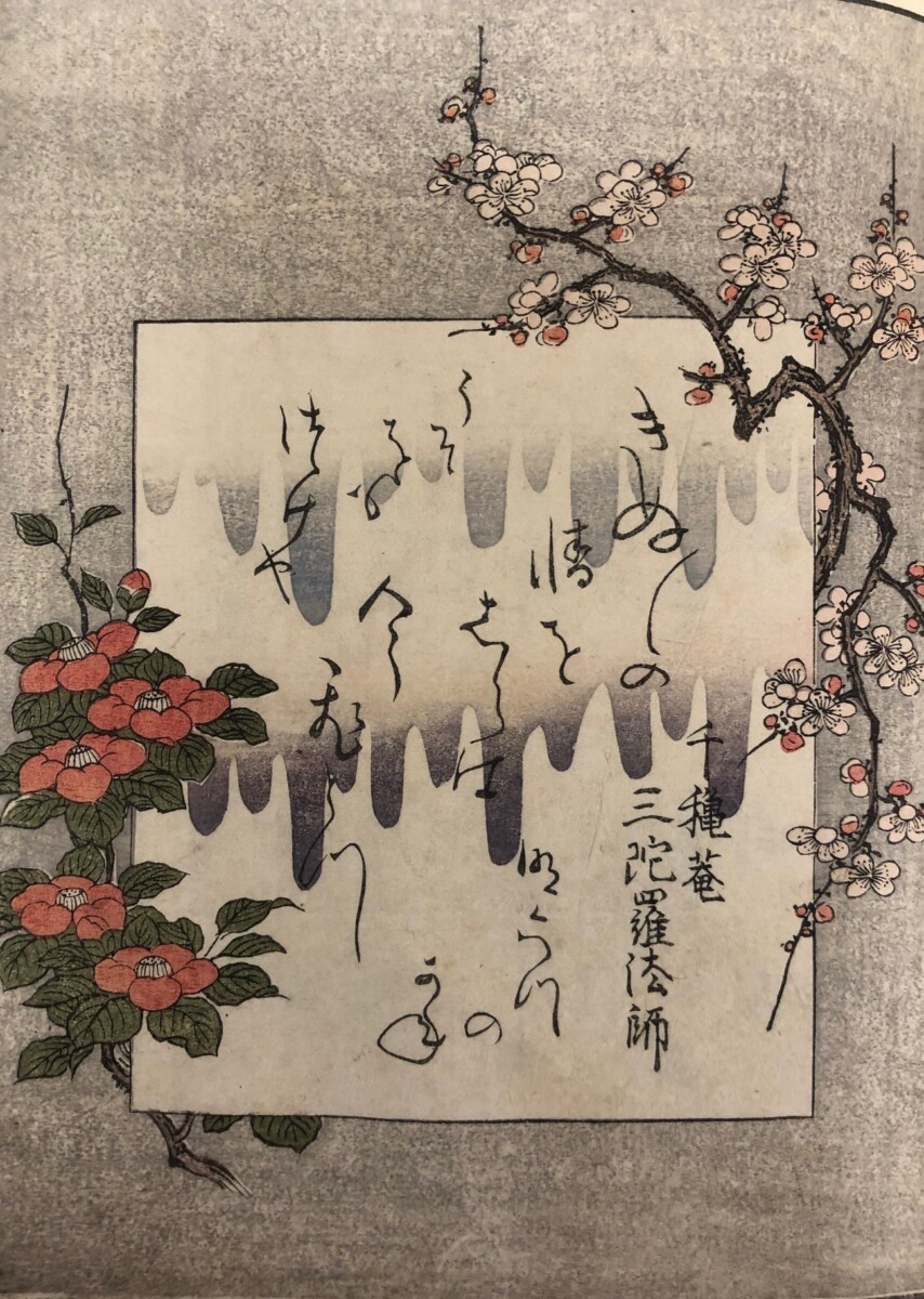
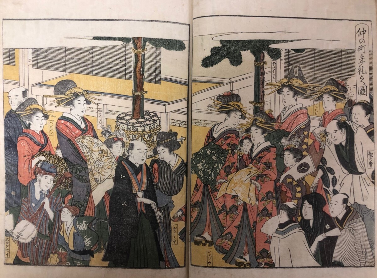
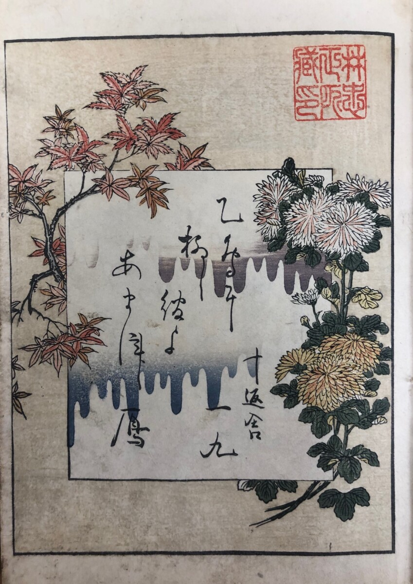
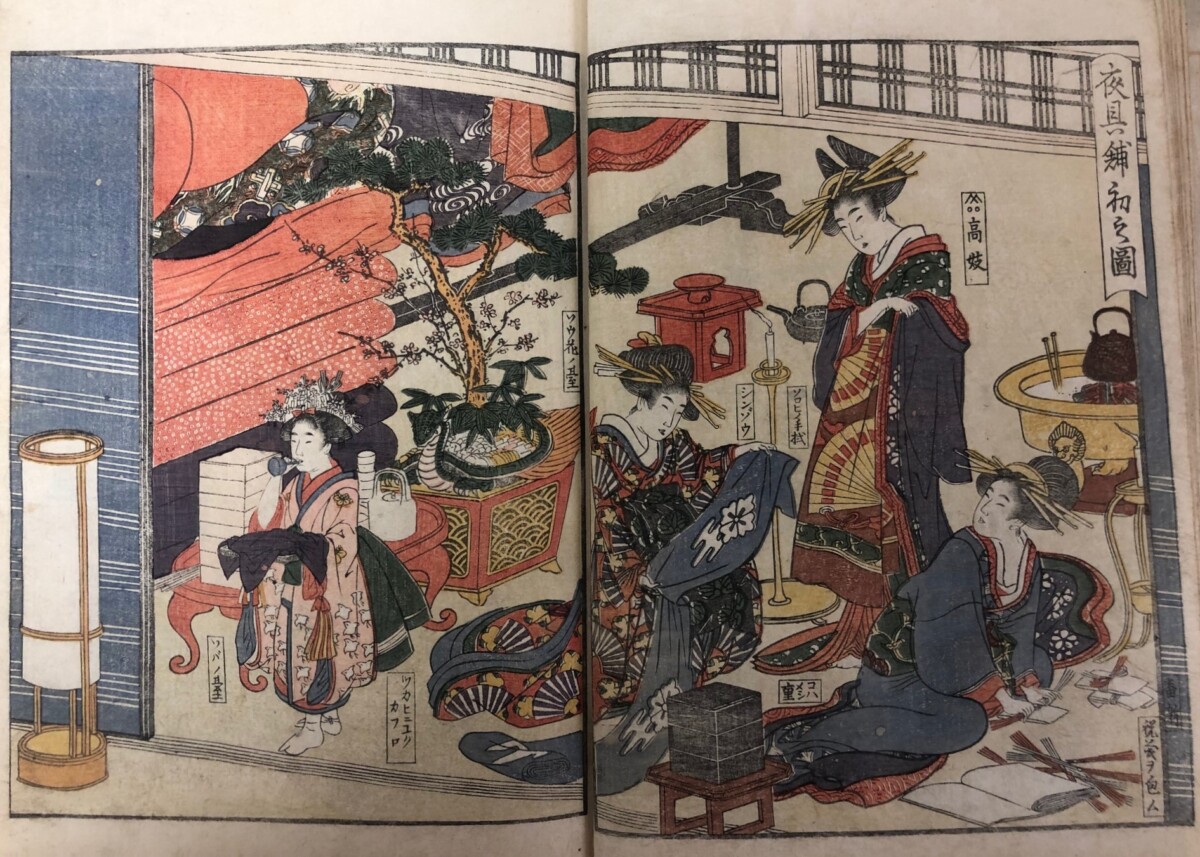
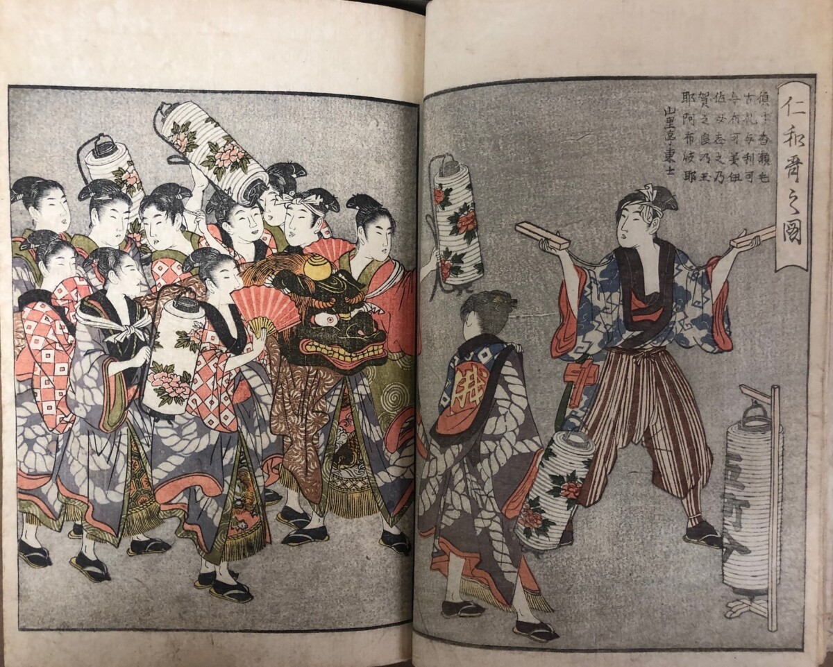
In 1804, when the book Picture Book Annual Events of the Green Houses (Seirō ehon nenjū gyōji) was published in Japan, who would have guessed that ninety years later it would take Europe by storm? However, by 1891, this two-volume set of books illustrating the annual festivities of the licensed pleasure quarters (Yoshiwara), was not only well-known, but celebrated as a masterpiece. More importantly, it was among the works by the artist, Kitagawa Utamaro (ca. 1763-1806) that had a profound effect on a group of artists that came to be known as the Impressionists.
Frontispiece of Plum and Camellia, with a poem by Senkian Bōshi, from volume 1.
The delivering of New Year’s gifts in Nakanochō, the main street of Yoshiwara.
Frontispiece of Chrysanthemum and Maple, with poem by Jippensha Ikkū, from volume 2.
The two-volume set of woodblock-printed books first enjoyed great popularity when it was published at the beginning of the 19th century in Japan. It was written by one of the stars of the literary world, Jippensha Ikkū (1765-1831) [1] and illustrated by the legendary artist Utamaro. The publisher was so confident in the book’s success that he not only printed two versions—one, like this, in color and a cheaper version in black & white—but also announced a sequel in the advertisements at the end of the book. Anecdotal reports, however, suggest that, after publication of these first volumes, there was an argument between Ikkū and Utamaro about which of them was responsible for the book’s popularity, which ended the collaboration and the possibility of this sequel.
First laying out of bedding given as gifts to the courtesan by her customers.
Niwaka Festival, with a parade of women singers, disguised as young boys.
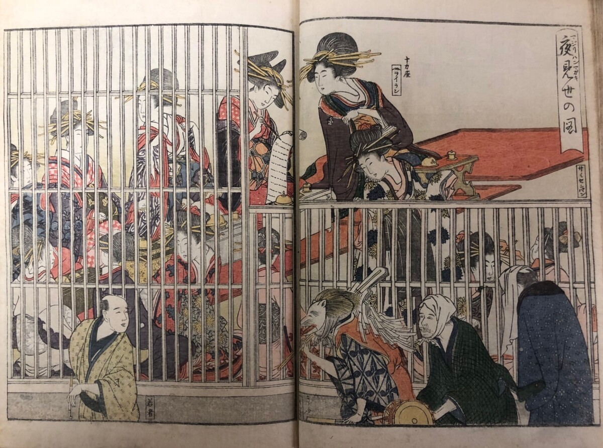
As the title, Picture Book Annual Events of the Green Houses, suggests, the book is about the various festivals and activities that took place at the “green houses,” a poetic euphemism for Yoshiwara. The entertaining text and exquisitely designed images are a peek into the world of the pleasure quarters, with views that, today, can be a bit disturbing. In addition to the depictions of lively street performers and processions of beautiful women in gorgeous robes, for example, there are also scenes of women in “cages” overlooking the street—the “display rooms” of brothels. It reminds us that the women of Yoshiwara we see here and in other Ukiyo-e printmaking, no matter how celebrated they were in literature and art—no matter how skilled they were in the arts or how beautifully they were dressed—were essentially in bondage.
“Display Room” of a house of pleasure.
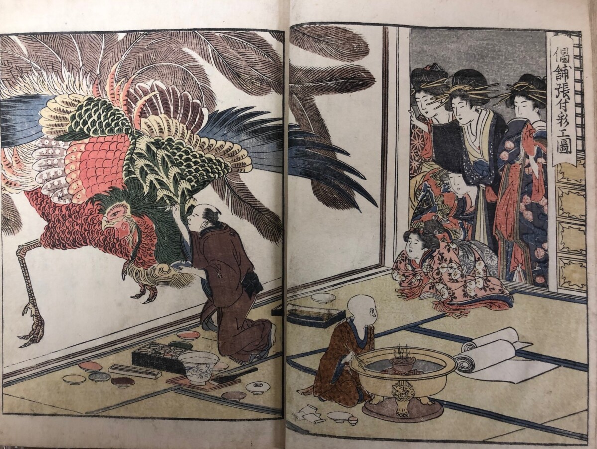
The original blue covers of Picture Book Annual Events of the Green Houses are embossed with the crests of some of the most prominent Yoshiwara houses of pleasure. Lovely frontispieces with plum blossoms and camellia (vol. 1) and chrysanthemums and a maple branch (vol. 2) are symbols for the seasonal changes taking place within (see above). Most notable is the final image, which is believed to be a self-portrait of Utamaro painting a Japanese phoenix (hō-ō) on the wall of a brothel as curious courtesans look on.
Cover embossed with crests of Yoshiwara establishments.
Utamaro “adding colors to the interior wall of a house of pleasure.”
In 1891, the French author, critic and Asian art collector, Edmond de Goncourt, published a monograph on Utamaro, Outamaro—Le Peintre des Maisons Vertes [Utamaro—Painter of the Green Houses], which introduced the artist to France as one of the finest in Japan. He endeared the public to Utamaro by recounting his sometimes-tragic life story and the struggles Goncourt perceived he must have had with his art. Much of this book was then devoted to Picture Book Annual Events of the Green Houses, and included detailed descriptions of each image and long passages discussing the differences between Western and Japanese prostitution, which he described as being elegant and refined. (He describes the “display cages” as “trellised windows facing the street.”) It sparked the public’s imagination and made the book quite famous, even beyond the world of European art collectors.
Entertaining on a moonlit night in mid-Autumn.
Goncourt’s translation of Ikkū’s text and his knowledge of Yoshiwara were undoubtedly provided by Hayashi Tadamasa (1853-1906), Goncourt’s art dealer and friend. Hayashi was probably the single most important figure in the popularization of Japanese art in Europe, even referred to in the early 20th-century as “the grand architect of the transformation of the European sense of Japanese art.” [2] He had arrived in France in 1878 as an agent and translator for a company planning an exhibition of Japanese art and stayed to become a famous art dealer and influencer, successfully promoting Japanese prints and books across Europe and America. Through Goncourt’s Outamaro, then, he and Hayashi Tadamasa were instrumental in bringing Utamaro and his wonderful Picture Book Annual Events of the Green Houses to the attention of the Western world.
[1] Jippensha Ikkū was a prolific writer, best known for Shank’s Mare [Hizakurige], about a journey of two comical characters traveling the Tōkaidō Road, which was the inspiration for Ando Hiroshige’s iconic print series, Fifty-three Stations of the Tōkaidō Road [Tōkaidō Gojūsan-tsugi.]
[2] Raymond Koechlin in Souvenirs d’un vieil amateur d’art de l’Extreme Orient. (Paris, 1934), p. 9.
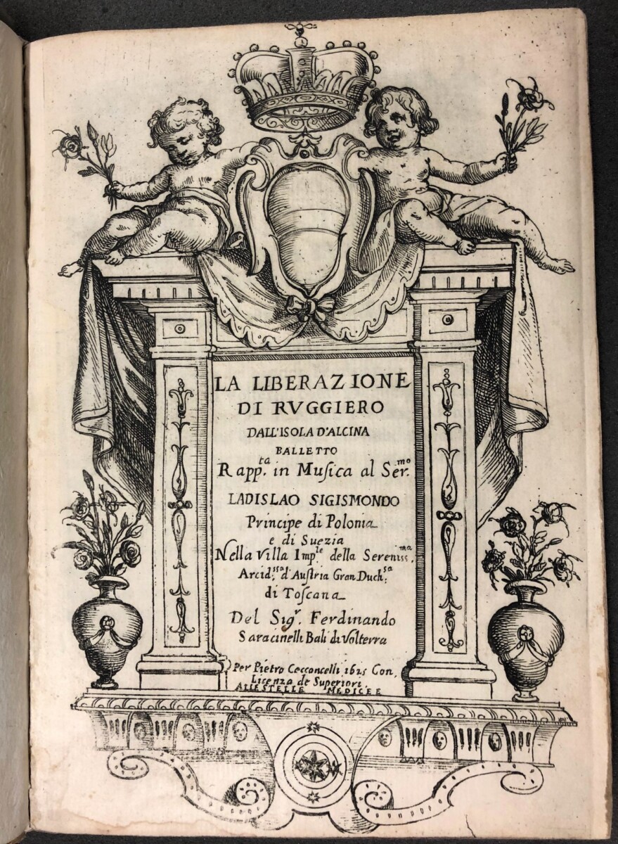
Ferdinando Saracinelli, La Liberazione di Ruggiero dall’Isola d’Alcina. Balletto rapp.ta in musica al Ser.mo Ladislao Sigismondo principe di Polonia e di Suezia nella villa imp.le della serenss.ma arcid.ssa d’Austria gran duch.sa di Toscana… Florence: Pietro Cecconcelli (1625)https://catalog.princeton.edu/catalog/99113265403506421
Title page: La Liberazione di Ruggiero dall’Isola d’Alcina… (1625)
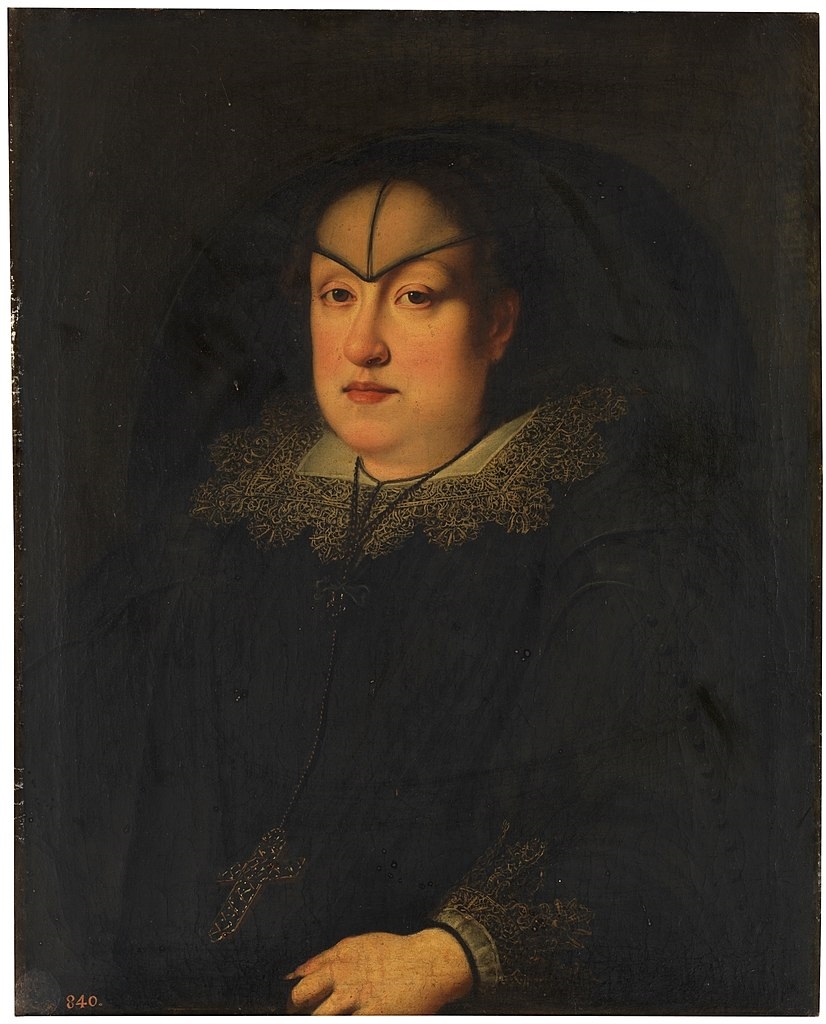
In Marquand’s rare books collection is a precious souvenir of the first performance of La Liberazione di Ruggiero dall’Isola d’Alcina…, considered to be the first opera composed by a woman – Francesca Caccini. The publication, illustrated with etchings by Alfonso Parigi after the sets designed by his father Giulio Parigi, served as a record of three entertainments performed for the visit of Prince Władysław Sigismund Vasa-Jagiellon, later king of Poland, to the Medici court in 1625. All three items in this specially created festival book feature female protagonists, in honor of the court’s female patron, Archduchess Maria Maddalena of Austria, co-regent of Florence with Christina of Lorraine, her mother-in-law, after the death of Maria Maddalena’s husband, Grand Duke Cosimo II de’Medici, in 1621.
Justus Sustermans, Portrait of Maria Maddalena, Archduchess of Austria and Grand Duchess and Co-Regent of Florence, ca. 1627. Museo del Prado collection
Born in Florence in 1587, Francesca Caccini was the daughter of Giulio Caccini, the composer of L’Euridice (1600), itself thought to be the earliest surviving opera. Although Francesca was celebrated as both a composer, vocalist, and musician, and was the highest paid musician at the Medici court, this was her sole surviving opera and her name was not recorded alongside that of the male librettist on the the title page.
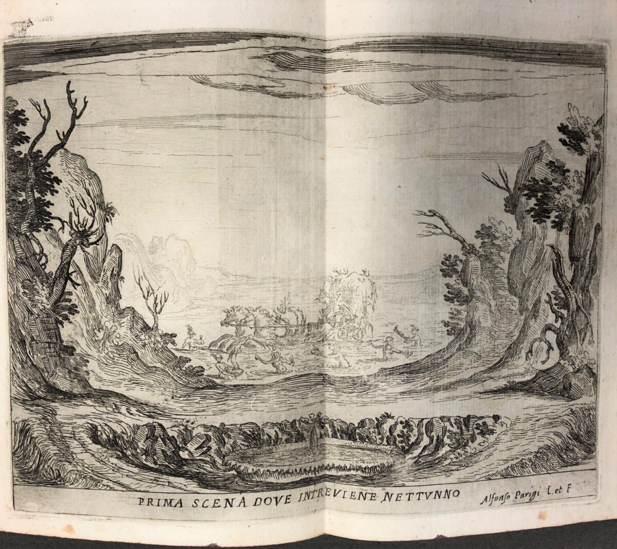
First scene showing Neptune introducing the story of Ruggiero
As described in the title, this opus is defined as a “balletto,” which combined singing, dancing, and a final “ballo a cavallo,” (equestrian ballet), common features of early Florentine opera. With a libretto by Ferdinando Saracinelli deriving from both Ariosto’s Orlando Furioso and Orlando Innamorato by Matteo Maria Boiardo, this comic opera in four scenes was performed for the first time at the Villa Poggio Imperiale on February 3, 1625, the time of Carnival. To honor the Polish visitor, Neptune (shown above) invited Vistula, the river god, to join him in recounting the story of Ruggiero for the audience.
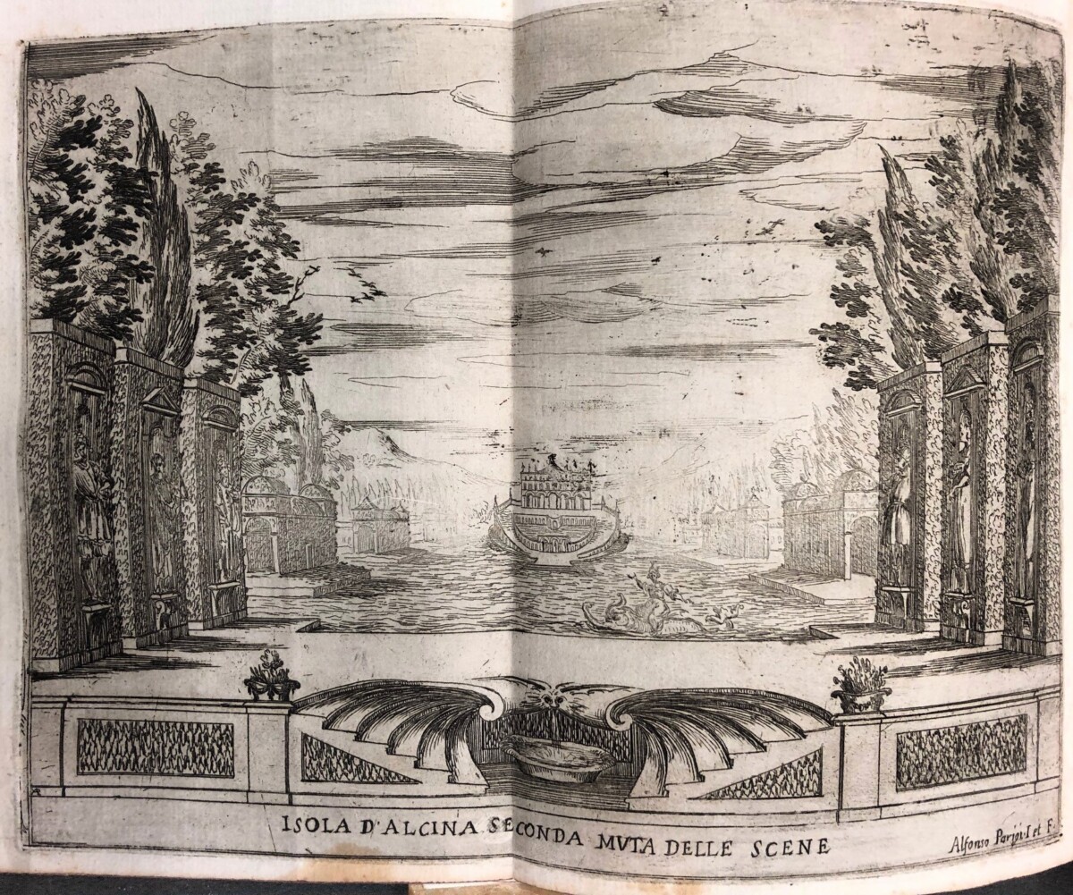
Melissa arriving at the Isle of Alcina on the back of a dolphin
This tale of two powerful women, the sorceresses Alcina and Melissa, dramatized their battle for control of the fate of Ruggiero, the multiracial son of a Christian knight and a Saracen princess, the daughter of Argolant, king of Africa. Like all good operas, the story was complex and fantastical: having been whisked away by a hippogriff from captivity in an enchanted castle, Ruggiero was deposited on the isle of Alcina. Bewitched by the sensual charms of Alcina, Ruggiero was unable to leave her island, and neglected his future wife Bradamante (another Christian knight, later featured in an opera by Handel). Arriving on the back of a dolphin, Melissa’s mission was to return Ruggiero to Bradamante, with whom he was destined to found the house of Este, who also happened to be the patrons of Ariosto and Boiardo.
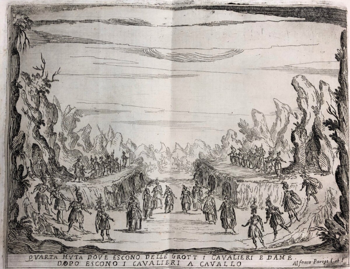
Scene showing young people leaving their caves
Once liberated by Melissa, Ruggiero could hear the cries for freedom of other victims of Alcina’s spells who had been transformed into flowers in her gardens. In the penultimate scene, young people leave their caves and dance. The dancers were recorded as members of the court rather than professional performers. In the background are faint images of the knights on horseback who would perform the final “ballo a cavallo” in the courtyard.
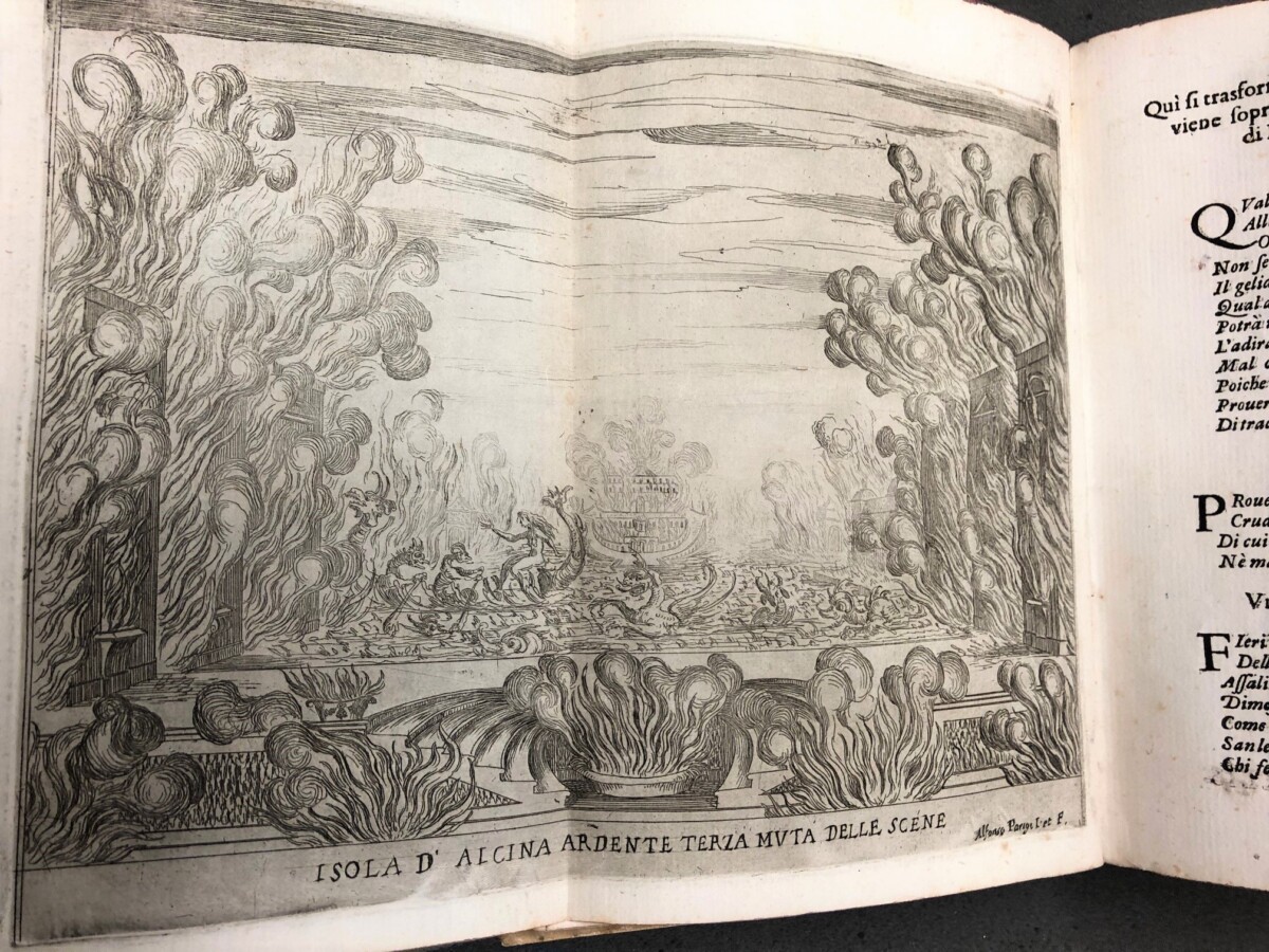
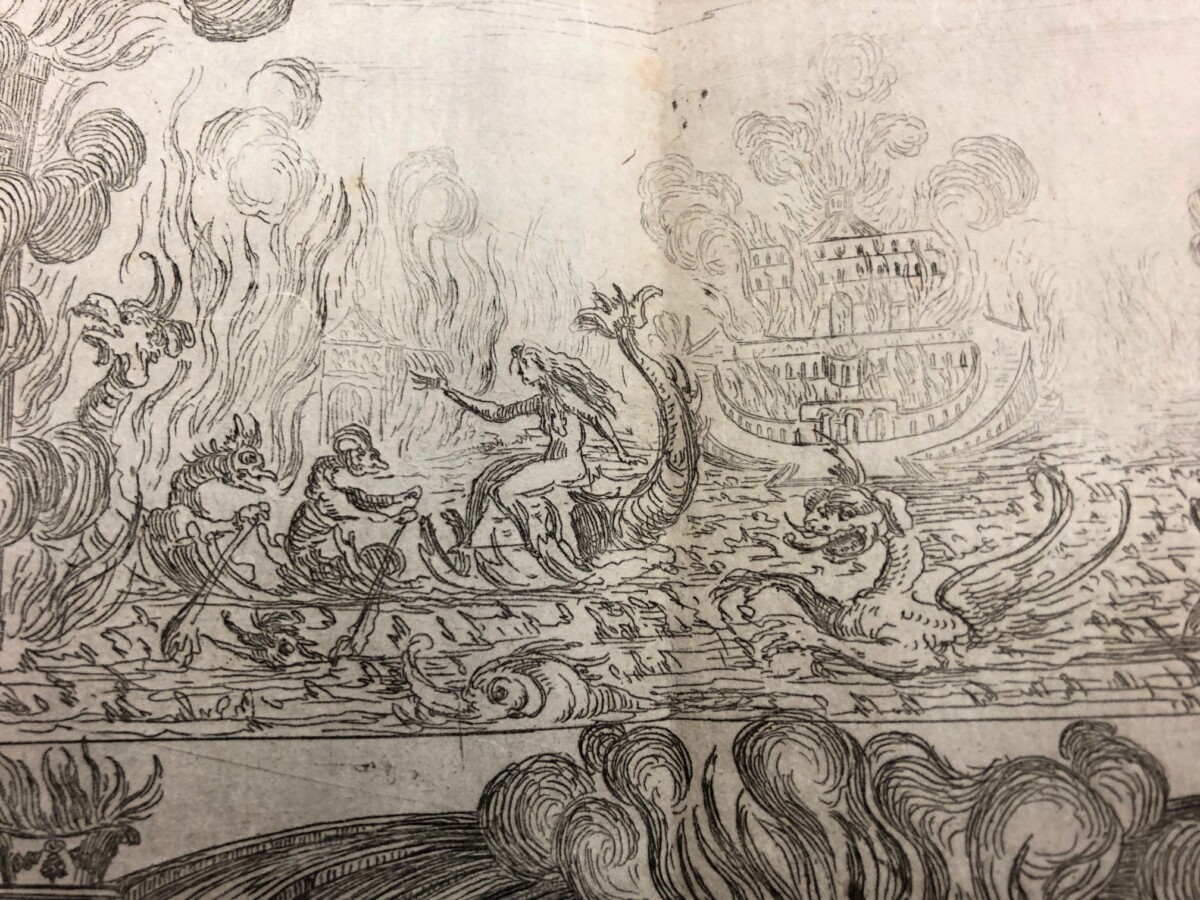
Scene showing Alcina setting fire to her island and fleeing
Detail of Alcina and her retinue
Alcina, enraged by the loss of her lover and the other captives, fled with her demonic retinue, having ignited her island with real flames, a display of pyrotechnics that forced the entire audience to evacuate their seats, and was intended to cause them to reflect on the powers of the Grand Duchess of Florence herself.
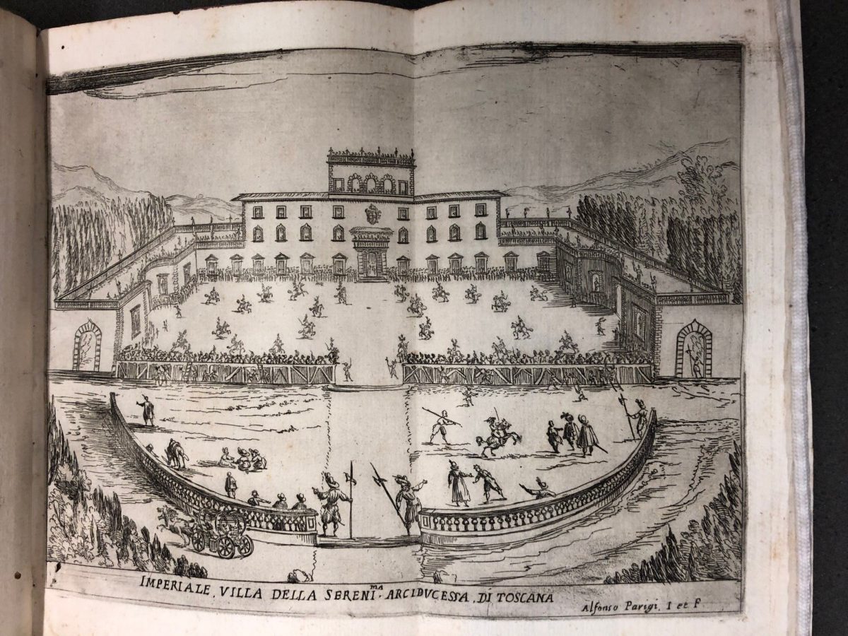
Equestrian ballet performed in the grounds of Villa Poggio Imperiale
The performance took place at Villa Poggio Imperiale, which had recently been renovated by Giulio Parigi, the Medici court architect, for the Grand Duchess. While the other plates depict performers against painted backdrops with spectacular changes of scenery, this plate provides a valuable record of the exterior of the palace, where the equestrian ballet occupied the entire courtyard: the palace was destroyed in the eighteenth century.
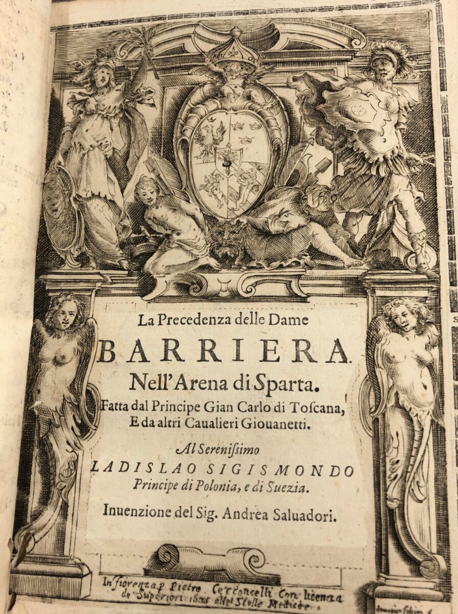
Title page: Andrea Salvadori, La Precedenza delle Dame nell’Arena di Sparta
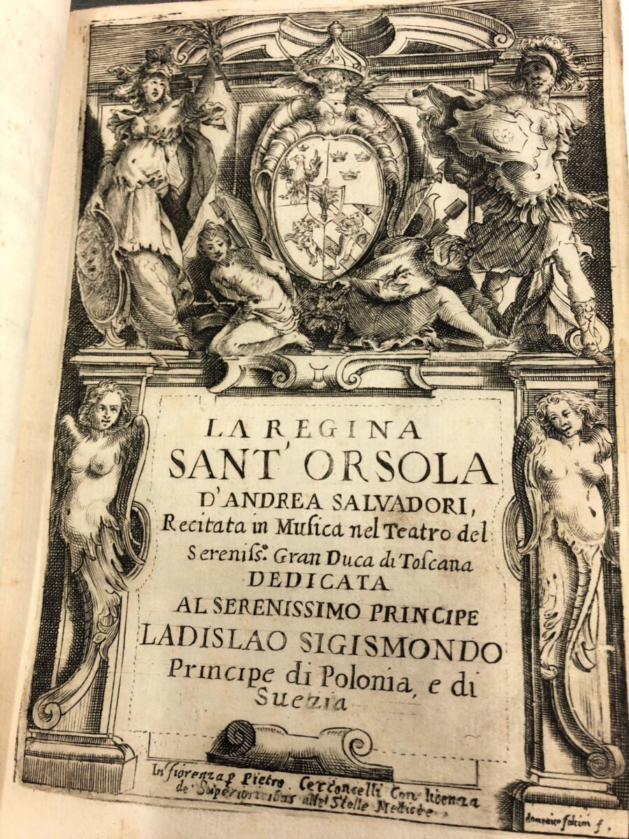
Title page: Andrea Salvadori, La Regina Sant’Orsola
The other two works in this festival book were also female-centred, multi-media performances. La Precendenza delle dame…, created by the Florentine librettist Andrea Salvadori, was sponsored by Cardinal Gian Carlo de’Medici, Maddalena’s son. Dedicated to the “beautiful women of the world,” La Precedenza included a joust and another horse ballet, performed by young men of the court. Set to music by Jacopo Peri, again with designs by Giulio Parigi, La Precedenza enacted a battle between Mars, accompanied by the young men of Sparta, and Athena, supported by the young women of Sparta, who were triumphant. The third entertainment, La Regina Sant’Orsola, a long “recitata in musica,” performed in the Grand Ducal theatre, concluded with the ascension of the virgin martyr Saint Ursula to heaven.
To enjoy a fuller experience of Francesca Caccini’s opera, an audio version of a performance of La Liberazione di Ruggiero, recorded on November 10, 2016 at the Oratorio del Gonfalone di Roma is accessible through the Princeton University Library catalogue.:
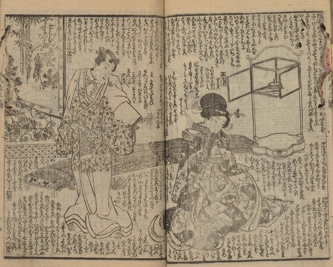
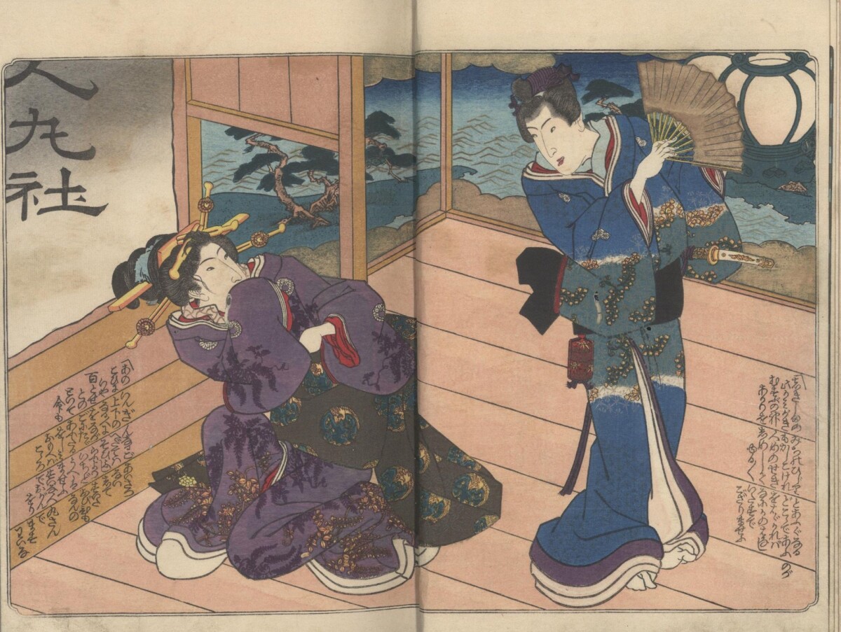
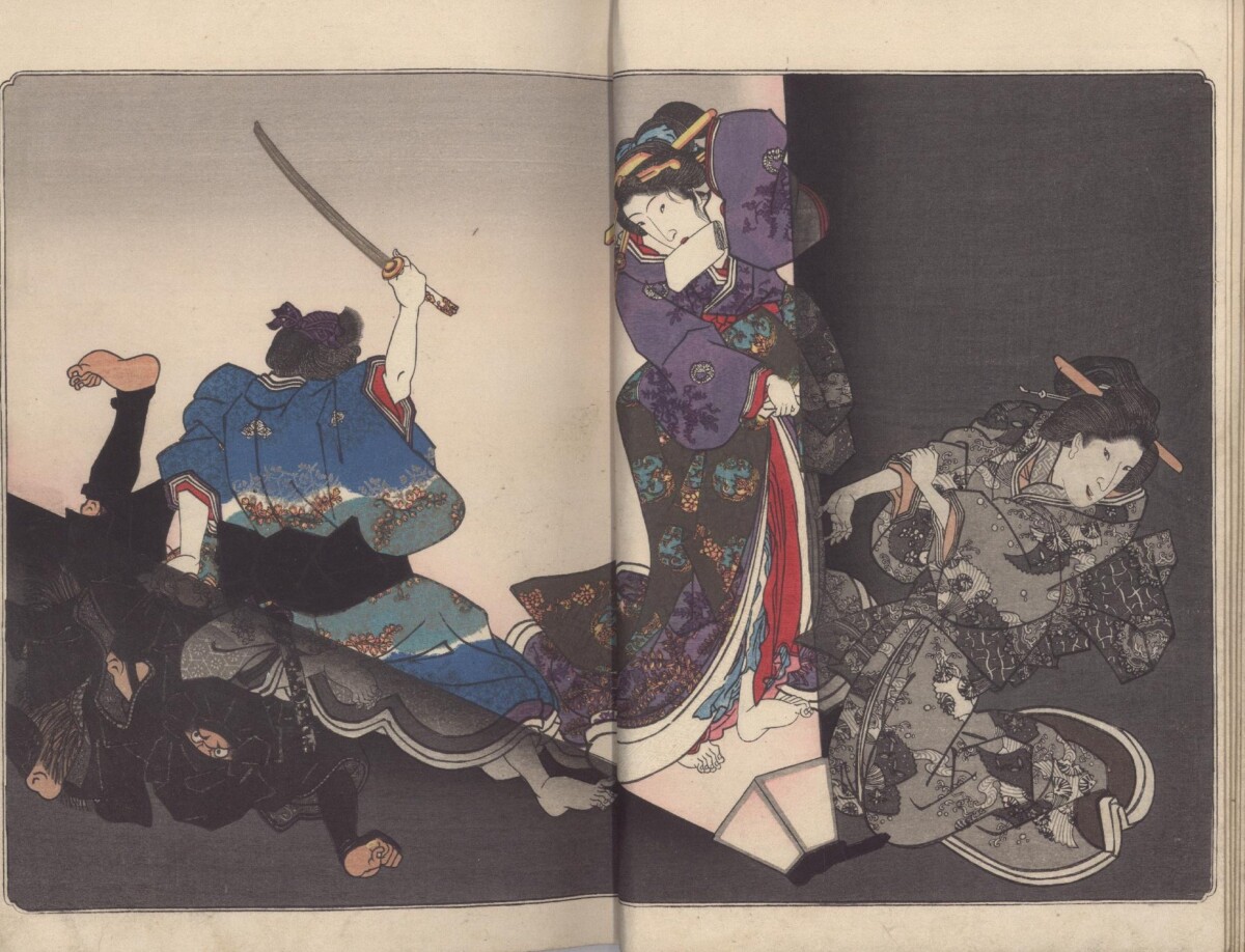
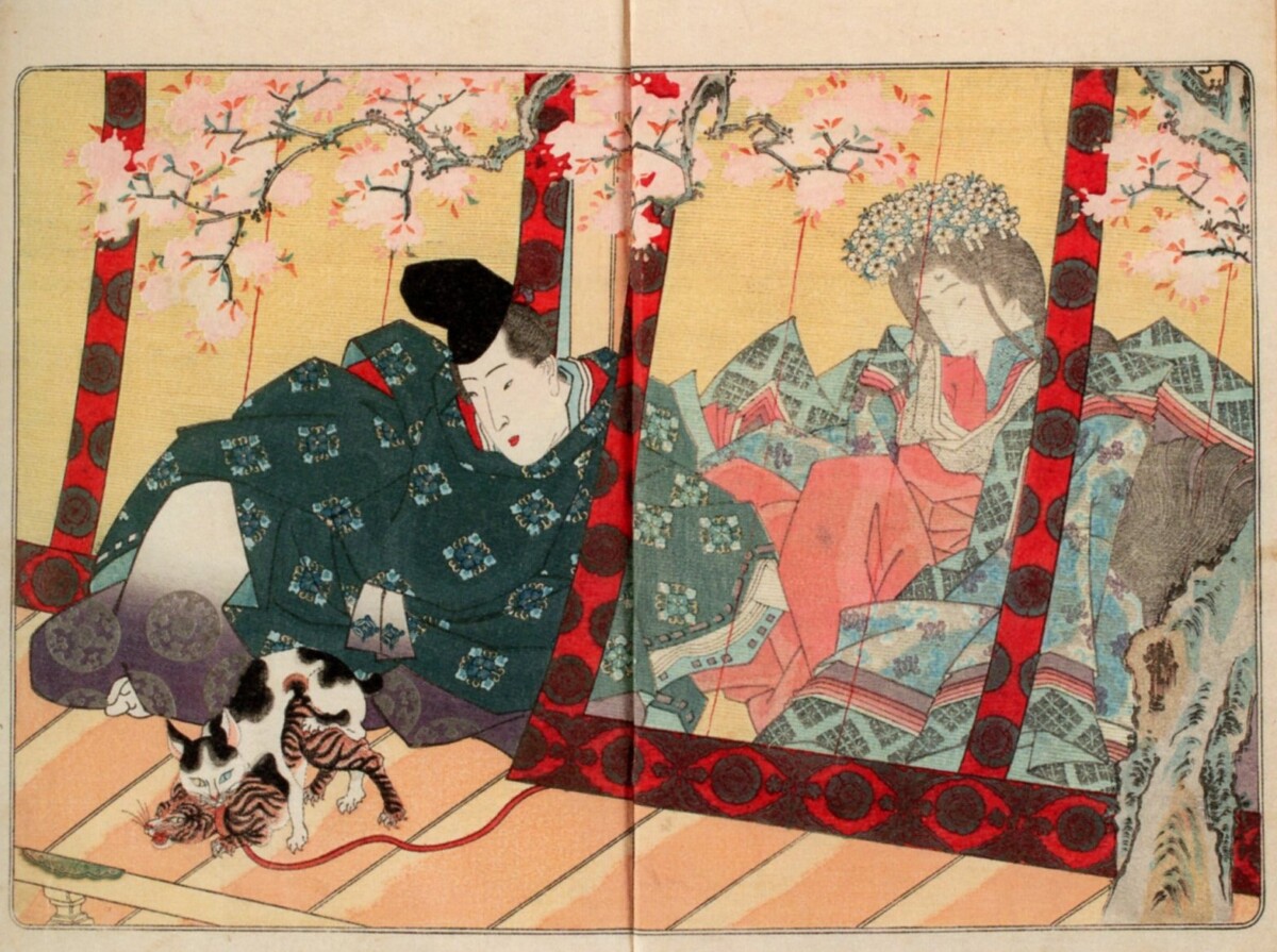
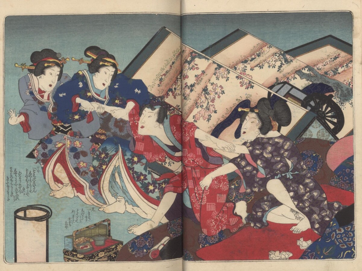
Utagawa Kunisada (1786-1864) is often considered the leading woodblock print artist of the 19th century. A “superstar” in his own time, much of his fame and popularity can be credited to his beautiful and dynamic book illustrations parodying the classic Tale of Genji. Marquand Library recently acquired three of Kunisada’s most important Genji masterpieces, often referred to as the “The Three Genji” (San Genji)1: The Amorous Murasaki Finds Pleasure in Fifty or More Chapters [Enshi gojūyo jō] (1835); Deep Feelings of Birds and Flowers: Genji of the East [Kachō yojō Azuma Genji] (1837); and A True-Life Devoted Genji [Sho-utsushi aioi Genji] (ca.1851). All three are erotica and were therefore illegally published. The first two titles may actually have been part of the 1842 government burning of eleven of Kunisada’s erotic books–and the woodblocks used to print them. According to an investigator’s report, Kunisada may have been tipped off to the raid because the artist had just left on a long pilgrimage to the Ise Shrine.
The Tale of Genji (Genji monogatari) is the most important work of classical literature in Japan. Written around the year 1000 C.E. by Murasaki Shikibu, a lady-in-waiting to the empress, it is heralded as world’s first novel. Like Shakespeare in the West, allusions to Genji permeate Japanese culture even today. It is, however, important to understand not only the iconic nature of this book, which is over 1000 pages in its English translation, but also the 19th century audience’s love of literary and illustrative parody in contemporary books and woodblock prints.
Between 1829 and 1842, the author Ryūtei Tanehiko (1783–1842) wrote a wildly popular parody of The Tale of Genji. Known as “The Rustic Genji” [Nise Murasaki inaka Genji]. The serially published volumes were illustrated by Kunisada and printed in black & white. Like Genji, the hero of the classical tale, Tanehiko’s protagonist, Mitsuuji, had many amorous adventures, which were then discretely illustrated by Kunisada. Brisk sales and Mitsuuji’s romantic escapades, however, appear to have sparked the idea to create erotic and more luxurious versions of Rustic Genji with its original illustrator.
The Amorous Murasaki Finds Pleasure in Fifty or More Chapters(ca. 1835) follows the first 14 chapters of Rustic Genji. Here, our hero, Mitsuuji, arrives for a secret tryst with Fuji-no-kata at Hitomarosha. Kunisada created Mitsuuji’s signature “shrimp-tail” top-knot hairstyle, which subsequently became fashion in the capital city of Edo. *
All three of these Kunisada titles are 3-volume sets and are extravagantly produced first editions. They are printed in rich expensive color on thick luxurious paper. The images have been enhanced with embossing, mirror printing,2 metallic pigments, gold leaf, mica and crushed mother-of-pearl. Perhaps most striking is Kunisada’s use of a deeply saturated Prussian blue (berorin-ai), a synthetic pigment which had only recently been imported from Europe.
The Amorous Murasaki Finds Pleasure in Fifty or More Chapters(ca. 1835)The light from a lamp, knocked over in a scuffle with intruders, allows Kunisada to display his masterful talent with this brilliant play of light and shadow.
The lavish printing of these books suggests private sponsorship for an elite audience, but after these expensive first editions were printed, the same woodblocks would be used to print runs of cheaper versions for the general public. These subsequent editions of Genji-themed books proved to be so popular and profitable that they established Kunisada as a premier artist of erotica, which continued to be the most popular subject matter of Japanese books and woodblock prints in the 19th century.
Deep Feelings of Birds and Flowers: Genji of the East [Kachō yojō Azuma Genji] (1837)The cherry blossoms let us know that spring has arrived and “amorous” cats have had a stirring effect on the sequestered princess and her male courtier.
The first two of the “Three Genji” were published concurrently with new chapters of Rustic Genji, but in 1842, a rumor circulated that, although couched as a parody of the classic tale, the serialized story was really about the goings-on in the Shogunal harem in Edo Castle.3Rustic Genji was banned with only 38 of the 54 chapters published. Tsuruya Kiemon, the series’ publisher, was prosecuted and left bankrupt. The author, Ryūtei Tanehiko died in custody after questioning. As mentioned earlier, Kunisada avoided prosecution, deciding to take a last minute pilgrimage. He may indeed have been tipped off by the elite samurai sponsors his erotic books. He also changed his name to Toyokuni, which some scholars believe may also have helped.
A True-Life Devoted Genji [Sho-utsushi aioi Genji] (ca.1851) The colors of this book, like the red seen here, have been overprinted many times to produce this deep saturated color.5
It was not until 1851 that the third Kunisada Genji-themed erotica of the set was published. In the first two titles, Kunisada had hidden his pseudonym4 within a print in each volume. In this book, perhaps more cautious, he did not. This third title is the most luxuriously created of the three. It is believed to have been privately published by the samurai lord and son of Tokugawa Ienari, Matsudaira Yoshinaga (1828-1890), as a gift for friends. Marquand’s copy is particularly remarkable in that it retains its original wrapper (see below). Although beautifully printed, these book wrappers were often discarded by their owners.
A True-Life Devoted Genji [Sho-utsushi aioi Genji] (ca.1851)Wrapper depicting a sparrow escaping from a bird cage, a scene alluding to the original Tale of Genji in which Genji meets his future wife.6
Erotic versions of the Tale of Genji were popular from the 17th century onward. Marquand Library actually owns what is considered the earliest extant edition of Genji erotica, Genji’s Elegant Pillow (Genji kyasha makura), dated 1676. More about that in a future post, but enjoy seeing this book here.
* Because most of the images from these books are very graphic and may offend, I have chosen the few discrete images available to illustrate this post. If you wish to see an example of a more typical image, an illustration from Deep Feelings of Birds and Flowers: Genji of the East, please click here.
1. Timothy Clark, et al., eds. Shunga: Sex and Pleasure in Japanese Art. London: British Museum, 2013, p. 238.
2. shomen-zuri (front printing) is a burnishing technique, which was used to make the black lines/ areas of woodblock prints shiny.
3. ibid., p. 237. Another scholar suggests that the books may have been banned because the price had become so high as to violate sumptuary laws. (p. 233)
4. Bukiyo Matahei (Matabei)
5. Sebastian Izzard, Utagawa Kunisada: His World Revisited (Exhibition catalog) March, 2021, p. 154.
6. Timothy Clark, et al., eds. Shunga: Sex and Pleasure in Japanese Art. London: British Museum, 2013, p. 241.
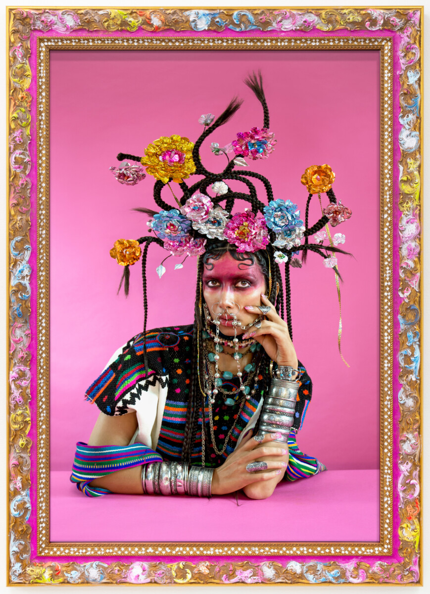
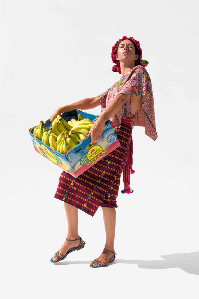
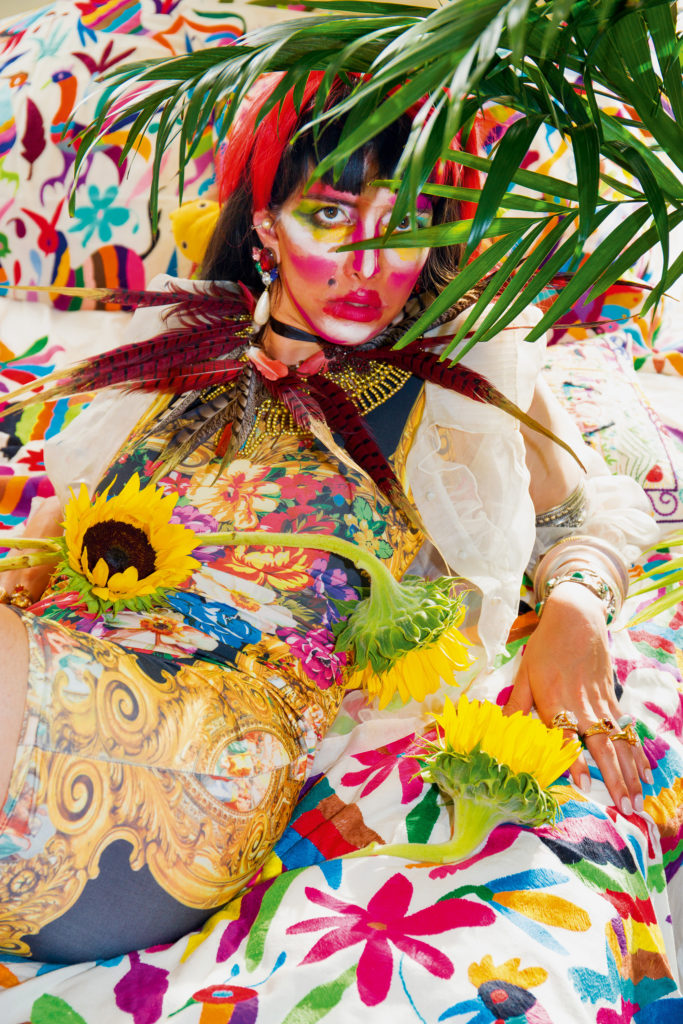
Martine Gutierrez. Indigenous Woman (front and Back cover), 2018. Artist magazine, off-set printed; 124 pages. 16 1/2 x 11 inches (41.9 x 27.9 cm).
Marquand Library collects rare and limited edition items from all time periods. This recent contemporary acquisition is an exceptional example of a publication by artist Martine Gutierrez that at first glance appears to be a modern-day beauty and fashion magazine complete with advertising, interviews, editorials, and fashion photography of the highest level. Upon closer inspection, a biting humor and satire emerge and a more deeply seated cultural critique begins to shine through.
Martine Gutierrez, a self-proclaimed trans artist of mixed ancestry with a Guatemalan father of Mayan heritage, and a mother from upstate New York who is of European descent, started her life in culturally diverse Oakland, California. During the artist’s adolescence, her family moved to Vermont, which proved “jarring” after her experience of the multi-cultural and cosmopolitan lifestyles of families in the Bay Area.
Solo Exhibition, Ryan Lee Gallery New York, 2018
Gutierrez’s artistic work questions not only gender, but what it means to be a “Native-born” woman, and the concept of indigeneity and its manifestation in popular culture. The publication, and later solo exhibition at the Ryan Lee Gallery in New York, was developed over four years during which the artist’s examination of her own identity, cultural background, and ultimately her own image became the central subject of the work. The printed magazine becomes, as a result, an object of performance as Gutierrez’s own image repeats throughout the 124-page spread. A subsequent installation of the photographs were featured in the Venice Biennale in 2019, to great acclaim.
Turning the pages, it becomes abundantly clear that the vibrant and often absurdist imagery is masterfully appropriated and aims to subvert Western standards of beauty in what is otherwise recognized as a ubiquitous format that can be found on any newsstand. The fashion spreads within the work comprise a series of personifications of characters from Mayan communities of Cakchquel, Chuj, and Kekchí, along with images of the artist modeling Guatemalan textiles from her family’s collection, and an inventive “Neo-Indeo” supermodel image that exaggerates stereotyped identities that the artist has endured in her own experiences.
This multi-layered work of art in the guise of a commercial magazine deserves a deeper examination of not only the images, but the interviews, editorials, and advertisements. The artist’s idiosyncratic study of the visual language of the medium that she parodies offers a re-framing of what it means to be a woman, an indigenous person, and a muse of the artist’s own making.
Holly Hatheway Head, Marquand Library of Art & Archaeology
ABOUT: Welcome to Marquand Library's blog highlighting our rare book collection and all things visual. Our staff are delighted to share our growing collections and we invite guest contributions from those who use our materials for teaching and research.
First Marquand Library of Art & Archaeology c.1908
Sign up for Blog updates:
Join 90 other subscribers
NEW RARE BOOK OF THE WEEK!
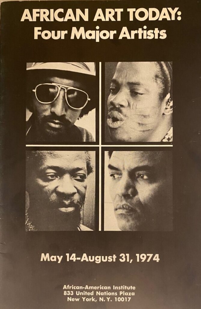
African American Art Today: Four Major Artists / an exhibition of paintings and sculpture by Skunder Boghossian, Valente Malangatana, Twins Seven Seven, and Amir I.M. Nour. New York:, African-American Institute, 1974.


