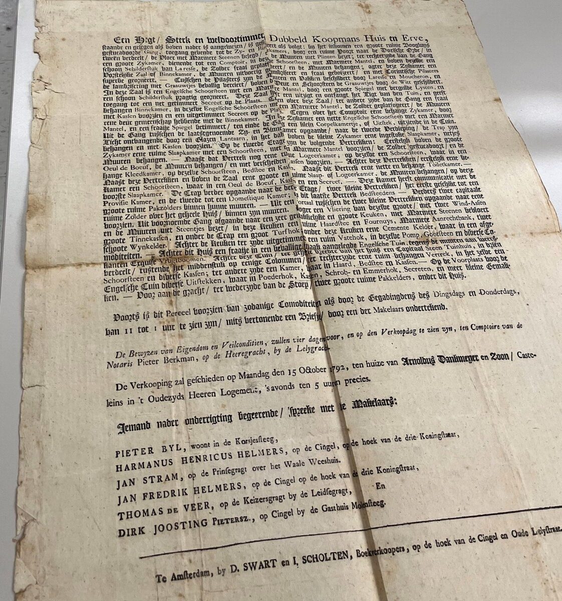
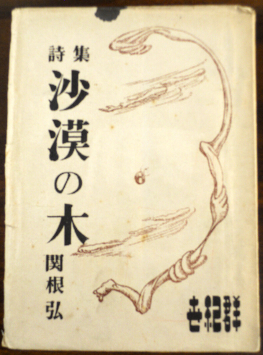
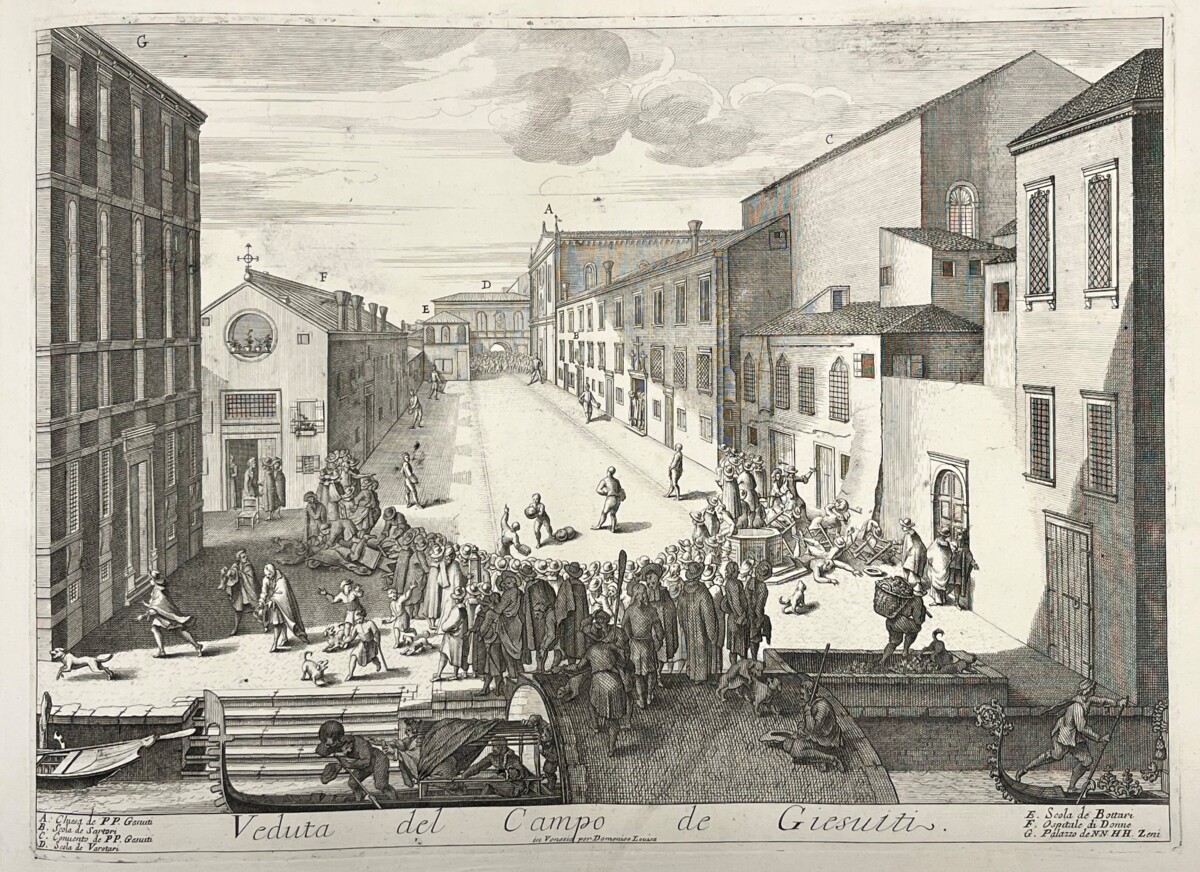
Chronicling Disaster in Mid-19th century Japan

*

It is said that if one natural disaster strikes, a second will occur…

*

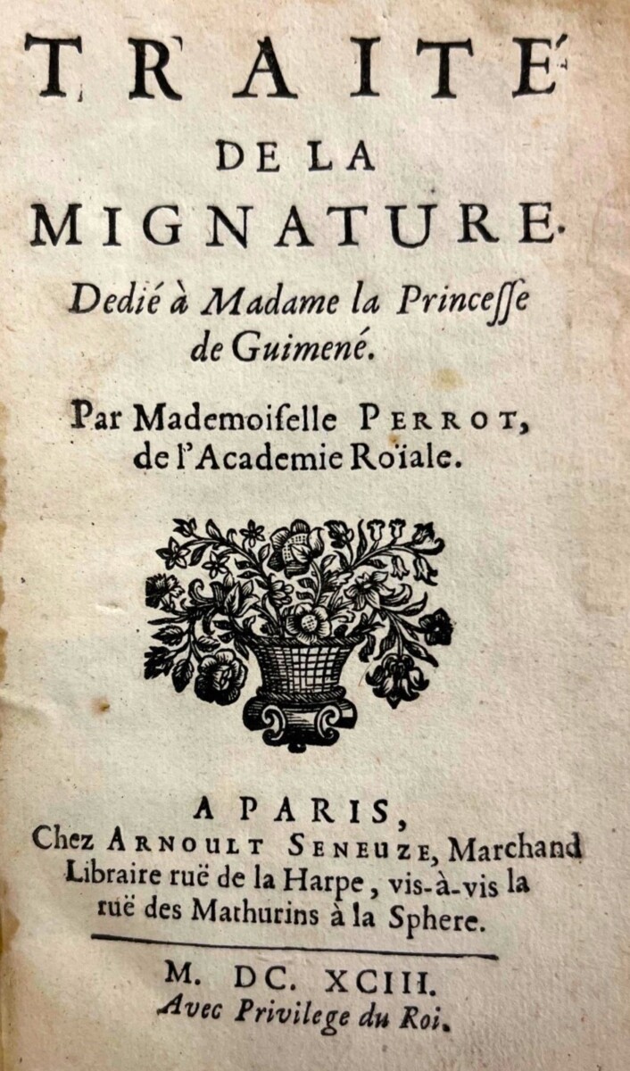
So begins the preface to Natural Disasters of the Ansei Period [Ansei fūbunshū], a harrowing chronicle of disasters that took place in Japan during the first two years of the Ansei period (1854-1860). The era was beset with natural calamities: four major and many minor earthquakes, two tsunami, flu and cholera epidemics that killed hundreds of thousands of people, and a typhoon in 1856. The main focus of this book, however, is the typhoon and the subsequent flooding that took 10,000 lives and wiped out much of northern Edo (present-day Tokyo) and the Izu peninsula. The author, popular fiction writer-turned-journalist, Kanagaki Robun (1829–1894), blends eyewitness accounts, religious and mythological interpretations of events, and powerful images to report these tragic events of the day.

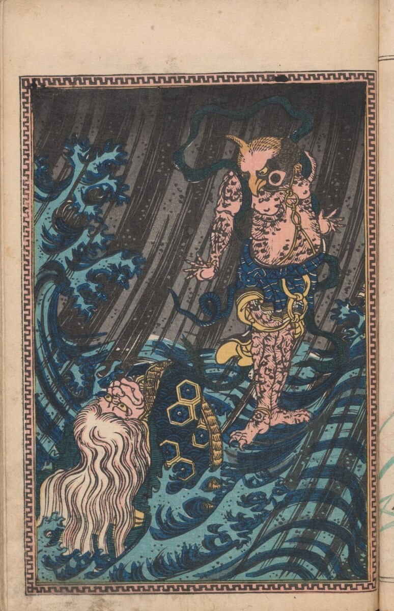
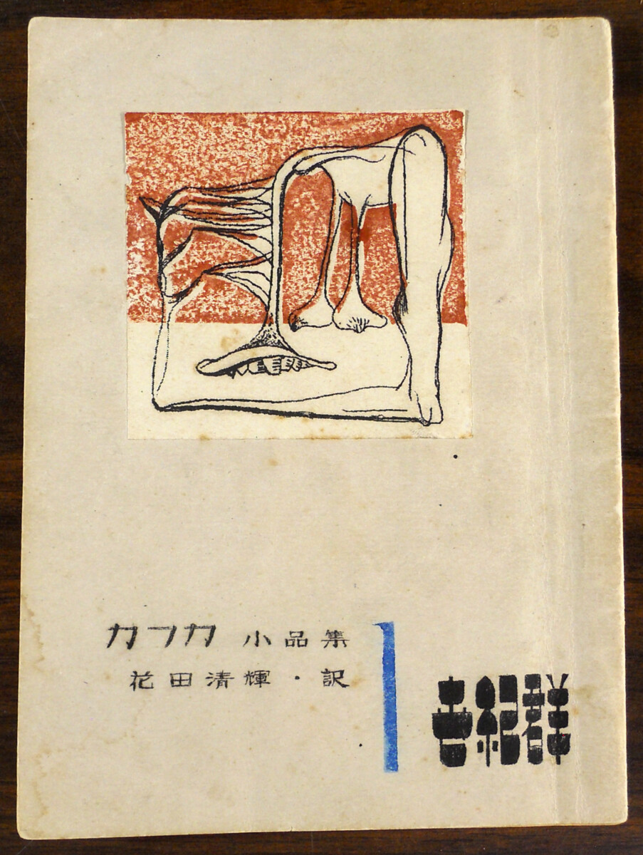
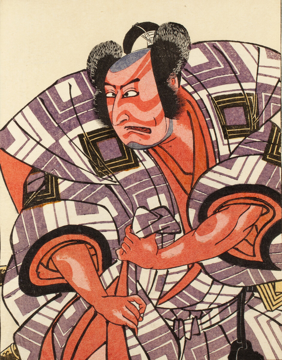
Hiren, the Chinese God of Wind, hovers above an elderly drowning woman in the first illustration for volume 1. Known as a troublemaker, he carries his destructive winds with him in a bag. Robun warns that this image might frighten children.

Many blamed the spate of natural disasters on the arrival of American commodore, Matthew Perry, and his “black ships” in 1853 and again in 1854. Perry forced Japan into trade agreements with the West, ending over two hundred years of self-imposed isolation. Some welcomed the changes that contact with the West brought to Japan, calling it “Modernization.” Others did not, and they believed the earthquakes, tsunami, and floods should be interpreted as a sign that the indigenous Shinto gods (kami) were displeased with this new relationship with the West.

***

Very little is known about the making and distribution of this three-volume set. This is undoubtedly because the books were published illegally.

The Typhoon

The printing of books and woodblock prints was strictly regulated from the early 18th century in Japan. Influenced by the Neo-Confucian teaching that everything should be peaceful and uneventful during the reign of a virtuous government, the Tokugawa Shoguns believed that there was implied criticism in the discussion or publication of anything that might be considered “newsworthy.” They were especially sensitive to criticism that they had unnecessarily capitulated to the Americans when they agreed to trade with Western nations.

To control the publishing industry, all books and prints issued during the Ansei Period were required to include the names of the author(s), artist(s), and the name and address of the publisher. They also required approval from a government censor before publication. Non-compliance could mean public handcuffing or exile for all parties. Publishers, however, often flaunted these laws in books like Natural Disasters of the Ansei Period, and left out publication information. Authors and artists would also use pseudonyms to sign their work. Here, Kanagaki Robun uses the alias Kinton Dōjin.

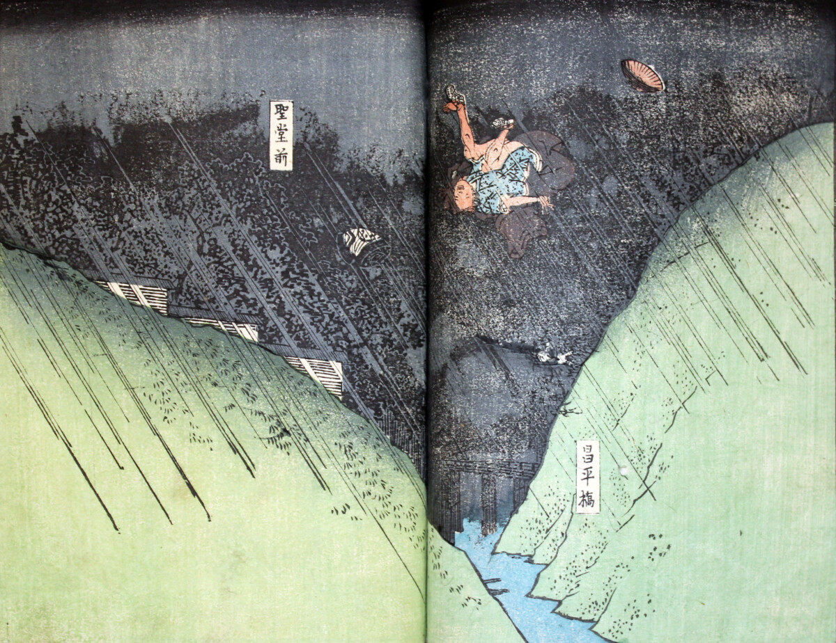
In this scene, the wind from the typhoon is so strong that a man is blown off a mountain near the Shoei Bridge in the Chiyoda section of Tokyo. The Seidō Temple is just visible in the background. This site, one of Hiroshige’s famous 100 Views of Edo, was well known to the very literate Japanese audience. Seeing it manipulated by the artist in this way must have made the visual impact of this scene all the more shocking.

Kanagaki Robun and his publisher were well aware of the dangers of publishing Natural Disasters of the Ansei Period. Months earlier, Robun’s had published another book chronicling a massive earthquake that occurred in 1855.1 It was not only banned by the Shogun after publication, but the artists, the block cutter and the printer were all required to surrender their earnings and pay steep fines. The publisher was banished from his residence. However, as reported in the contemporary diary, Fujiokaya nikki,2 Kanagaki’s anonymity saved him from being punished. It is probably not surprising then, that in an attempt to appease government censors, Kanagaki begins this book declaring that natural disasters are the fault of nature–and not the result of discord or ineffectual rule. Still, no chances were taken with the publication of Natural Disasters of the Ansei Period, and those involved in the publishing process remained anonymous.

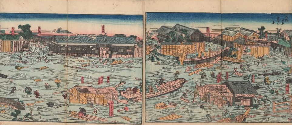
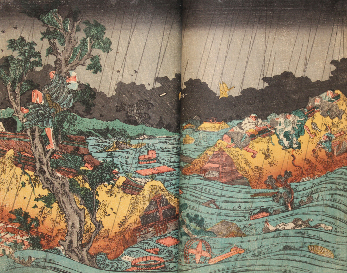
In volume 2, we learn about the many districts of Tokyo that were flooded by the Sumida River during the typhoon. This is a fold-out view of the neighborhood of Ryōgoku after the storm. The red cartouches are inscribed with the names of the different shops and businesses that were destroyed, giving this scene an almost documentary quality.

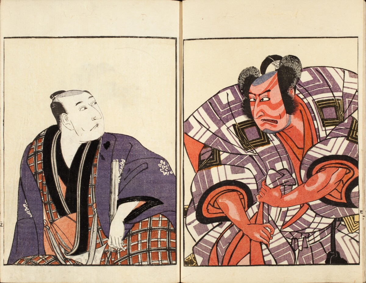
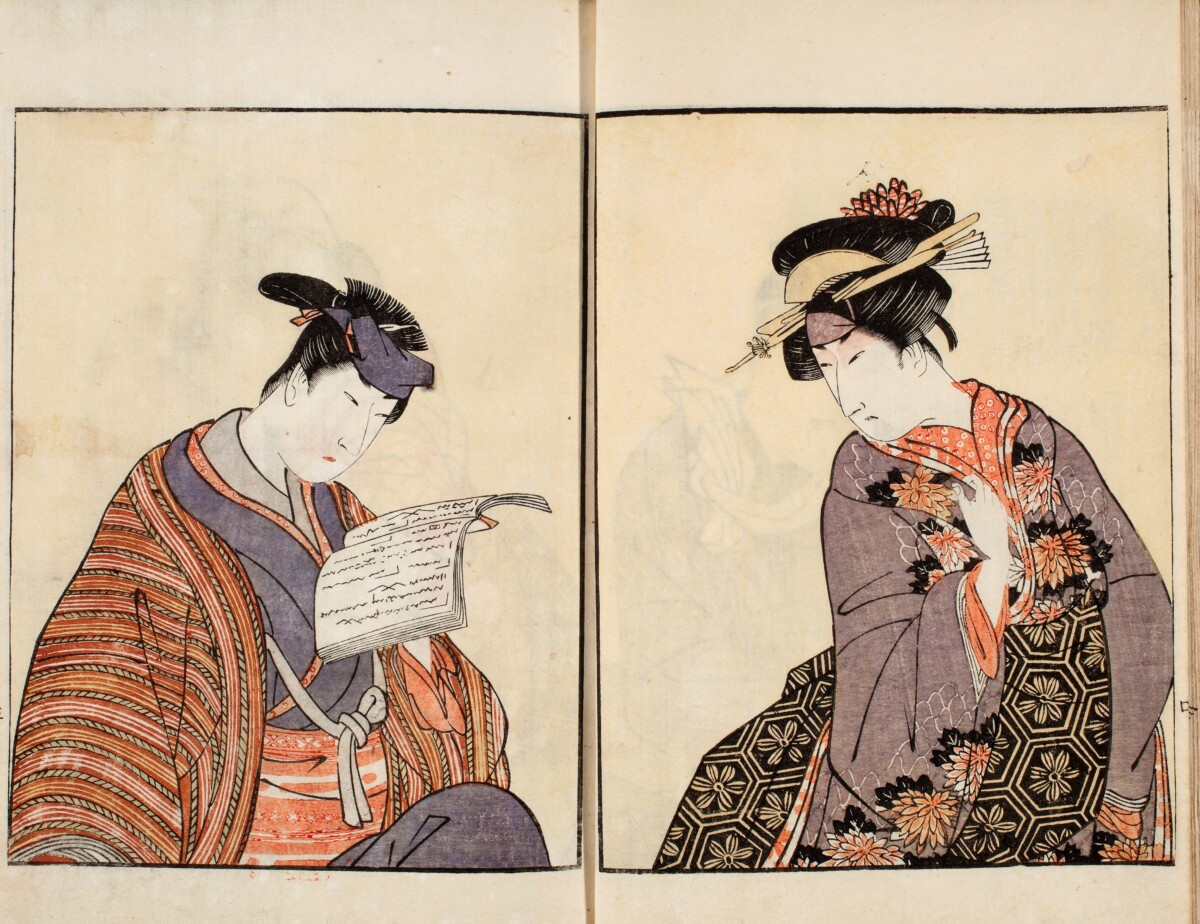
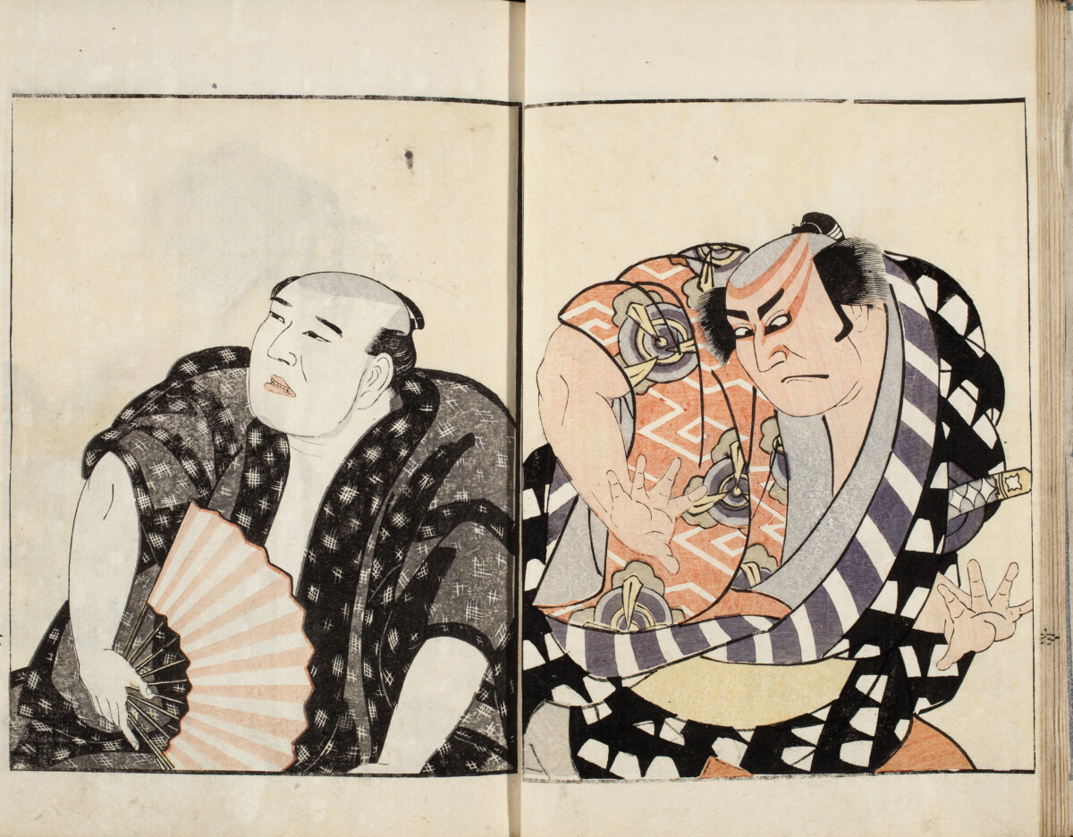
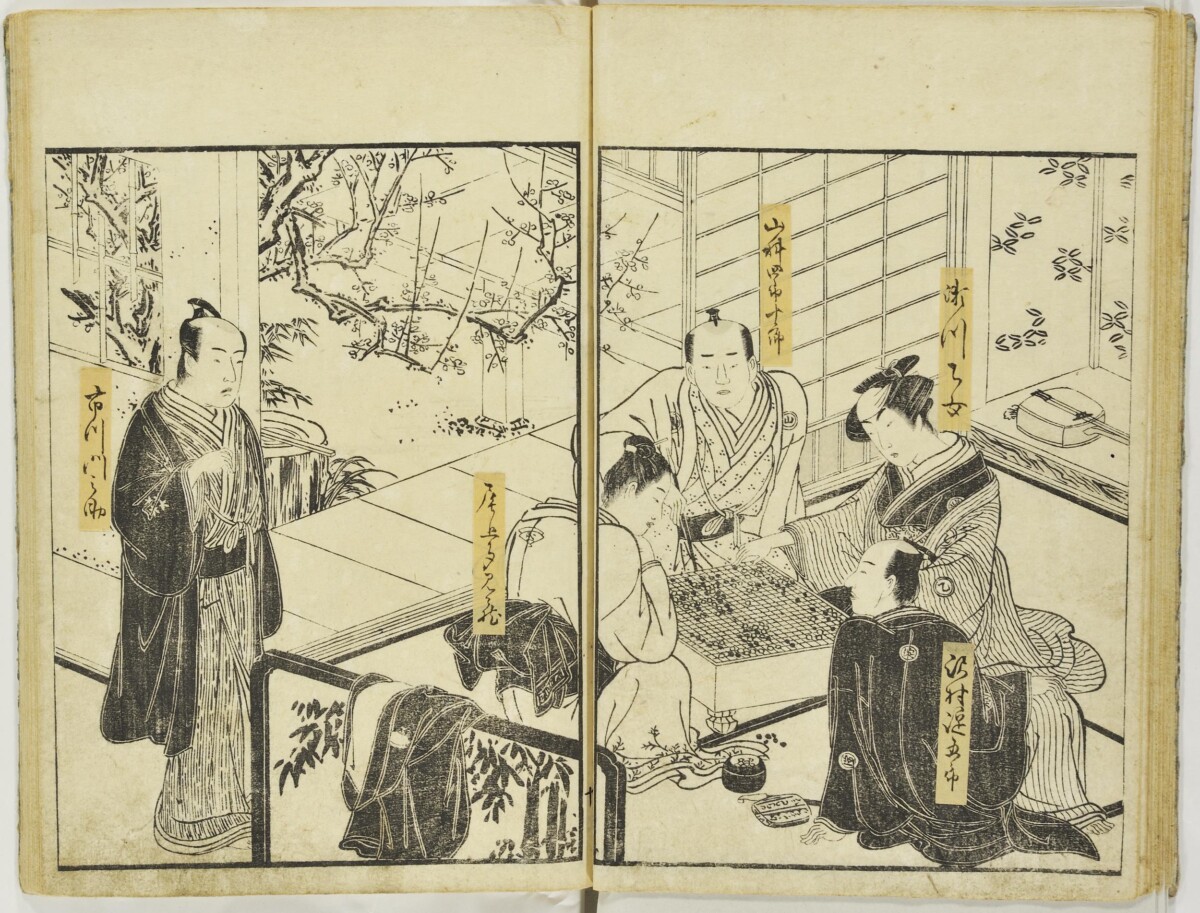
It is difficult to attribute the illustrations in these volumes to a single artist. In Kenji Toda’s 1931 annotated catalog of the Japanese book collection at the Ryerson Library of the Art Institute of Chicago, he reports that their copy is signed, “Utagawa Yoshitsuna” (act. 1850-1860’s), one of the artists fined for designing the woodblock prints for Kanagaki’s earlier earthquake chronicle.3 Although this has become the traditional attribution, the illustration of the man falling from the mountain (above) is signed Mitsuchika Mori (n.d.). It is therefore possible that, like its predecessor, Records of What Was Seen and Heard in the Ansei Period, there were several artists were employed to illustrate this set of books.

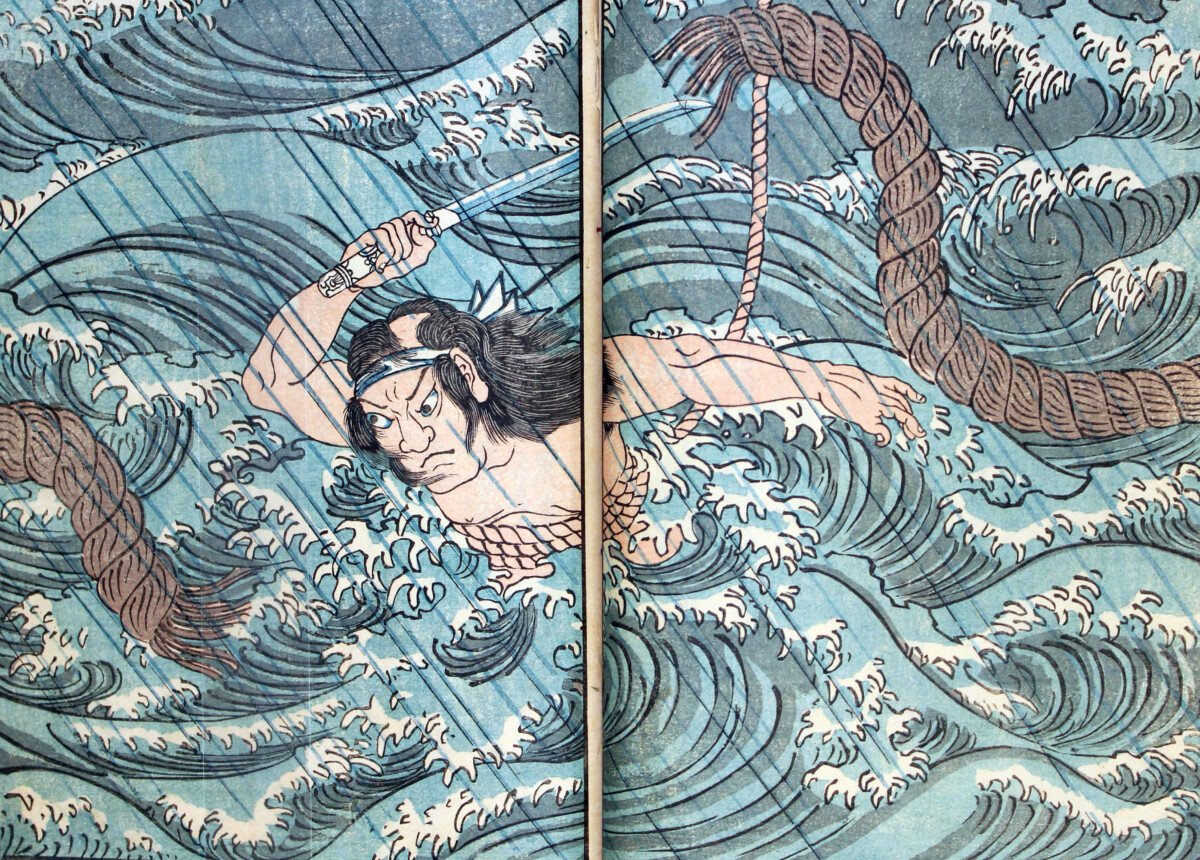
This double-page spread illustrates a personal account from a sailor aboard a boat that got caught in the typhoon. As the crew was managing to keep the damaged vessel afloat, the anchor cable of a much larger ship suddenly appeared before them in the water. Crashing into this heavily-weighted cable would have meant total destruction and loss of life, so the sailor decided to jump into the churning sea to cut it free with his knife. He saved both the boat and the sailors on board from any further harm before being pulled to safety with the rope he has tied around his waist. It is interesting that while many illustrations in this book are panoramic views of the storm’s destruction, the artist here has chosen to depict this story by focusing on one climactic moment.

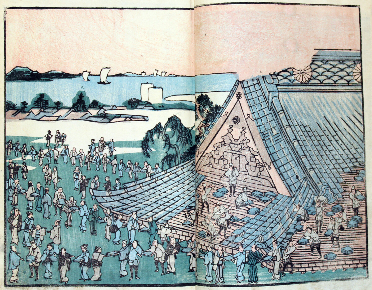
In this scene, repair of the roof has begun on the Teppōzu Inari Shrine, providing work for hundreds of men. The shrine still exists today in Tokyo.

It is interesting that in the third volume of Natural Disasters of the Ansei Period there was also a perceived positive side to catastrophes of the era in Japan. People, who didn’t have much to begin with, began to receive charity for the first time from both the government and wealthy merchants. Carpenters, blacksmiths, and other craftsmen profited greatly from the reconstruction of Edo and its environs. In later years, the destruction caused by the Ansei disasters was described as means to begin anew, to set the wheels in motion for the restoration of imperial rule in 1868, and to bring Japan into the modern age.

  • Nicole Fabricand-Person, Japanese Art Specialist

  1. The book was titled, Ansei kenmonshi [Records of What Was Seen and Heard in the Ansei Period], published 1855-1856. ↩︎
  2. The Fujiokaya Diaries, which date from 1804 to 1868 are a major source of information about the culture (including crimes) of the Edo period. They were written by merchant and bookseller Sudō Yoshizō (b. 1793), using the pseudonym Fujiokaya. See: Tōzō Suzuki and Shōtarō Koike, eds., Fujiokaya nikki. Tōkyō : San’ichi Shobō, 1987-1995. ↩︎
  3. Kenji Toda, Descriptive Catalogue of Japanese and Chinese Illustrated Books in the Ryerson Library of the Art Institute of Chicago. Chicago: [Printed at the Lakeside Press, R. R. Donnelley & Sons Company], 1931, p. 295.  ↩︎

Posted in East Asian, Edo period, Japanese, Japanese, Natural Disasters, Rare monograph, Typhoons, Woodblock-printed books | Comments Off on Chronicling Disaster in Mid-19th century Japan

Catherine Perrot: An Early Treatise on Miniature Painting

Portrait of Catharine Perrot, print by Charpentier, nd.

The Académie royale de peinture et de sculpture, created in 1648 during the Regency of Anne of Austria, shaped the teaching and regulation of the arts of painting and sculpture in France. During the 145 years of its existence, only fifteen women were elected to its membership. Catherine Perrot (ca. 1653- after 1693?), only the seventh female member to be accepted into its ranks in 1682, was the first French woman to publish a treatise on painting. Her Traité de la mignature: dedié à Madame la Princesse de Guimené / par Mademoiselle Perrot, de l’Académie Roïale (Paris: chez Arnoult Seneuze, Marchand Libraire rue de la Harpe… 1693), a recent acquisition by Marquand Library, is one of possibly only eight copies recorded in American institutional collections. But what made this acquisition even more exciting was the description offered by the dealer, which provided information to support a birth date for the artist/author of ca. 1653, more than 30 years later then has traditionally been suggested. So little is still known about Perrot’s life, that this new date leads to a reassessment of her life and career. Even the whereabouts of this portrait of the artist by Charpentier is unknown and is reproduced here from L’Art: revue bimensuelle illustrée (1888).

Louis Ferdinand d’Elle the Elder, Portrait of Marie-Louise d’Orléans, ca. 1679, Musée de l’Histoire de France, Palace of Versailles

Perrot’s Traité de la mignature originated from her experiences teaching painting to royal princesses and aristocratic women at the French court, including Marie-Louise d’Orléans (1662-1689), the Dauphine, Louis XIV’s niece. The text developed from Perrot’s earlier publication, Leçons royales: ou la manière de peindre en mignature les fleurs et les oyseaux; par l’explication des livres de fleurs et d’oyseaux de feu Nicolas Robert, fleuriste (1686), dedicated to her most famous pupil, the Dauphine, who later became Queen of Spain through her marriage to King Charles II of Spain in 1679. In her portrait above, the Dauphine gestures towards the delicate flowers and swans in the background, the type of subject matter she might herself have painted.

Perrot, Traité… (1693), with description beginning at top right of the colors used for the flowers in the 30th plate of Robert’s Diverse fleurs…(1660)
Nicolas Robert, Diverse fleurs…(1660), pl. 30.

Perrot had trained with Nicolas Robert (1614-1685), whose exquisite botanical and ornithological watercolors on vellum were painted first for Gaston d’Orléans and then for Louis XIV, after examples found in the Jardin des Plantes and the Royal Ménagerie. While Robert’s vellums were highly esteemed by the King, his prints of the same subjects were also popular and often served as models for amateur painters. A watercolor of a pot of flowers placed on a mirror was Catherine’s Perrot’s entry piece for admission to the Académie. Perrot’s publications were attractive to her primarily female audience: they offered helpful information on the subject of miniature painting for beginners who wished to learn more about the practice without a tutor. These compact volumes, small enough to be carried around by their owner, also supplied practical recipes for creating colors for those skilled enough to create miniatures themselves or others who wished only to add appropriate color to traced drawings or prints for their own pleasure. As shown in the images above, the text made close reference to examples of the numbered plates found in two books of Robert’s prints, Diverse fleurs dessinées et gravées d’apres la nature (1660) and Diverses Oyseaux (1673).

Catherine Perrot, Les leçons royales … (1686)

On the title page to the Leçons (1686), Perrot had been careful to include her credentials: the association with the books of Nicolas Robert, her membership of the Académie, her dedication to her former pupil the Dauphine, and her marriage to Claude Horry. Horry held an important bureaucratic office — apostolic notary to the Archbishop of Paris, a position whose power was extended by order of Louis XIV in 1691 to “notaire royaux et apostolique.” He had also authored several legislative books, including Le Parfait Notaire Apostolique (1688) and Le Pratique Civile des Officialitez Ordinaires… (1703), noted here because we learn from that title page that his home (and more importantly, presumably that of Catherine, if still living) was in “rue neuve Notre-Dame, devant la grande Porte de l’Eglise & Paroisse de Sainte Geneviève du miracle des Ardens,” Paris.

Catherine Perrot, Traité de la mignature…(1693)

By the time that Perrot reworked her 1686 publication and published it as the Traité (1693) there were notable changes. The title announces a scholarly work, befitting an established académicienne, who no longer needed to be identified by her husband’s status. Following the death of Dauphine/Queen of Spain in 1689, a new dedicatee was needed, this time to “Madame la Princesse de Guimené,” another pupil. In the brief “Avis,” Perrot also now reminds her readers that she had been appointed to the Académie by the venerable Monsieur Le Brun himself (who had died in 1690), and that she was the pupil of Nicolas Robert, the Royal flower painter.

Privilege page for the Traité

From the privilege page at the end of the Traité (printed in April 1693), we learn that the publishing rights to the 1685 Leçons, good for 6 years, had been transferred legally to Arnoult Seneuze, the new publisher. A few months after the publication of the Traité, Perrot was summoned to appear before the Académie. Somewhat mysteriously, nothing further is heard of Mademoiselle Catherine Perrot after this date, and with no other recorded information in the minutes of the Académie, it has been assumed that she either withdrew or was expelled from the membership. We can only speculate on whether her Traité may have ruffled feathers at the Académie. Did she offend by introducing a few added remarks on the theory of painting in general, which have been shown to derive from the work of illustrious theoreticians, such as Roger de Piles and Roland Fréart de Chambray, without acknowledgement (today = plagiarism; then = commonplace)? Or was it because the author had ventured beyond her supposed area of expertise — miniature painting, considered low in the hierarchy of subject matter — into the loftier realms of history painting (figures) and landscape, by adding recipes for painting flesh, draperies, sky and land? Or was it simply that she was a female author/artist attempting to assert her voice in a predominantly male field in a book that some would have considered too lightweight, written for amateurs not professional artists. Perrot’s book may also have been compared to the only other work on the topic: the (originally anonymous) Ecole de mignature or Traité de mignature published by “C.B” (generally attributed to Claude Boutet, though first published by Christophe Ballard). While Boutet’s treatise, first published ca. 1673, appeared in many later different editions and translations (seven in English alone between 1739 and 1752), Perrot’s Traité only reappeared in 1725 as part of Felibien’s Entretiens sur les vies et sur les ouvrages des plus excellents peintres anciens et modernes, tacked on to the very end on the last volume of the series.

Record of marriage of Catherine Perrot and Claude Horry, 1679

After Perrot’s admission in 1682, no more women were admitted to the Académie until 1720. In 1706, it (temporarily) ended the admission of women: seven women in a membership of more than 100 men appears to have been considered somewhat “dangerous.” The publication that same year of Elisabeth Sophie Chéron’s Livre a dessiner, composé de testes tirées des plus beaux ouvrages de Raphaël (1706), may have confirmed fears that an increased female membership might lead to more problems with women artists aspiring to greater power. Chéron (1648-1711), one of the other six female academy members in Perrot’s cohort and a respected portrait painter and more outspoken proto-feminist, has been contrasted by several authors with the “aged” and less threatening Perrot. All previous authors appear to have appraised Perrot’s career from the perspective of a tentative birthdate of ca. 1620, making her in her sixties when elected to the Académie in 1682. This presumed age, coupled with her advancement through royal preferment, led one author to use the phrase “[une] dame âgée inoffensive” to describe her.1

However, the new information regarding Perrot’s age that accompanied Marquand’s copy of the Traité changes our view of Perrot’s career. Many thanks are due to Stéphanie Guerit for bringing to light a manuscript record of the marriage of Catherine Perrot to Claude Horry on June 31, 1679. Catherine is described as being about 26 years old, daughter of Jean Baptiste Perrot, living at rue de la Barillerie, and Henry Pottier “master painter” is recorded as “assisting” Perrot. This information has long been available in the records of the civil status of French artists and artisans compiled by Léon de Laborde (1807-1869), director of the Imperial Archives, but was not widely available until it was digitized as the Répertoire alphabétique de noms d’artistes et artisans, des XVIe, XVIIe et XVIIIe siècles, relevés dans les anciens registres de l’État civil parisien par le marquis Léon de Laborde, dit “Fichier Laborde.” Stéphanie Guerit also cited another source in support of this new view of Perrot’s age: a note relating to Claude Horry in a publication of 1703 recording official permission to delay the baptism of Charles Horry, born in 1689, described as the son of Catherine Perrot and Claude Horry. I was able to explore these sources for myself, and they led to more discoveries.

When she edited and republished the 1686 Leçons as the Traité in 1693, instead of being in her sixties and presumably nearing the end of her career, if not her life (some scholars have suggested that this work may have been published posthumously), Perrot would have been a seasoned but far from elderly académicienne. It is heartening that it still remains possible to discover documents that radically change accepted narratives about the work of women and other underrepresented artists. More research of digitized archival records and other sources may bring news of what actually happened to Catherine Perrot after 1693.

  1. Elisabeth Lavezzi, “Catherine Perrot, peintre savant en miniature: Les Leçons Royales de 1686 et de 1693.” In Colette Nativel, ed. Femmes savantes, savoirs des femmes du crépuscule de la Renaissance a l’aube des Lumières. Geneva: Droz, 1999, p. 230.

Posted in Rare monograph | Tagged , , , | Comments Off on Catherine Perrot: An Early Treatise on Miniature Painting

Before Ruscha?: All the Buildings on Amsterdam’s Canal Streets…ca. 1768

A recent purchase for Marquand Library, Verzaameling van alle de huizen en prachtige gebouwen gelangs de keizers en heere-grachten der stadt Amsterdam beginnende van den Binnen Amstel en eindigende aan de Brouwers-Gracht (Collection of all the beautiful buildings along the Emperor’s and the Lords’ canals of the city of Amsterdam, starting at the inner Amstel, and ending at the Brewers canal) is a unique record of 1400 facades of the buildings along the canal streets of Herengracht and Keizersgracht as they appeared in the late 1760s. The project was devised by the publisher Bernardus Mourik and financed by subscription of 242 individuals, whose professions and ranks were recorded at the beginning of the book. The twenty-four plates were first published in installments between 1768 and 1770, and could be bound as a book (or not) as the purchaser wished. Although the name of the architectural artist and engraver Caspar Philips Jacobsz has long been associated with the prints in this publication, popularly known as the Grachtenboek, his name did not appear on the title page until the second edition of 1791, after Mourik’s death.1 Marquand’s copy is a first edition.

Each plate is composed of two paired strips of prints of the facades of all the existing structures on the two grandest canals in the city, where some of the most desirable residences and establishments were located.

The major canals are arranged in roughly parallel half-circles, as shown in this map of Amsterdam (1662) viewed from the port at the bottom. The Kaizersgracht and the Herengracht are the second and third of these canals depicted just inside the outer border of the city. The outermost canal is the Prinzengracht, which was not depicted in the book, perhaps because the project was never intended to be comprehensive or simply ran out of money. In the plates, the facades on one side of the Kaizersgracht are depicted upright above the facades on the other side, shown flipped upside down; the facades of both sides of the Herengracht are recorded below in the same manner. The four strips scroll smoothly across the twenty-four plates that comprise the book. An ideal viewing of buildings on both sides of a canal simultaneously would seem to be from a boat moving along the water rather than by strolling along the usually narrow sidewalks. A canal boat ride to view the architecture is a pleasure that can still be enjoyed today, and some of the facades have changed very little since the publication of the Grachtenboek.

The original copper plates for the illustrations were discovered in 1912 by Eelke van Houten in the library of the Society for the Promotion of Architecture, resulting in van Houten’s first reissue of the plates in 1922, with added architectural and historical notes. Both the original publication and the later versions have been used by generations of architects for preservation and restoration work in the city as well as for inspiration for new construction. Grachtenboek. Van Caspar Philips. Herdruk, a copy of the 1967 reedition, is also available for viewing in Marquand Library.

As described on the title page, in addition to being intended to appeal to the residents of “these beautiful buildings” the book was recommended for “all those enthusiasts who enrich their art cabinets with everything that shares that taste.” Moreover, since many of the buildings depicted “were built after the designs and drawings of famous Italian and French architects,” the plates would function as a model book for a whole spectrum of those who created such buildings, including carpenters, masons, stonemasons, painters, and smiths, among others. That the book was initially popular with the building trades is reflected in the many names of subscribers with related occupations: there are five master masons, around twenty master carpenters (“Mr. Timmerman”), a few painter-glazers, a master clockmaker, and other craftsmen in the list of subscribers.

Though the name of Caspar Philips does not occur in the title page or on the plates of this first edition of the Grachtenboek, he is recorded as “Casper [sic] Philips, Kunst Plaatsnyder te Amsteldam” in the subscribers’ list, as are two other engravers. Booksellers, both from Amsterdam and other Dutch cities, also appear in this list, as do notable city office holders, along with some only identified by initials. A few widows of prominent citizens, from both Amsterdam and elsewhere, are also named among the mostly male subscribers. Some of these subscribers were also residents of the buildings depicted.

An added bonus to this recent acquisition was a large broadside (see above), advertising the public sale of a double-fronted merchant house and garden on the Herengracht in 1792. The poster had been placed in the book at some point in its history, and is like a time-capsule of a lavishly decorated merchant house in the late eighteenth-century, with mention of the marble floors and fine painted wall panels by Johannes Glauber and Gerard de Lairesse in this property “located on the Herengracht, between Lelygracht and Herenstraat, diagonally across from the Bergstraat.”

On the reverse of the broadside is a (difficult to decipher) pencil note: “Beschrijving van het [huis?] a/d. Heerengracht No. 132 ” and in another spot “Heerengr. 132” with a name: “Tuteins[?] Nolthemius[?].” A few plates in Marquand’s copy of the Grachtenboek include pencil notes by someone who added numbers and notes below certain facades, and one possible date of 1909.

Plate 17 (above) seemed to be of particular interest to the author of these notes: houses along Herengracht opposite Bergstraat have been numbered, and under No. 132 (a handsome, double-fronted house) has been inscribed “ons huis T Nolthemius.” Another house on plate 18 is labelled “tantes Crommeling.” By tracing information about 132 Herengracht, it was possible to conclude that the inscriptions refer to the Tutein Nolthemius family, who inherited the house from the Crommelin family, the owners of the house after the 1792 sale. This particular copy of the Grachtenboek was, apparently, used by its owner to record family history represented by the images of grand homes on the canal. The broadside was likely a souvenir to commemorate the new ownership of the house.

Wikimedia Commons credit: Rudolphous, 2011

This particular house (like all of the others in this remarkable book) has an interesting history.2 Originally built in 1615, No.132 Herengracht was renovated in 1787 (the broadside mentions that it was newly renovated) by Jacob de Fines, and the stepped gables were replaced with a straight wooden ornamented cornice. The painted panels by Glauber and Lairesse, commissioned by the owner in the 1680s to adorn the walls, were first lent to the Riksmuseum before 1910 and later gifted to the museum in 1977, and a similarly painted ceiling was also recently rediscovered in the storage of the Cultural Heritage Agency (RCE).3 On New Year’s Eve, 2008, the house was severely damaged by a fire, but since it was considered a significant landmark, was restored in 2014-2016 and still exists today (see above, right) though it now differs greatly from the image in the Grachtenboek.

For anyone who has read this far in search of Ed Ruscha, Ruscha has described inspirations for his Every Building on the Sunset Strip (1966, first edition) in a video made with the V&A Museum, Dundee, and there is no mention of the Grachtenboek, but Ruscha’s books (including Dutch Details (1971), published in the Netherlands) may be a topic for another blog entry.4

  1. For more information on the editions of the book, see: “Grachtenboek van Caspar Philips,” https://www.amsterdam-monumentenstad.nl/database/grachtenboek_tekst.php?id=34
  2. See more comparisons of facades from the 1768 publication with photographs taken in 1990-1991 by Annemieke van Oord-de Pee in Paul Spies, The Canals of Amsterdam The Hague: SDU [1991], trans. Alan Miller.
  3. For information about the wall and ceiling paintings originally in this house, see: https://www.amsterdam-monumentenstad.nl/berichten.php?id=75
  4. https://www.vam.ac.uk/dundee/articles/ed-ruscha-every-building-on-the-sunset-strip

Nicola Shilliam, Western Art History Bibliographer

Posted in Architecture, City Planning, European, Rare monograph | Tagged , , , , , | Comments Off on Before Ruscha?: All the Buildings on Amsterdam’s Canal Streets…ca. 1768

Art Between the Wars: “Seikigun” and Experiments in ‘Synthetic Art’

Marquand Library is fortunate to be the only institution to own a complete 7-issue run of the Japanese serial Seikigun [世紀群], published and hand-distributed in 1949 and 1950 by the artist/writer organization, The Century Association [Seiki no Kai]. The eclectically produced pamphlets were created as experiments in ‘synthetic art’ (sōgō geijutsu), which was defined by the group as the merging of visual art and literature to create a new form of expression.

Cover of Volume 1

It was the hope of The Century Association that the subject matter of each issue would inspire artistic and political discussion about Japan’s recent participation in World War II. To that end, volumes 2-7 are stamped “Research Material” (kenkyū shiryō) on the back covers. Today, these small printed volumes not only capture the artistic mood of the brief period between the end of the world war in 1945 and the beginning of the Korean Conflict in 1950, but preserve for us the unknown works of important avant-garde artists and writers in Japan.

Founded in 1948, The Century Association was largely made up of the younger members of an avant-garde collective of writers and artists known as The Night Group [Yoru no kai ]. The new group was led by the famous poet, novelist and playwright, Kōbō Abe (1924-1993), who is probably best known in the West for his 1962 novel, Woman in the Dunes (Suna no onna). Teshighara Hiroshi (1927-2001), the avant-garde filmmaker who received an Academy Award nomination for his film version of the book in 1964, was a later participant in the group. Some of its other well-known members were: the poet, Sekine Hiroshi; artists, Okamoto Tarō and Katsuragawa Hiroshi; the art critic, Segi Shinichi; the artist/photographer, Kitadai Shōzō; and the literary critic and journalist, Hanada Kiyoteru.

Illustration from Volume 6

Each of the seven issues of Seikigun is unique in both design and content. All are small in scale (around 18 cm). They are not printed, but stenciled (mimeographed) in black ink with some illustrations done in colored ink (mostly red). What appear to be a few woodblock prints have also been pasted onto the cover of Volume 1 and onto pages of subsequent issues. In keeping with The Century Association’s goal to democratize the creation of art, each issue was a collaborative effort with participants experimenting in areas outside their fields of specialization. So, while the texts were mostly written by the professional writers of the group, the illustrations were designed and hand-stenciled by both the artists and the writers (with artist assistance). The influence of Western Surrealism and Existentialism is clearly evident throughout.

Remilitarization in Japan after the outbreak of the Korean War convinced The Century Association that the essence of the avant-garde movement should be relinquished to the masses, and by 1951 the group had disbanded. It our privilege at Marquand Library to be able to preserve the collaborative work of these writers and artists who, for just a brief moment in time, helped to define the modern art movement in Japan.

Individual Volume Highlights

The first volume of Seikigun, Essays/Small Works by Kafka [ Kafuka shōhinshū] features literary critic Hanada Kiyoteru’s translation of two short pieces by Franz Kafka. One of the founders of The Night Group, Hanada was widely considered the leader of the avant-garde movement in Japan after World War II and may have coined the phrase “total art.” Teshigahara Hiroshi is credited with conceiving the overall design of the issue and it contains two illustrations by Katsuragawa Hiroshi (see below). These, it is explained, are not illustrations of the text, but work that grew out of a group discussion about the publication.

Frontispiece Portrait of Franz Kafka

Volume 1: Illustrations by Katsuragawa Hiroshi

Tucked inside this first volume is a small 3-page insert written (and probably illustrated) by Kōbō Abe. It outlines the goals of this ‘experiment in collaboration’ to create a new genre of diverse artistic expression.

Volume 1: Insert Cover by Kōbō Abe

Volume 2 of Seikigun begins with an essay by Suzuki Shutarō entitled Slip of Paper [Shihen]. There are also two written vignettes and a woodblock print by Ono Seiji.

Volume 2 Cover and Illustration by Ono Seiji

Volume 3 begins with a frontispiece portrait of Piet Mondrian and contains an essay by Segi Shin’ichi entitled, New Realism: American Abstract Art [Amerika no chusho geijutsu: atarashi riarizumu].

Volume 3: Cover

Volume 4 contains Kōbō Abe’s essay, The Magic Chalk [Mahō no choku], about a starving artist who find a piece of “magic” red chalk in his apartment that makes the things he draws on the walls become real. A color woodblock print by Teshigahara Hiroshi also appears in this issue.

Volume 4 Cover and Woodblock Print by Teshigahara Hiroshi

Kōbō Abe is also the author of the essay in Volume 5: Enterprise [Jigyō] / Utopia, which has tipped-in images by writers, Katsuragawa Hiroshi and Suzuki Shutarō.

Volume 5 Cover and Illustration

Volume 6 is comprised of Sekine Hiroshi’s Tree in the Desert [Sabaku no ki] [and illustrations by Kōbō Abe, Teshigahara Hiroshi, Ono Seiji and Katsuragawa Hiroshi.

Volume 6: Cover

Volume 6: Illustration by Teshigahara Hiroshi

The final issue, Volume 7, contains Segi Shin’ichi’s translation of Issues of Literary Critism by Aleksandr Aleksandrovich [Bungei hyoron no kadai ni tsuite]. Volumes 6 and 7 are slightly larger than the other five.

Volume 7: Cover

  • Nicole Fabricand-Person, Japanese Art Specialist

Posted in 21st Century, Japanese, Japanese, Rare journal, Rare monograph | Tagged , , , , , , , | Comments Off on Art Between the Wars: “Seikigun” and Experiments in ‘Synthetic Art’

A Medieval Woman Artist and Musician at Work: The Gradual of Gisela von Kerssenbrock

Gisela von Kerssenbrock with other nuns, detail from Gisela Codex, ca. 1300

Medieval illuminated manuscripts were produced collaboratively by groups of artists and craftspeople – including scribes, illuminators, pigment and parchment preparers, and book binders – whose identities were usually unrecorded. Though some of these manuscripts have been attributed, usually by stylistic comparisons, to named artists, only a few are documented as the work of a particular hand, and that hand was usually male. One notable exception is a named woman whose work was recorded in a book of sacred music, known as the Gradual of Gisela von Kerssenbrock, before her death in 1300. Gisela, identified by name (“Gisle” written in red above her head), is shown here in a detail from the initial letter introducing the music for Advent, one of fifty-three large historiated initials that decorate the manuscript. Though the original manuscript is now conserved in the Diözesanarchiv, Osnabrück (Inv.-Nr. Ma 101), a facsimile copy of this famous gradual was one of the items displayed in Marquand’s most recent Open House in its Scribner Library temporary home.  

Originally made for the convent of Marienbrunn (founded 1246), in Rulle near Osnabrück, this exquisitely illustrated manuscript carries the inscription: “The venerable and pious virgin Gisela von Kerssenbrock wrote, illuminated, notated, paginated, and decorated this admirable book with golden letters and beautiful images in her memory. In the year of our Lord 1300 her soul rested in peace.”

Illuminated initial depicting the Nativity, Introduction to Mass sung at Advent, Gisela Codex, ca 1300

Though the inscription was added after Gisela’s death, and certainly exaggerated her all-encompassing role in the project, research has supported the claim that she made multiple contributions to the project, acting as one of the (possibly three) illuminators, with special responsibility for the writing and notation of the chants recorded in the Gradual. Also, from the evidence of the image above, she was also the cantrix – the leader of the choir, who would have gathered around the gradual used as the score for the musical component of church services in the convent. Since she was depicted and identified by name not once but twice in the illuminations, she was obviously a prominent and probably aristocratic member of the Cistercian convent, and may have commissioned the work. She is portrayed in acts of religious devotion – praying and singing – in two of the key scenes of the Christian calendar, the Nativity of Christ at Advent and the Resurrection of Christ at Easter, where Gisela (again, identified by name) is shown kneeling on the left outside the initial letter “R.” Both events were celebrated in special masses accompanied by music. Gisela’s pride in the value of her services to her faith and her community as an artist and musician here triumphs over the humility and self-effacement traditionally associated with cloistered religious women of her time.

Illuminated letter depicting the Resurrection of Christ, Gisela Codex

Accompanying the full facsimile of the Gisela Codex is a commentary volume with essays about many aspects of art, music, and religious life in ca. 1300, as well as a CD: “Singen wie die Engel,” a recording of sacred music from the Gradual by the Frauenschola des Osnabrücker Jugendchores, directed by Clemens Breitschaft, recorded in the Herz-Jesu-Kirche, Osnabrück, on November 28, 2014.

Facsimile of the Gisela Codex. Luzern: Quaternio Verlag [2015]

The unique and fragile nature of surviving illuminated manuscripts necessitates restricted use and careful handling of the originals to help preserve them for the future. High-quality facsimiles, created using current technological tools, come as close as possible to reproducing the look and feel of reading the unique books themselves, offering wider access to the original documents, and a welcome alternative to viewing online. Marquand Library is fortunate to have one of the most extensive collections in the United States of recent facsimiles of medieval and Renaissance illuminated manuscripts. These facsimiles provide an important resource for research and teaching and are frequently used in classes in many areas of study at Princeton University.

 Nicola Shilliam, Western Art Bibliographer


Posted in European, Medieval Art, Rare monograph | Tagged , | Comments Off on A Medieval Woman Artist and Musician at Work: The Gradual of Gisela von Kerssenbrock

Early 20th-Century Japanese Photography: Hakuyō Magazine

Published between 1922 and 1926, Hakuyō is, historically speaking, one of Japan’s most important photography magazines. It was in this journal that the early 20th century artistic evolution from traditional Pictorialism to Modernist Expressionism was documented–inadvertently–with photographs and essays about photography by the most noteworthy Japanese photographers of the era. Although relatively few copies of Hakuyō survive, Marquand Library acquired 17 original issues, including a special edition catalog of an exhibition held in 1923.

Hakuyō was a monthly magazine published by the Japan Photographic Art Association [Nihon Kōga Geijutsu Kyōkai](JPAA)–the country’s first national organization with ‘art photography’ (geijutsu shashin) as its focus. Both the organization and the magazine were founded by photographer Fuchikami Hakuyō (1889-1960), who owned a photography studio in the city of Kobe. It is believed that the organization may have been formed with the idea of producing the first issue of Hakuyō in 1922, although most of the photographs we see here are by Fuchikami himself.

  • (LEFT) Fuchikami Hakuyō, Foreigners in the Street at Noon [Hakuyō,Volume 1, No. 1 (1922)]. Typical of Fuchikami’s work before 1925, this photograph was taken in March of 1922 in the Kitano district of Kobe. It was an area of the city occupied by foreign residents, and is still famous today for its Western-style architecture.

Marquand’s acquisition of a range of issues across five years allows us a more comprehensive sense of the development of Hakuyō than was previously possible. The early issues of the magazine, for example, were unique in size and shape. They had a variety modern “Western” images printed on their covers. In 1924, however, the dimensions of the magazine became uniform, and by 1926, the covers were all printed with an image of a European-looking woman embracing a guitar (see above) on differently colored stiff papers.

Cover of first issue, 1922

Volume 3, No. 7 (March, 1924)

Volume 4, No. 2 (February, 1925)

No matter what the year, every aspect of this publication was beautifully designed with woodblock prints on the front and back covers and decorative flourishes added to pages of the text.[1] Each issue was filled with finely printed photographs: individual collotypes that had been tipped in and could presumably be removed for display.

Back cover design (1923)

Back cover design (1925)

In the early part of the 20th-century, Japanese photographers were greatly influenced by Western photography, and particularly by Western Pictorialism–an aesthetic movement that had begun in Europe at the end of the nineteenth century. Pictorialists eschewed the documentary aspect of photography and attempted to make their photographs appear more like paintings. Like other fine artists in Japan, Fuchikami and his fellow art photographers also rejected being identified as “professional artists,” with its commercial connotations, and referred to themselves as “advanced amateurs.”

Their portraits and images of nature were conceived in half tones and with a soft focus. Efforts were also made to enhance the texture of photographs to give them a painterly feel. This visual link between painting and photography was especially appealing to Japanese photographers who were struggling to elevate photography to a fine art in early 20th-century Japan.

Fuchikami Hakuyō, Old Man [Hakuyō, Volume 1, No. 1 (1922)]

Cover of 1923 exhibition catalog, Koga no shin-kenkyū [New Studies in Photography], published as a special issue of Hakuyō (November 1923).

We see these photographers embracing the Pictorialist style in earlier issues of the magazine and in the Japan Photographic Art Association‘s 1923 group exhibition catalog, Koga no shin-kenkyū [New Studies in Photography]. Published as a special issue of Hakuyō in November 1923, the catalog was sponsored by the newspaper publishing company, Osaka Mainichi Shinbunsha.

Takada Minayoshi (1899-1982), Departing Boats. Though his work was rooted in the Pictorialist-style seen in this 1923 photograph, Takada later became one of the leading proponents of Constructivism. From the exhibition catalog Koga no shin-kenkyū [New Studies in Photography].

Kagiyama Ichirō (active 1906-after 1941), Lake (Marsh). As seen here, simulating the texture of paintings was an important aspect of Japanese Pictorialism. Not much is known about the “amateur” work of Kagiyama, who spent over 30 years in Australia as commercial photographer to the Japanese community living there. From the exhibition catalog Koga no shin-kenkyū [New Studies in Photography].

By 1925, the images that appeared in Hakuyō were very different. The photography of the JPAA had been transformed into a new kind of modernist expressionism influenced by Western Constructivism and the changing urban environment. Surprisingly, this was not a casual development over time, but a twist of fate caused by a natural disaster.

Fuchikami Hakuyō, Circle and Human Body [Hakuyō, Volume 5, No. 6 (1926)] Hakuyō favored manufactured motifs like this one in his Constructivist works.

The Great Kanto earthquake, which devastated Japan’s capital city of Tokyo in 1923, forced the relocation of artists of the MAVO group to western Japan. Heavily influenced by European avant-garde movements like Futurism, Dadaism, and Constructivism, MAVO spearheaded new art movements in Japan. Now, newly settled in the Kobe area, the MAVO group members encountered Fuchikami Hakyuyo and the JPAA.  Their exchange of ideas resulted in the birth of the Japanese Constructivist School (kōsei-ha).

The pages of Hakuyō clearly document the transformation that took place in photography over the next few years. We see there is a breaking away from the conventional subjects of Pictorialism and a movement toward more abstract notions of beauty found in manufactured motifs and urban landscapes. By 1925, the artist essays that accompany the pictures describe the photograph as a work of abstract art. Fuchikami himself, in an article entitled “Impressions, Still Lifes” (Kansō seibutsu) in a 1925 issue of Hakuyō, [vol. 4, no. 1] declares that “[t]he ultimate reason for viewing nature is to discover the emotive qualities of abstracted nature.”

Matsuo Saigorō (1905-1956) Study # 1 [Hakuyō, Volume 5, No. 6 (1926)] The urban landscape was a popular Constructivist theme.

Constructivist photography reached its peak in 1925, driven by Fuchikami and other photographers like Tsusaka Jun, Matsuo Saigorō, Takada Minyoshi, and Kara Takeshi.

(RIGHT) Tsusaka Jun (1900-1963), Bridge. [Hakuyō, Volume 5, No. 6 (1926)] Tsusaka Jun was one of the JPAA’s first members in 1923. He learned photography while working in the Kobe shipyards and at an aircraft manufacturing plant in Nagoya. Like other members of the association, his early work featured traditional subject matter photographed in soft focus. In 1925, however, inspired by Fuchikami, Tsusaka joined the Constructivist School movement and broke away from nature studies and portraits to become one of Japan’s most famous avant-garde photographers. In this photograph, considered a hallmark of Constructionism, Tsusaka treats his subject matter—an urban landscape—as an abstract construction.

Scholars speculate, however, that in 1926, Fuchikami began to distance himself from Constructivism, and in September of that year, he ceased production of Hakuyō. Even so, as Anne Wilkes Tucker has observed in The History of Japanese Photography, these Constructivist photographers “charted the route toward modernism” in Japanese photography.

Despite the ephemeral nature of the magazine in general and the transience of old photographs, we are fortunate that these issues of Hakuyō have survived to document 1920’s Japanese photography and its first steps toward modernism. 

  • [1] These images were in keeping with a new movement in Japanese woodblock printing: The Creative Print Movement (Sōsakuhanga). In emulation of Western printmaking, these artists shunned traditional Japanese printmaking to carve their own blocks and create “art for art’s sake.”
  • Nicole Fabricand-Person, Japanese Art Specialist
Posted in Rare monograph | Tagged , , , , , , , , | Comments Off on Early 20th-Century Japanese Photography: Hakuyō Magazine

It’s Not Too Late to Take a [Virtual] Vacation: Lovisa’s Il Gran Teatro di Venezia…[ca. 1720]

Although summer has (almost) officially ended, and many of us have returned to work, it’s always possible to take a virtual trip with one of Marquand’s rare topographical books, such as Il Gran Teatro di Venezia overro raccolta delle principali vedute e pitture che in essa si contengono, a recent acquisition. Venice, still miraculously shimmering on its lagoon in the Adriatic, in spite of the ravages of time, too many admirers, and the recent consequences of global warming, is brought vividly to life in this publication from the early eighteenth century.

Il Gran Teatro consists of two albums of prints published in one large volume: part one of Marquand’s copy offers 65 views of the churches, confraternities, palaces, academies, and other notable architecture in their picturesque settings; part two shows 57 printed reproductions of major works of art to be seen inside Venetian institutions, including many paintings in the chambers of the Palazzo Ducale, the Scuole Grandi di San Marco and San Rocco, and churches such as Santa Maria della Salute and SS. Giovanni e Paolo, among others. This book would have provided either a lavish memento of an actual visit or the eighteenth-century version of what we would now consider a virtual tour of the city, illustrated with many of its famous views as well as highlights of paintings in the collections of civic art, for someone who had not been able to make the Grand Tour in ca. 1720.

The publication of a high quality, large format book with so many views of Venice and its art works was both an act of civic pride as well as an economic and cultural statement for the Republic. Though still a Mediterranean entrepot that attracted many visitors, the political power of Venice had waned by this date. Funded by Battista Nicolosi and other members of the Venetian elite, an academy was created to collect material for the proposed publication, which took as its model two earlier view books, Le Fabbriche e Vedute di Venezia (1703) by Luca Carlevarijs and Le Singolarita di Venezia (1708-1709) by Vincenzo Coronelli. The ambitious project took many years to come to fruition and was finally handed to the publisher Domenico Lovisa (1690-1750) to execute as the Gran Teatro, first printed as a collection of prints with no title page in an undated “edition” [ca. 1717]. Marquand’s copy, also with an undated title page but with the addition of a very useful two-page index (see first page, below), is thought to date from that period. Another version, with a slightly different title was printed in 1720. Later versions (1730s-1750s) are distinguished by the inscription “Appo T. Viero Venezia” added to the plates.

With its long tradition of book publishing, patrician funding, and the presence of a large community of painters and engravers, Venice provided Lovisa with the means to complete the project. Many successful artists worked on the prints, including Andrea Zucchi, Luca Carlevarijs, Giuseppe Valeriani, Felippo Vasconi, Domenico Rossetti, Silvestro Manaigo, and a young Giambattista Tiepolo (above: his signature in one of the plates), though many are also unsigned.

The prints in the second part of the book are interesting examples of early reproductions of works of art in public collections. Many of the paintings are depictions of events in the history of the Serenissima by some of the foremost Venetian artists working in the sixteenth century, including Veronese, Tintoretto, and Palma il Giovane. This print after Tintoretto’s painting in the Chamber of the Great Council of Doge’s Palace shows the reception of the Venetian ambassadors at the court of Frederick I Barbarossa (Holy Roman Emperor, 1155-1190), a period when Venice was a major power in the Mediterranean.

Another print, made by Andrea Zucchi after a drawing by Silvestro Manaigo, reproduces Tintoretto’s dramatic painting (ca. 1562-1566) of the miraculous “translation” (or theft, depending on your point of view), of the remains of St. Mark from Alexandria to Venice in the ninth century. Its subject would have been particularly challenging for the printmakers: a night scene, with sudden lightning and the illusion of ghostly figures and cherubim in the background, contrasting with the dramatically lit, realistic flesh of the protagonists in the foreground. Venerated as the patron saint of the city, images of St. Mark were a major feature of the Scuola Grande di San Marco. This painting is now in the collection of the Accademia, Venice.

Jacopo Tintoretto, St Mark’s Body Brought to Venice (ca. 1562-1566) (Accademia, Venice)

In addition to the famous buildings and religious and history paintings, the prints offer insights into aspects of everyday life in this bustling city in the early eighteenth century, ranging from detailed views of major public ceremonies, such as the Easter festivities in Campo San Zaccaria (above), to some less dignified but still significant sights, such as this scene (below) of a crowd in the Campo dei Gesuiti watching a ball game, one of the popular and sometimes violent urban pastimes that also attracted many spectators. The scene also throws light on a lesser known feature of life in the city: garbage disposal. In addition to the piles of broken furniture and other detritus visible near the crowd is an enclosure next to the canal denoting that this area is one of the “scoazzere,” designated enclosures where Venetians could leave everything that could not be tossed into the canals to be carried away by the tides that naturally removed most garbage twice daily. Once the scoazzere became full, boats would load up the trash and dump it outside the city.

Looking at a photo of the same square today, many of the locations shown in the book appear remarkably similar, even three centuries later.

Photograph of Campo dei Gesuiti, Venice, by Didier Descouens at Wikimedia Commons

Nicola Shilliam, Western Art History Bibliographer

Posted in Rare monograph | Comments Off on It’s Not Too Late to Take a [Virtual] Vacation: Lovisa’s Il Gran Teatro di Venezia…[ca. 1720]

Public and Private Sides of the Kabuki Actor

Woodblock-printed books and single-sheet prints related to the kabuki theatre were in high demand during the Edo period (1615-1868). It is estimated that more than a third of all woodblock prints published during this era were “kabuki prints” (kabuki-e). Like movie magazines of the past and celebrity-focused social media today, they were the vehicle by which images of actors and highlights of theatrical performances were transmitted to enthusiastic audiences throughout the country—even to those who could not afford admission or to those who, because of their location in major cities, would never have the opportunity to see a show.

Detail from Actors on Two Sides of the Leaf (1803) by Utagawa Toyokuni

Among the kabuki theatre-related materials in Marquand Library’s collection, is the extremely rare and renowned book Actors on Two Sides of the Leaf [Yakusha konotegashiwa]. This two-volume set of richly-colored half-length portraits of kabuki performers by the artist Utagawa Toyokuni (1769-1825) created a sensation when it was published in 1803. At a time when the book-buying public craved innovation, it was a new and novel concept: it offered both the large focused portraits of the costumed actors popular in contemporary single-sheet prints on one side of the page opening and, on “the opposite leaf,” similarly-sized portraits of those same actors as they looked in everyday life—barefaced, without wigs, and in street clothes. (To understand the book’s popularity, one need be reminded how tempting it is today to click on a link that will show you a Hollywood celebrity without make-up!)

Actors on Two Sides of the Leaf (1803) by Utagawa Toyokuni

These portraits were touted as being superb likenesses of the individual actors both on and off the stage. In his preface to the book, for example, playwright and humorist Utei Enba claims they are as alike as “a reflection in water” and compares the portrait pairs to a classic story of an ancient painting of a horse. The painted horse, he recounts, was so realistic that each night it left the confines of the painting to go outside and eat bush clover. The striking contrast between these “realistic” portraits of actors and their onstage personae is so striking, it is not surprising that these images would delight reading audiences everywhere.

Actors on Two Sides of the Leaf (1803) by Utagawa Toyokuni
Thuja Orientalis (Oriental Arborvitae/ in Japanese: Konotegashiwa)
[Photo from the College of Agricultural Sciences of the University of Oregon:
 https://landscapeplants.oregonstate.edu/plants/thuja-orientalis]

The title of the book, Actors on Two Sides of the Leaf, while referencing the book’s format, is also a play on words, something that would have been much appreciated by contemporary audiences. The word konotegashiwa is only very loosely translated to mean “two sides of the leaf.” Konotegashiwa is actually the Japanese word for the tree, Thuya Orientalis, which has leaves that are different on either side. The expression “the two faces of konotegashiwa,” (konotegashiwa no futa omote) was often used to describe things that appeared to be different, but were actually the same. Utei Enba, at the end of his preface acknowledges his clever title by referring to the “the two faces of the actor” (yakusha no futa omote).[1]

Although Actors on Two Sides of the Leaf was appreciated for its innovative design, it was not without its precedents. The first foray into portraying actors in “everyday life” was a book designed by the artist, Katsukawa Shunshō (1726-1793), and published in 1780. Printed less luxuriously in black & white, Actors Like Fuji in Summer [Yakusha natsu no Fuji], was filled with illustrations of actors living their private lives, enjoying activities like boating, visiting shrines, playing go, or strolling on the street. Like Mount Fuji, without its snow-capped peak in summer, the actors were portrayed without their wigs (or stage make-up). The book appears to have been popular because a second edition was issued in 1781, with the final page altered to include three actors new to the Edo (Tokyo) kabuki stage. [2] Yet, the subject matter appears to have languished until Toyokuni’s re-imagining of the theme with focused portraits in 1803.

Actors, in their private lives, playing the game of go. From Shunshōs book, Actors Like Fuji in Summer [Yakusha natsu no Fuji] [Edo: Okumura Genroku and Matsumuru Yahei]. Courtesy of The Trustees of the British Museum.

The publication of Actors on Two Sides of the Leaf was timed to coincide with the 100th anniversary of the death of Ichikawa Danjūrō I, the first in family line of legendary kabuki actors that continues to this day. Toyokuni begins the book with the 12-year-old Danjūrō VII (1791-1859), who had inherited the name two years earlier in 1801, and ends with portraits of his grandfather, Danjūrō V (1741-1806) (see below).

Ichikawa Danjūrō V (Ichikawa Hakuen) from Actors on Two Sides of the Leaf (1803) by Utagawa Toyokuni

Also in the Marquand collection is a later version of the “Fuji in summer” theme by one of Toyokuni’s pupils, Utagawa Kunisada (whose work was highlighted in a previous blog post on banned books), entitled Actors Compared to Fuji in Summer. The two volumes, published 1827-1828, follow Katsukawa Shunshō’s earlier model and illustrate actors in various offstage pursuits (volume 1) and in and around their homes (volume 2). This detailed look at actors in their private lives is distinguished from the earlier publication by its rich color. Beautiful patterns on actor robes and luxurious wall papers and accoutrements hint at lavish lifestyles of kabuki stars, who are identified by name in the cartouches beside them. It reminds us that, just like our peeks into celebrity homes today in magazines like Architectural Digest and TV shows like MTV Cribs, people have always been fascinated with “the other side” of famous actors.

  • [1] Jack Hillier, The Art of the Japanese Book. [London: Sotheby’s Publications, 1987], vol. 1, p. 575.
  • [2] Kenji Toda, Descriptive Catalogue of the Japanese and Chinese Illustrated Books in the Ryerson Library of the Art Institute of Chicago, [Chicago, 1931], pp. 181-2.

  • Nicole Fabricand-Person, Japanese Art Specialist

Posted in East Asian, Japanese, Japanese, Rare monograph | Tagged , , , , , , , , , , , , | Comments Off on Public and Private Sides of the Kabuki Actor

JAPANESE ‘POP-UP’ TEA HOUSES: Chaseki okoshiezu

As early as the seventeenth century–long before there was 3-D computer-modeling for home renovations on HGTV–Japanese carpenters (architects) created detailed three-dimensional paper models of famous tea houses, designed by the great tea masters of the past.

Sakata Sakujirō,Chaseki okoshiezu [Folding-drawing Tea Houses] (early 20th-century).

Although very rare, Marquand Library has been able to acquire two complete sets of tea houses: a hand-inscribed set of pop-up models dating from the late 19th-century (ca. 1820-60) and a woodblock-printed set from the early 20th-century. The former was originally owned by the Kenshin’in, a small temple in Kyoto, and the latter was made and sold by the tea utensil dealer, Sakata Sakujirō. Each set contains 90 pop-up models housed in two wooden boxes.

Pictured here are the paulownia wood boxes from the 19th-century set of pop-up tea houses, originally owned by the Kenshin-in temple. The 45 models in each box lay flat in soft paper envelope-like enclosures (seen here to the right). A table of contents has been pasted to the underside of each box lid.

Very little is known about the history of these “folding-drawing tea houses” [chaseki okoshiezu]. Some scholars have suggested that, like HGTV celebrity hosts, architects made these boxed sets of pop-up models to share ‘the look’ of classic structures and potential building designs with their clients. Others—noting the comprehensively inscribed details of construction and decoration on each model—have speculated that they were originally made to transmit classical ideals of tea house construction and spatial design to future generations in their family workshops. Whatever their origin, by the late 19th-century, these sets of pop-up models appear to have been made and sold by tea utensil dealers as collectibles for tea aficionados.

Traditional tea houses are generally small rustic wooden buildings, specifically created for the tea ceremony (chanoyu)–the ritual of preparing and drinking powdered green tea (matcha). They are built to be a respite from the chaos of everyday life and therefore emulate the thatched huts of quiet mountain villages. The tea house and adjunct garden design developed in the 16th-century not only impacted the history of Japanese building design but, in the 20th-century, profoundly influenced architecture around the world. These models preserve this architectural tradition.

Built in 1582, the Tai’an Tea House was designed by the famous tea master Sen no Rikyū (1522-1591) for the legendary general, Toyotomi Hideyoshi (1593-1615). Tai’an survives today on the grounds of the Myōki’an, a Zen temple just outside of Kyoto. It is one of three tea houses to have been officially designated a Japanese National Treasure.

The tea ceremony itself is an art form in Japan and the collecting of tea utensils (tea bowls and caddies, scoops and whisks) for use and for display has been popular since the 15th-century, when the Ashikaga shoguns first acquired collections of fine tea ware from China. For hundreds of years, dealers sold fine tea ceremony-related items to avid collectors and practitioners–and it appears, that by the turn of the 20th-century, these sets of tea houses had become another popular item to collect.

The early 19th-century pop-up tea house in Marquand’s collection was once owned by the Kenshin’in, a small temple that still exists today in Kyoto. It is a particularly fine collection of large, highly articulated models that have detailed hand-written notations regarding construction, materials and decoration. Made and signed by Nobutatsu Tansai, this set differs from the others made by him, which are comprised of 65 tea houses, housed in a single, divided box. This set features 90 tea houses divided evenly between two wooden boxes made from paulownia wood. (Paulownia wood was used because it is not only insect resistant, but regulates the interior environment of a box by swelling and contracting with outside changes in heat and humidity.) A soft paper envelope, labeled with the name of the model, protects each individual tea house from damage. It is attached to and becomes the base of the model when the structure is unfolded. As can be seen above, there is a hand-written index (mokuroku)—a Table of Contents—listing each of the forty-five tea houses within, pasted to the underside of each box’s lid. All are legendary buildings designed by famous tea masters from the sixteenth to early nineteenth century. Their names appear in tiny characters to the right of each structure and include such notable figures as Takeno Jōō (1502-1555), Sen (no) Rikyū (1522-1591), Furuta Oribe (1544-1615) and Kobori Enshū (1579-1647). The site of this set’s manufacture, Hokushō Koga (an area in modern Chiba and Ibaraki prefectures) appears beside the index, in the upper left corner of the label, followed by the name and seal of the set’s maker, Tansai Nobutatsu.

Fushin’an tea house. Designed and built in the 16th-century by the legendary tea master, Sen no Rikyū (1522-1591), the Fushin’an tea house is located in Kyoto and is associated with the Omoesenke School of Tea.

Our early 20th-century set of pop-up tea houses was made and sold by the tea utensils dealer, Sakata Chōjirō. Like the Kenshin’in set, it has 90 folded structures equally divided between two wooden boxes. There is some variation, however, in the tea houses chosen for inclusion in each set. This may reflect changes in the perceived importance of certain tea houses or, possibly, the emphasis on tea houses associated with different schools of tea. In both sets, similar papers–the stiff stock used for the pop-up tea house structure and the thick soft sheets used for the envelope enclosures have been used. Three of the tea houses from this set have been photographed from different angles and digitized. For a better sense of these remarkable pop-up structures, they are available for viewing here.

  • Nicole Fabricand-Person, Japanese Art Specialist
Posted in Rare monograph | Tagged , , , , , , , , , , , , | Comments Off on JAPANESE ‘POP-UP’ TEA HOUSES: Chaseki okoshiezu

Samuel Fosso: In the Beginning

Samuel Fosso at Photo Studio Nationale, 1970s, Studio Photo Nationale (2021)

The work of Samuel Fosso, an acknowledged star of the contemporary art world, whose career spans five decades, was recently showcased in Samuel Fosso: Affirmative Acts, organized by the Princeton University Art Museum in collaboration with the Walther Collection and curated by Princeton University Professor Chika Okeke-Agulu with Silma Berrada, Lawrence Chamunorwa, Maia Julis, and Iheanyi Onwuegbucha.1 But the artist began his career as a photographer early, opening a portrait studio “Studio Photo Nationale” in Bangui, Central African Republic, at the age of just thirteen. Born in Cameroon in 1962, but raised in Nigeria, Fosso lost his mother early, and had been forced to flee his home in Afikpo for Central African Republic to escape the widespread violence of the Nigerian Civil War. Joining an uncle in Bangui, he began an apprenticeship with a local photographer but quickly branched out on his own.

Samuel Fosso, 70’s Lifestyle (1976-77), printed 2022, gelatin silver print
Princeton University Art Museum purchase, Carl Otto von Kienbusch Jr Memorial Collection Fund

As the sign below the counter promised, in their Studio Photo Nationale portraits, Fosso’s clients would be “… beautiful. chic. refined and easy to recognize.” In between portrait sessions for clients, the teenager escaped the dangers and traumas of his life by creating his own world in the stylish and playful photographic self-portraits he made, dressed in the hipster fashions of the vibrant African music scene of the era, and posed against colorful patterned textiles and props in the photo studio. These photos were rendered even more striking in the black-and-white format that was the mainstay of his commercial business. In a photograph now in the collection of the PUAM, he reveals his process in the act of taking a self-portrait in the studio setup before editing out the lights and cropping the final composition. Fosso recounted that he sent some of these self-portraits to cheer up and reassure his grandmother, hundreds of miles away in Nigeria.

Samuel Fosso, Studio portrait photo, 1970s, Studio Photo Nationale (2021)

On his website, the artist notes that in this early period in Bangui, in addition to his admiration of the style of contemporary West African musicians, he was also “excited by the images of the African Americans and their sense of style” that he first saw in the magazines that young Peace Corps volunteers in Central African Republic brought with them.2 Thus began the evolution of Fosso’s ongoing series of inspired self-portraits, where the artist embraces the personas of others, both famous and fictive, to create narrative vignettes of his complex world view.

Samuel Fosso, Studio portrait photo, 1970s, Studio Photo Nationale (2021)

After almost twenty years of studio work, Fosso achieved international status as a participant in the first Rencontres de Bamako Photography in 1994 and has since led an increasingly cosmopolitan life, with studios in Nigeria and Paris and worldwide exhibitions of his work, which explores the intersection of photography, self portraiture, performance, and societal commentary.

Cover of Studio Photo Nationale (2021)

Studio Photo Nationale (2021), a recent purchase by Marquand Library, is already considered a “scarce” book — it is one of a run of only 500 copies. It celebrates the early portrait photographs produced in his Bangui studio, work that was almost completely lost. In 2014, Fosso’s home and studio there were attacked during a period of violent civil unrest in the region. Two photo journalists, Jerome Delay and Marcus Bleasdale, helped by Peter Bouckaert, Emergency Director of Human Rights Watch, managed to rescue Fosso’s archive of around 50,000 negatives and more than 150 prints from destruction and sent them to Fosso in Paris. The three steel trunks apparently remained closed until 2021, when Sébastien Girard edited a selection of them into the current format, a sampling of Fosso’s compelling early studio photographs from the 1970s-1980s.

Nicola Shilliam, Western Art History Bibliographer

  1. Samuel Fosso: Affirmative Acts, on show at Art on Hulfish in Princeton, New Jersey from 19 November 2022-29 January 2023.
  2. https://samuelfosso.com
Posted in Contemporary Art, Photography, Rare monograph | Tagged | Comments Off on Samuel Fosso: In the Beginning